Pages

Thursday, August 25, 2011

Fun with Geometrics! Stripe Stroke Style + Tables + Diagonal Lines...

I came up with this stroke style idea while driving around town, slightly distracted at the geometric patterns used in traffic signage. Perhaps I should pay more attention the street names, and less attention to geometric patterns around me. Needless to say, I often get horribly lost. Here is what I saw that made me inspired to combine a stripe stroke with diagonal lines. This is offically known a "bicycle priority lane."


Here is my version: It is a 2-column, 2-row InDesign Table. The cells are filled with blue, and I made a custom Striped Stroke Style, which I then applied as 48 pt crossing diagonal lines at 50% tint.


There is a trick to getting the diagonal lines to line up perfectly both horizontally and vertically. You must have the space at the top of the top stripe be an equal distance from the bottom of the bottom of the bottom stripe. In this example:
  1. The top stripe starts at 5% and extends 10% of the width of the stroke. That makes the ending point of the first stripe is 15%. Then I have a 10% blank space.
  2. Then second stipe begins at 25% and extends down to 35% . Another 10% blank space.
  3. Third stripe goes from 45% to 55%.
  4. Fourth stripe goes from 65% to 75%
  5. Fifth stripe goes from 85% to 95%
So there is a 5% blank space at the top (from 0-5%) and another 5% blank space at the bottom (from 96-100%).


Here are the diagonal lines settings that I used for these cells.


In this next example, I changed the diagonal lines from crossing diagonal to right slanting diagonals. Then I added a 48 point cell stroke (using my aforementioned custom stroke style) around all the cells. (Click on the pictures to enlarge them so you can see the stroke panel). This one is orange because I had the cells highlighted so the stroke settings I used would show up in the panel.


Here is the same design, unhighlighted, so you can see the original blue.


Something cool that I discovered is that because the pattern is created within the cell settings, when you increase the number of rows and columns (by holding down Alt/Option and then dragging on the table or cell borders), when more rows are added, they inherit the same size and styling as the cell you're dragging from. So it works like a dynamic step and repeat, only it's accomplished through just option-dragging. The pattern enlarges magically, right before your eyes.


Here is another example of a 2 row by 2 column table, 48 pt wide x 108 pt H, with a 108 pt crossing diagonal lines cell stroke. Because the cell diagonal lines are equal in stroke weight to the width of the column, they line up perfectly and make tidy little diamonds.

Just to mix it up, I decided to add some gradients and color it all pink. Does it remind you vaguely of a ski sweater? It should. This is a common graduated color technique used in Fair Isle and Norwegian knitting. Only they don't typically use pink.


You can more easily utilize reversed gradients by first making one gradient swatch, then swapping the colors and making a second swatch. Like so:


If you're want to investigate this technique further, or use my stroke style for your designs, here you go. I made a zip file with an CS 5.5 INDD, an IDML, and a PDF. Enjoy.

Monday, August 15, 2011

Using InDesign Tables to Duplicate the Window Structure Outside the Lincoln Memorial

Last May, I was able to attend the 2nd annual InDesign Secrets Print and ePublishing conference in Arlington, VA. I spent each day at the conference surrounded by fellow InDesign aficionados, talking about prepress, interactive graphics, searchable PDFs, and best practices for publishing workflows. Those conferences are more fun for me than any theme park. I was on InDesign overload, and loving every minute of it.

On the last evening of the conference, my husband and I took some time to tour the National Mall. Since I was recovering from the aforementioned (self-induced) InDesign overload, all I could think of was patterns. (If you've read my blog for awhile, you may have read some of my other posts about patterns.)

While I was touring the several-hundred-year-old buildings and streets, I snapped a few photos of some of the more interesting patterns in the architecture, with plans to recreate the geometry using InDesign tables.

This photo is of the concrete window-type architectural details on the Lincoln Memorial. If you're inside the memorial, and about to head back down the stairs, stop and turn to your right. Walk two columns past the main entrance and look at the face of the wall. That's where you'll see these window cutouts. These tiny little windows are so small when compared to the rest of the memorial, that they're nearly impossible to see on most of the Lincoln memorial photos I found on the web. But fortunately, I found a photo that displayed the little windows on both sides of the Lincoln Memorial. See the little windows? (By the blue arrows.)

Copyright Rocco Caveng. Photo used with permission.
Here are the windows up-close.


Since my plan was to recreate the geometry of the windows in InDesign, let's get started. There are a couple of different ways to create these windows. Both methods use Diagonal Lines.


Table Cells with Crossing Diagonal Lines
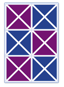
Make a table with two columns and three rows, with crossing diagonal lines, as shown below. Using the Crossing Diagonal Lines method, each cell has an X through it, and so if you choose to fill your cells with colors, they will be limited in that the entire cell has to have the same fill color. This is definitely the easier of the two methods, as each of the cells have the same stroke and diagonal lines settings.

2 Columns, 3 Rows, Crossing Diagonal Lines
2 Columns, 3 Rows, Crossing Diagonal Lines (Colored Cells)
Table Cells with Single Diagonal Lines
Another way to create this window pattern is by making a table with 4 rows, and 6 columns, and manually formatting each of the cells with a single diagonal line. I explored this idea in another blog post: Data-less Tables: InDesign Meets Knitting.

Using this method, you have more flexibility in your color choices because there are so many more cells.


Something interesting that I discovered while working with diagonal lines with that they can have different stroke properties than the other cell strokes. By increasing the vertical and horizontal stroke weight (and leaving the diagonal lines at a smaller stroke weight), you can create some interesting effects. For this example, I created a separate orange-filled frame behind the table. I also added a drop shadow to the table frame.


By adding some color to the strokes, and then shearing the table, you can create some very unique geometric designs.