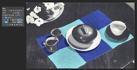
Here is the photo as I originally scanned in it. It has low contrast and looks pretty boring.
 |
| Checkerboard Design Table Mat |
1. So in Photoshop, I started by adjusting the curves. I just clicked Auto.
 |
| Auto Curves |
 |
| Set Blend Mode to Multiply |
4. Make sure that you have your pixels portion of your layer selected. See the little border around the transparent pixels in the image below?
5. Then go to Edit > Fill > Color > and choose a nice blue.
And the result is nothing so far. But now we'll start painting in the areas that we want to be blue.
6. Select your paintbrush tool, and choose white for your foreground color. Start painting in around the parts that you want to be blue. Then fill in the area clean up the edges, adjusting your brush size and feather as needed. You can adjust your brush size using the [ and ] keys.
- ] will increase the size of you brush.
- [ will decrease the size of your brush.
You can also adjust the feather of your brush using the keyboard.
- Shift + ] increases the hardness (decreasing the feather).
- Shift + [ decreases the hardness (increasing the feather).
7. It looks pretty good, right?
Now I can more easily see those areas and fill them in.
9. Then repeat this process for the light blue squares.
You can even add a gradient fill, to mimic variegated yarns.
The original pattern calls for cotton yarn in an afghan weight. In modern day terms, that means a worsted weight yarn. Just this morning, I discovered some great worsted weight cotton yarn, in a variety of colors, at an affordable price. Conveniently, enough, it's called "Dishie" (because it is super durable and suitable for dishcloths and other kitchen-related tasks). Cotton yarns are typically rather muted in color.
For my original colorway of blues, I'll choose Dishie in Blue and Azure.
But if you look at the original blue colored photo, the blues I chose are too intense.
By reducing the opacity of the blue layers, I can more closely match the color of the yarn that I'm specifying for the checkerboard table mat pattern. I reduced the Blue layer to 80% and the Light Blue layer to 60%.
Here is the final table mat, knitted in Dishie yarn.
 |
| Checkerboard Design Table Mat |


No comments:
Post a Comment