Thursday, December 29, 2011

PatternMaker Squares

I love TeaCup PatternMaker, and so I have decided to regularly explore its pattern possibilities and post my findings here. Some people sketch or doodle. I make patterns. Enjoy!

All of the patterns here use the same three colors:
  1. A grey fill on the frame
  2. A medium blue for the fill of the pattern, and
  3. A dark blue for the stroke of the pattern.
In the first example, by making the element gap and Square size very close, we get squares that stack on top of each other, like fish scales, only square.


In the second example, I increased the Element Gap to 47 and adjusted the Pattern and Shape Angles.

The Shape Angle refers to the orientation of each square. The Pattern Angle refers to the angle of the entire pattern (as a whole) within the frame. So in this example, a Shape Angle of 180 degrees has the same effect as a Shape Angle of 0 degrees. And the entire pattern is rotated by the pattern angle, which is 45 degrees.


By expanding the Element Gap, the squares move farther apart. This next example has a shape angle of 90 degrees, but because the shapes are squares, they look visually the same as if they would have a shape angle of 0 or 180 degrees.


Next, I increased the square size quite a bit, and also increased the element gap by just a little. Now the squares are larger, and close together. Also, because the pattern angle and shape angle are in increments of 90, the squares align straight up and down.


Here is the same pattern, only with "Has Fill" UNchecked. Now, it appears as though each square has a double stroke, but that's because the 50 pt squares overlap one another, because they only have a 40 pt Element Gap.

Tuesday, December 13, 2011

How to Avoid Accidentally Auto-Expanding Your "Live Corners"

I've run into some difficulty when trying to edit the shape of rounded rectangles. Let's say that I want a rounded rectangle that looks like it's in perspective. So I start with a rectangle, add the rounded edges, and then start to move the points and edges around so that my rectangle is in the correct perspective.

So let's start with a plain rounded rectangle, before attempting to reshape it.

Rounded Rectangle with Live corners

My first inclination is to simply drag one side of the rectangle using the white arrow tool. But when I do do this, the corners are no longer live. (See how each corner now has two small points near the corners, but no points actually on the corners?) Hey! That's not what I wanted! Undo, undo...


So next I tried just dragging one of the corners to put just that corner where I want to it to go. But, instead, this moves the entire rectangle, PLUS expands the corners.  Again, this is not what I wanted! Undo, undo, undo...

Dragging a corner moves the entire rectangle AND expands the Live Corners

My corners are now dead!


So after a bit of experimentation, I finally figured out the trick to not accidentally expanding Live Corners:
  1. First, select a corner (or a side) with the white arrow.
  2. Then nudge it a bit using your cursor keys.


Once you've nudged part of the rectangle, you can use the white arrow tool to click on any of the corners and any of the sides and drag them wherever you want them to be. The live corners will still stay live.


You might think (as did I), that the act of clicking-on-and-nudging a corner point would have the same effect and clicking-on-and-dragging a corner point. But alas, no.

Now interestingly, the little yellow square indicating "Live Corners" has disappeared. But you can still edit the corners by going to Object > Corner Options.

This rectangle still has Live Corners even without the little yellow square

I'd like to think that this behavior is a bug, and that Live Corners wouldn't automatically expand on accident. If I were to change the behavior of the feature, I would set Live Corners to NEVER auto-expand without me telling them to expand. There really should be a separate command for that in the menus. 

Edit 8-10-16: 
This bug was finally fixed! Now, There is a trick to make your paths expand, should you want to. You can find the explanation here.

Wednesday, December 7, 2011

The Trick to Getting Column Strokes to Be in Front

Yesterday I was working on a table that needed to have red column strokes and white column rows. The column strokes needed to be on top. I thought it would be easy. I went to the Table Options dialog box (or command+Shift+Option+B...similar to the Text Frame Option dialog box, with a couple other modifier keys thrown in.)

The screenshot below shows the dialog box as it was set initially. I thought, "This should be simple. I just nee to change the stroke drawing order." So I then changed the stroke drawing order to Column Strokes in Front.

Row Strokes in Front

But nothing happened. I attempted it several times, but gave up, thinking I could tackle the problem again after a good night's rest. But the next morning, I came back and the problem was still there. Row Strokes were in front, even though I told them not to be.

I thought maybe it a screen issue. For example, sometimes when viewing a page in Acrobat, if the page has a table with all the same stroke weights, sometimes some of the row strokes seem thicker than others. But I've never seen InDesign display stroke weights incorrectly before, so that couldn't be it. I thought maybe by modifying the weight of the column strokes, I could fatten them up enough visually that they would seem like they were in front. Sort of like visual dot gain. 

Column Strokes should be in front, but they are not!

So I changed the column strokes to 2 pt and they were now magically in front. I changed them back to 1 pt just to see what would happen and they were still magically in front. After a little experimenting, it turns out that InDesign doesn't actually change the drawing order unless you go back and modify the strokes (whichever ones you want on top) again. For example, if you change the settings to be Column Strokes in Front, after exiting the dialog box, you'll need to then go back into the table and modify your column strokes somehow. Change the color, change the stroke weight, whatever you want. But somehow, the act of modifying the column stroke tricks InDesign into doing what you had asked it to do in the first place.

Likewise, if you change your settings to be Row Strokes in Front, you'll then need to go in and somehow edit your row strokes for the setting to actually take effect.

Now column strokes are really in front


Wednesday, November 30, 2011

A Closer Look at the Sub-Level Sorting When Sorting Comments by Color In Acrobat 9

Let me start of by saying that this article is all about sorting comments by color in Acrobat 9. You may ask, "Why are you writing about features in old software? Acrobat X has been out for over a year now." Well, sadly, Sort Comments by Color (my favorite Acrobat feature) was removed in Acrobat X. So I still use the old software. But I digress.

Sort Comments by Color is at the heart of my production workflow. I have a dozen or so colors that I use to color-code pertinent parts of my documents. Each color represents a similar type of information. So when I'm working an a project, I'll start with the pink comments, then go the gray comments, then to magenta, and so on down the line. The Sort Comments by Color feature allows me to group all the similar information together so that I work on it more easily.

So, once my comments are sorted by color, there is another secondary level of sorting that Acrobat uses. It doesn't sort as you think it might. It sorts not by where the comments fall in order of creation, nor where they fall in the page sequence (as you'd think they might), but rather, Acrobat sorts them based on the Y coordinates. Like so:


In the example above, I have two purple comments: the first is on page 1 at the bottom of the page, and the second is on page 2, near the top of the page. In this example, the comment on the second page will appear at the top of the list when sorted by color.

If you'd like to read more about Sorting Comments by Color: check out my other article on the topic: Acrobat Rectangle Tool: Why Do You Disappoint Me So?

Edit 10-9-14: I recently found a useful add-on for Acrobat X and XI. It allows you to filter comments by color. While it doesn't have all the same functionality as Sort Comments by Color in Acrobat 9, it may be a good choice for those that use color-coded comments and do not have access to Acrobat 9. Here is the script: Acrobat -- Filter Comments By Color 

Edit 9-25-15: Please check out my latest article: Sort Comments by Color... In Acrobat DC!

Edit 7-12-16: I'm happy to report that when Adobe finally restored "Sort Comments by Color" back to Acrobat DC, they fixed the secondary sorting issue. So now, when comments are sorted by color, they are listed in order by page, then by Y-coordinate.

Monday, October 17, 2011

When Text Won't Left-Align

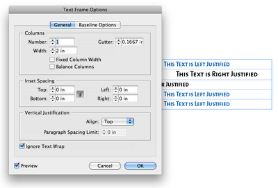
I recently came across a bit of text that wouldn't left align. It would center-align and right-align just fine, but it wouldn't left align. (Note that my left-indent was set to zero, and my left-cell padding was set to only 0.08 inches.)


I tried what normally works to fix alignment isues: I went to the Text Frame Options. I figured that maybe there was a mysterious text-wrapping on an object nearby. So I checked the Box "Ignore Text Wrap." I figured that would solve the problem. But no.


So then I went though all the paragraph settings and tried to see what would cause left aligned text to NOT left align. I didn't find anything that would cause weird indent issues. However, I found that this paragraph style (H4) was based upon another paragraph style (H1).


So I applied the H1 paragraph style to the text in my table, and it magically left-aligned as it should.


I then reapplied the H4 style, and tried copying and pasting the offending H4 text into a new text frame, and it left-aligned as one would expect it to.


So then I went back to the H4 paragraph style options and examined the differences between the H1 and the H4. After a little digging, I found that the H4 had an "align to decimal" tab stop.


I removed the tab stop, and presto! The text now left-aligned as it should. (See the fourth row?)


I'm not sure why the "align on decimal" tab stop was there... I most certainly put it there intentionally at some point in time, though I don't know when, nor why. For some reason, I was trying to align digits, and had set the tab to align on a dollar sign. (Click on photo to enlarge.)


Based on the fact that the same text behaves differently when placed in a table, I am inclined to think that there is a bug in inDesign, that when you use an "align on" tab stop within a table, InDesign will not honor your left-align paragraph settings. Though I have used the words "Left Justified" in my screenshots, this issue holds true for both left aligned, as well as left justified text within a table.

Edit on 4-23-12: I recently came across a great article that explains this behavior. Apparently, this falls into the category of: "it's a feature, not a bug." Check out the InDesign Secrets article on this topic: Tab Stops in InDesign Tables.

Saturday, October 8, 2011

Diamonds, Dots, and Waves: Stroke Style Options for InDesign Tables

For today's episode of Fun With InDesign Tables, I started out by to experimenting with the White Diamonds stroke style.

I made a table 4 columns by 2 rows and gave it a 35 point White Diamond stroke. Just a note: "White Diamond is the name of the stroke, but you can color the diamonds however you want. I suspect that the name "White Diamond" has to do with the fact that the center of the diamonds appear as white (paper-colored)...that is, unless you give the stroke a gap color.

Then I colored the outside border red, and the inside column strokes to yellow.


Next I took the same table and widened it a bit, and then added a black gap color to the table strokes. I thought it was interesting that the gap color stayed confined to the border of the diamond shapes, and made inverse white knockouts in the corners of the table.


Next, I took the same table and gave it a stroke style of Japanese dots. Notice how the black gap color now extends to fill out the rounded corners. This one sort of reminds me of the beaded counting toys that I remember from my childhood


Here are a few more tables, with different stroke styles.

Straight Hash Stroke Style

Think-Thin-Thick Stroke Style

Wavy 
Dashed
Note that the only thing I changed in these 6 tables is the stroke style. The stroke width, stroke colors, and gap color remained the same.


Friday, September 30, 2011

The British Flag as an InDesign Table

This post is a continuation of my other posts about diagonal lines within tables. Now for those of you who are British, please don't get upset that I didn't get the diagonals quite right. But my goal was to: using a single InDesign table, replicate the British flag as closely as possible.

Technically, the diagonals should line up exactly from one corner of the table to the opposite corner of the table, but InDesign: diagonals run from one corner of the cell to the opposite corner of the same cell. In this case, our table is 2 cells wide by 2 cells high, so the diagonals aren't perfect. But you get the idea.

My mental starting point for this table was a graphic containing geometric specifications for the British flag. You can find it here.

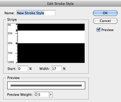
Because the specifications graphic listed proportions for the stripe width, I was able to create custom stripe stroke styles based on those proportions.

First, I made a table; then I filled the table with Blue and then started working on my strokes. I made a three custom stroke styles: one for the horizontal and vertical lines, and two for the diagonals. Then I applied a thick white stroke, set the gap color to Red, and applied my new custom stroke styles.

So, download my sample files, make 2 row by 2 column table, with the cells each 15 points high x 30 points wide. Then apply these cells styles to it. Voila! An almost British flag. 


The stroke style for the horizontal and vertical table strokes (10 pt white stroke with gap color set to Red )


Stroke style for the right-slanting strokes (6 pt white stroke with gap color set to Red)

Stroke style for the left-slanting strokes (6 pt white stroke with gap color set to Red)
If you're puzzled by the logic that InDesign uses to apply stripe stroke style to diagonal lines, well, you're not alone. Check out one of other articles where I have a bit of a writeup about it, as well as some samples of a larger variety of stripe stroke styles applied as diagonal lines. Data-less Tables: InDesign meets Knitting

Thursday, September 29, 2011

The Case of the Possessed InDesign File - Mystery Solved

I recently encountered a problematic file that locked up every time I got to a certain point in my editing tasks. After restarting InDesign a few times, I attempted to go right back to where I left off, only to have the  program lock up again. Here are the things I attempted before I was able to pinpoint the problem:
  • Restarted InDesign
  • Deleted preferences
  • Deleted my InDesign recovery files
  • Restarted my computer
  • Tried editing the file from a different machine
Then I tried editing another section of the file (a different page), and all was fine... until I went back to that troublesome editing spot, which, in this case, was a table. Every time I touched the right-hand border of the table, InDesign locked up. I found that I could edit the text, and pretty much anywhere else in the file, just not the right hand border. So I decided to get rid of the table.


But I didn't really want to retype the whole thing, so I converted the table to text, then converted the text back to a table. And now I was able to move the right border without my program freezing.

For instructions on how to delete your InDesign Recovery files, see Anne Marie's instructions at the bottom of one of my other posts: "InDesign Crashing and Making Me Crazy.

10-8-11 Edit: After thinking on this for a few days, I suspect the problem may have to do with Keep options. I had all the cells in my table set to "Keep with next row," but I also had a few paragraphs to "Keep with the next 1 line." I think there may have been a conflict between the two, and when I tried to make move the right-hand border of the table, InDesign just didn't know what to do, and so it froze up.


The next time this happened (and I'm confident that it will), I will closely inspect the keep options and  document my findings here.

Thursday, August 25, 2011

Fun with Geometrics! Stripe Stroke Style + Tables + Diagonal Lines...

I came up with this stroke style idea while driving around town, slightly distracted at the geometric patterns used in traffic signage. Perhaps I should pay more attention the street names, and less attention to geometric patterns around me. Needless to say, I often get horribly lost. Here is what I saw that made me inspired to combine a stripe stroke with diagonal lines. This is offically known a "bicycle priority lane."


Here is my version: It is a 2-column, 2-row InDesign Table. The cells are filled with blue, and I made a custom Striped Stroke Style, which I then applied as 48 pt crossing diagonal lines at 50% tint.


There is a trick to getting the diagonal lines to line up perfectly both horizontally and vertically. You must have the space at the top of the top stripe be an equal distance from the bottom of the bottom of the bottom stripe. In this example:
  1. The top stripe starts at 5% and extends 10% of the width of the stroke. That makes the ending point of the first stripe is 15%. Then I have a 10% blank space.
  2. Then second stipe begins at 25% and extends down to 35% . Another 10% blank space.
  3. Third stripe goes from 45% to 55%.
  4. Fourth stripe goes from 65% to 75%
  5. Fifth stripe goes from 85% to 95%
So there is a 5% blank space at the top (from 0-5%) and another 5% blank space at the bottom (from 96-100%).


Here are the diagonal lines settings that I used for these cells.


In this next example, I changed the diagonal lines from crossing diagonal to right slanting diagonals. Then I added a 48 point cell stroke (using my aforementioned custom stroke style) around all the cells. (Click on the pictures to enlarge them so you can see the stroke panel). This one is orange because I had the cells highlighted so the stroke settings I used would show up in the panel.


Here is the same design, unhighlighted, so you can see the original blue.


Something cool that I discovered is that because the pattern is created within the cell settings, when you increase the number of rows and columns (by holding down Alt/Option and then dragging on the table or cell borders), when more rows are added, they inherit the same size and styling as the cell you're dragging from. So it works like a dynamic step and repeat, only it's accomplished through just option-dragging. The pattern enlarges magically, right before your eyes.


Here is another example of a 2 row by 2 column table, 48 pt wide x 108 pt H, with a 108 pt crossing diagonal lines cell stroke. Because the cell diagonal lines are equal in stroke weight to the width of the column, they line up perfectly and make tidy little diamonds.

Just to mix it up, I decided to add some gradients and color it all pink. Does it remind you vaguely of a ski sweater? It should. This is a common graduated color technique used in Fair Isle and Norwegian knitting. Only they don't typically use pink.


You can more easily utilize reversed gradients by first making one gradient swatch, then swapping the colors and making a second swatch. Like so:


If you're want to investigate this technique further, or use my stroke style for your designs, here you go. I made a zip file with an CS 5.5 INDD, an IDML, and a PDF. Enjoy.

Monday, August 15, 2011

Using InDesign Tables to Duplicate the Window Structure Outside the Lincoln Memorial

Last May, I was able to attend the 2nd annual InDesign Secrets Print and ePublishing conference in Arlington, VA. I spent each day at the conference surrounded by fellow InDesign aficionados, talking about prepress, interactive graphics, searchable PDFs, and best practices for publishing workflows. Those conferences are more fun for me than any theme park. I was on InDesign overload, and loving every minute of it.

On the last evening of the conference, my husband and I took some time to tour the National Mall. Since I was recovering from the aforementioned (self-induced) InDesign overload, all I could think of was patterns. (If you've read my blog for awhile, you may have read some of my other posts about patterns.)

While I was touring the several-hundred-year-old buildings and streets, I snapped a few photos of some of the more interesting patterns in the architecture, with plans to recreate the geometry using InDesign tables.

This photo is of the concrete window-type architectural details on the Lincoln Memorial. If you're inside the memorial, and about to head back down the stairs, stop and turn to your right. Walk two columns past the main entrance and look at the face of the wall. That's where you'll see these window cutouts. These tiny little windows are so small when compared to the rest of the memorial, that they're nearly impossible to see on most of the Lincoln memorial photos I found on the web. But fortunately, I found a photo that displayed the little windows on both sides of the Lincoln Memorial. See the little windows? (By the blue arrows.)

Copyright Rocco Caveng. Photo used with permission.
Here are the windows up-close.


Since my plan was to recreate the geometry of the windows in InDesign, let's get started. There are a couple of different ways to create these windows. Both methods use Diagonal Lines.


Table Cells with Crossing Diagonal Lines
Make a table with two columns and three rows, with crossing diagonal lines, as shown below. Using the Crossing Diagonal Lines method, each cell has an X through it, and so if you choose to fill your cells with colors, they will be limited in that the entire cell has to have the same fill color. This is definitely the easier of the two methods, as each of the cells have the same stroke and diagonal lines settings.
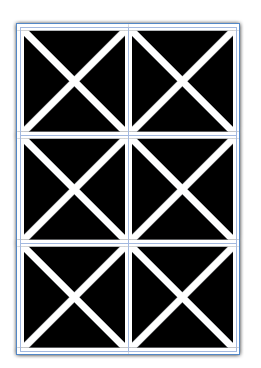
2 Columns, 3 Rows, Crossing Diagonal Lines
2 Columns, 3 Rows, Crossing Diagonal Lines (Colored Cells)
Table Cells with Single Diagonal Lines
Another way to create this window pattern is by making a table with 4 rows, and 6 columns, and manually formatting each of the cells with a single diagonal line. I explored this idea in another blog post: Data-less Tables: InDesign Meets Knitting.

Using this method, you have more flexibility in your color choices because there are so many more cells.


Something interesting that I discovered while working with diagonal lines with that they can have different stroke properties than the other cell strokes. By increasing the vertical and horizontal stroke weight (and leaving the diagonal lines at a smaller stroke weight), you can create some interesting effects. For this example, I created a separate orange-filled frame behind the table. I also added a drop shadow to the table frame.


By adding some color to the strokes, and then shearing the table, you can create some very unique geometric designs.