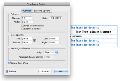
I tried what normally works to fix alignment isues: I went to the Text Frame Options. I figured that maybe there was a mysterious text-wrapping on an object nearby. So I checked the Box "Ignore Text Wrap." I figured that would solve the problem. But no.
So then I went though all the paragraph settings and tried to see what would cause left aligned text to NOT left align. I didn't find anything that would cause weird indent issues. However, I found that this paragraph style (H4) was based upon another paragraph style (H1).
So I applied the H1 paragraph style to the text in my table, and it magically left-aligned as it should.
I then reapplied the H4 style, and tried copying and pasting the offending H4 text into a new text frame, and it left-aligned as one would expect it to.
So then I went back to the H4 paragraph style options and examined the differences between the H1 and the H4. After a little digging, I found that the H4 had an "align to decimal" tab stop.
I removed the tab stop, and presto! The text now left-aligned as it should. (See the fourth row?)
I'm not sure why the "align on decimal" tab stop was there... I most certainly put it there intentionally at some point in time, though I don't know when, nor why. For some reason, I was trying to align digits, and had set the tab to align on a dollar sign. (Click on photo to enlarge.)
Based on the fact that the same text behaves differently when placed in a table, I am inclined to think that there is a bug in inDesign, that when you use an "align on" tab stop within a table, InDesign will not honor your left-align paragraph settings. Though I have used the words "Left Justified" in my screenshots, this issue holds true for both left aligned, as well as left justified text within a table.
Edit on 4-23-12: I recently came across a great article that explains this behavior. Apparently, this falls into the category of: "it's a feature, not a bug." Check out the InDesign Secrets article on this topic: Tab Stops in InDesign Tables.


