If you’ve ever tried to use numbering in a table, you’re likely familiar with the behavior of how InDesign determines where to place the numbers. As demonstrated in this article, you’ll see that InDesign will scan the table from left to right and then from top to bottom and apply the numbering this way.
But what if you want the numbers to be assigned from top-to-bottom and the left to right? It’s possible, but not inside of a table. With Western languages, text flows from top to bottom, and right to left. So what we need to do is construct our numbered list in a way that matches that flow. And then add the borders.
Read the entire article at InDesign Secrets.
Showing posts with label workaround. Show all posts
Showing posts with label workaround. Show all posts
Wednesday, July 24, 2019


Monday, September 12, 2016
How to Change the Text Size in Measurement Tool In Acrobat DC
I did a search for this topic this morning, and apparently, people have been wondering about this going back for about a decade, or whenever the Measuring Tool was added in to Acrobat. I do need to give a disclaimer that this is a kludgy workaround, and bypasses Acrobat's lack of built-in functionality for this feature. So here we go!
1. Start by opening the Measure Tool and measuring the object.

2. Next, go to your commenting tools and make a new text comment. You can use either there regular Add Text Comment tool, or the text box tool. Basically, we're just need to use one of the tools that gives us access to the text properties editing. Then using the Text Properties tool, type in the distance that Acrobat generated above when you measured your object. In this case, it is 1.5 in. Then change the font size to whatever you prefer. You can change the color as well if you like.
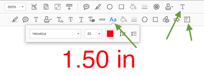
3. Next, select the text n the text comment you just made. Copy it.
4. Open the Comments pane. Select the distance measurement in the "Line" comment.


Edit: 9-18-918
I recently discovered a different software called BlueBeam Revu, which has much more customizable drawing markup properties, including the ability to choose the font, font size, and font color for measuring markups. Even the rectangle and callout line can have their own colors! Check out my article on Bluebeam Revu. It's an amazing program designed specifically to meet the needs of users in Architecture, Engineering, and Construction.
1. Start by opening the Measure Tool and measuring the object.

2. Next, go to your commenting tools and make a new text comment. You can use either there regular Add Text Comment tool, or the text box tool. Basically, we're just need to use one of the tools that gives us access to the text properties editing. Then using the Text Properties tool, type in the distance that Acrobat generated above when you measured your object. In this case, it is 1.5 in. Then change the font size to whatever you prefer. You can change the color as well if you like.

3. Next, select the text n the text comment you just made. Copy it.
4. Open the Comments pane. Select the distance measurement in the "Line" comment.

5. Paste in the text that you copied from the text box tool. Violá! Larger type!

Now, I wish there was a way to make this the default, but since Acrobat doesn't have text size as one of the editable properties of the measure tool, the size of the type isn't taken into consideration when you choose "Make Properties Default."

However, you can have access to edit a number of other properties of the Dimension Line, just not type size. If you need to have larger type Dimension Line type on a regular basis, I would imagine that an Acrobat scripter could easily write a script to do just that.

I recently discovered a different software called BlueBeam Revu, which has much more customizable drawing markup properties, including the ability to choose the font, font size, and font color for measuring markups. Even the rectangle and callout line can have their own colors! Check out my article on Bluebeam Revu. It's an amazing program designed specifically to meet the needs of users in Architecture, Engineering, and Construction.
Wednesday, March 18, 2015
A Workaround When Acrobat says a PDF is an "Unsupported File Type"
Today I needed to download a PDF from a website. I use Safari, and usually I can just save the file as a PDF using File > Save As.

"Acrobat could not open 'Ecomar-e.pdf' because it is either not a supported file type of because the file has been damaged (for example, it was sent as an attachment and wasn't correctly decoded). To create an Adobe PDF document, go to the source application. Then choose Save as Adobe PDF from the PDF drop down in the Print dialog.

So next I tried File > Export as PDF. But I got the same result.

In the past, I've used Preview when Acrobat can't open PDF files. But when I tried that today, I got the following message:

So I took a look at the file properties in Finder. For whatever reason, the file is 0KB.

So I decided to try using Acrobat to open the PDF. It's not well known, but there is a way to open a PDF directly from Acrobat. But you won't find it under File > Open. You'll find it under File > Create > PDF from Web Page...

If I recall correctly, years ago this feature may have been in the File > Open section of Acrobat, because notice the keyboard shortcut for this command: Shift + Cmd + O (which is just one key different than the Shift + O of File > Open). That brings up the following dialog box.

I just pasted in the URL of the PDF I was trying top open and clicked "Create." And Voila! The PDF opened perfectly!
But there is much more to this tool than first meets the eye. Create PDF from Web Page does just when the name says: it creates PDFs from HTML files. If you click on the "Settings" button, you are presented with a few options.
 |
| Web Page Conversion Settings: General Tab |
 |
| Web Page Conversion Settings: Page Layout |
 |
| Web Page Conversion Settings > General > HTML Conversion Settings |
Since my document was already a PDF, I didn't need to adjust any of the HTML conversion settings. But it is nice to know that they are there.
Sunday, January 27, 2013
Put Your Book Documents on a Time-Out for Bad Behavior
Are the InDesign files in your book slow to edit? Here's a workaround for InDesign's insistence on constantly verifying the cross references acrossdocuments in a book.


This article can be found at InDesign Secrets.
Tuesday, December 4, 2012
The Elusive Stroke Style Units of Measurement
Why does my Stroke Styles dialog box always display strokes in inches? Find out the source of this annoyance, and how to fix it. This article can be found in its entirety at InDesign Secrets.
http://indesignsecrets.com/the-elusive-stroke-style-units-of-measurement.php

http://indesignsecrets.com/the-elusive-stroke-style-units-of-measurement.php

Sunday, June 19, 2011
How to See Hidden Conditional Text in InDesign, Without Making the Condition Visible
Have you ever wanted to know what's hiding in your conditional text? If you've ever tried to locate a string of text that is in a hidden condition, you'll be familiar with the following error message: "Cannot find match.


So how can you see what's hiding in that hidden conditional text?
Well, you could simply unhide all your conditions and then search for the bit of text that you want. But, what if you have a large number of of conditions, let's say 20 or 30 in one document? If the conditions aren't applied perfectly to your paragraph returns, then showing and hiding conditional text can really mess your paragraph styling. H1s can turn into body type, body type can be turned into headings, etc. And then you'd have to go back and fix it all.
So randomly showing and hiding all your hidden conditions may not be the best way to find out what's hiding behind that little conditional text indicator marker.
For the sake of this discussion, let's say you set up your conditions many months ago, and forgot the rationale behind your setup. Or, perhaps the conditions were set up by someone else entirely, and you've inherited the document.
I stumbled across an interesting discovery recently and I wanted to share it with you. It's obscure, but that's why I love it.
Edit 10-11-11: Please see note below for more recent (and better) understanding of how this feature works.
First, in "Normal" mode, select your hidden conditional text indicator marker. The easiest way to do this is to put your cursor near the marker, and then use your arrows keys till you get over to the marker. Then shift+arrow to select the marker. It will just look like a little sliver is selected.


Now, without deselecting the text, hover over the conditional text marker. Be patient. Sometimes the pop-up will show up right away, sometimes it takes a few seconds. You may need to try hovering over the top of bottom of the highlighted sliver. It's a little finicky. But be patient. Wait for it...

Please forgive the poor picture quality. Remember how I said this feature was finicky? Well, pressing any keystroke to take a picture made the little dialog box disappear. And waiting more than about eight seconds also made the dialog box disappear. So I had to quickly take a photo with my iPhone and then colorize it in Photoshop.
So you can't Find-Change hidden conditional text, but you can still find out what's behind it...if you're patient.
If you want to learn more about find-change with conditional text, check out this InDesign Secrets article: Find/Change with Conditional Text.
Edit on 10-11-11: After working with this feature for a few months, I finally figured out the logic to get the hidden conditional text to display in a pop-up. It turns out to have absolutely nothing to do with the Preview mode. The trick is that you need to have your text insertion point within thestory frame containing the hidden conditional text. Then, hover over the hidden conditional text marker, and the yellow pop-up will appear.
Edit on 10-26-11: I recently discovered that you CAN see hidden conditional text within the Story Editor. It works similarly to seeing hidden conditional text in Layout view. All you have to do is hover your mouse over the hidden conditional text marker and you'll get a little yellow pop-up window displaying the text.
Edit on 8-23-18: A new plugin makes this much easier! It's called MoreInfo by Kerntiff Publishing Systems. It a panel that shows the contents of overset text, notes, index markers, track changes, and more!

Why, you ask? According to the Adobe help file:
Lovely. Well, you figure, "maybe it will show up in the story editor, like notes do." But alas, no."Text in a hidden condition is always omitted from searching."

So how can you see what's hiding in that hidden conditional text?
Well, you could simply unhide all your conditions and then search for the bit of text that you want. But, what if you have a large number of of conditions, let's say 20 or 30 in one document? If the conditions aren't applied perfectly to your paragraph returns, then showing and hiding conditional text can really mess your paragraph styling. H1s can turn into body type, body type can be turned into headings, etc. And then you'd have to go back and fix it all.
So randomly showing and hiding all your hidden conditions may not be the best way to find out what's hiding behind that little conditional text indicator marker.
For the sake of this discussion, let's say you set up your conditions many months ago, and forgot the rationale behind your setup. Or, perhaps the conditions were set up by someone else entirely, and you've inherited the document.
I stumbled across an interesting discovery recently and I wanted to share it with you. It's obscure, but that's why I love it.
Edit 10-11-11: Please see note below for more recent (and better) understanding of how this feature works.
First, in "Normal" mode, select your hidden conditional text indicator marker. The easiest way to do this is to put your cursor near the marker, and then use your arrows keys till you get over to the marker. Then shift+arrow to select the marker. It will just look like a little sliver is selected.


Now, go back to the bottom of the toolbar and change your viewing mode from "Normal" to "Preview." I've usually find it easier to simply press the W key to switch back and forth, but since I've got text selected now, pressing W would replace my hidden conditional text with a W. So, for the first time ever, I have a found a need to use the mouse to click on the view options button at the bottom of the toolbar.
Now, without deselecting the text, hover over the conditional text marker. Be patient. Sometimes the pop-up will show up right away, sometimes it takes a few seconds. You may need to try hovering over the top of bottom of the highlighted sliver. It's a little finicky. But be patient. Wait for it...

Please forgive the poor picture quality. Remember how I said this feature was finicky? Well, pressing any keystroke to take a picture made the little dialog box disappear. And waiting more than about eight seconds also made the dialog box disappear. So I had to quickly take a photo with my iPhone and then colorize it in Photoshop.
So you can't Find-Change hidden conditional text, but you can still find out what's behind it...if you're patient.
If you want to learn more about find-change with conditional text, check out this InDesign Secrets article: Find/Change with Conditional Text.
Edit on 10-11-11: After working with this feature for a few months, I finally figured out the logic to get the hidden conditional text to display in a pop-up. It turns out to have absolutely nothing to do with the Preview mode. The trick is that you need to have your text insertion point within the
Edit on 10-26-11: I recently discovered that you CAN see hidden conditional text within the Story Editor. It works similarly to seeing hidden conditional text in Layout view. All you have to do is hover your mouse over the hidden conditional text marker and you'll get a little yellow pop-up window displaying the text.
Edit on 8-23-18: A new plugin makes this much easier! It's called MoreInfo by Kerntiff Publishing Systems. It a panel that shows the contents of overset text, notes, index markers, track changes, and more!
Monday, April 25, 2011
Extract Vector Logos from PDFs
So it may seem like awhile since I've done a blog post. The truth is, I've been busier than ever writing new articles. However, the reason I haven't been posting here is because I'm actually started to work with an editor to get my articles posted on another popular blog. So, please take a moment and visit CreativePro.com, and check out my latest blog article there. You'll learn how to extract a vector logo from a PDF, using only Acrobat.
Creative Pro Article: Extract Vector Logos from PDFs
Creative Pro Article: Extract Vector Logos from PDFs
Tuesday, April 5, 2011
How To Remove Reader Enablement in Acrobat
Today I am filling out a W-9 form. The IRS usually does a pretty good job making their forms fillable. I was successfully inputting my data and got about halfway down the page, when I came to the signature line.
I couldn't sign it.

Normally,when a form is properly setup, the signature field looks like this. See the little red "Sign Here" arrow?

With most PDFs, when I need to sign a document and there is no signature field, I can just make one. But with this PDF, that option is grayed out.


I couldn't sign it.

Normally,when a form is properly setup, the signature field looks like this. See the little red "Sign Here" arrow?

With most PDFs, when I need to sign a document and there is no signature field, I can just make one. But with this PDF, that option is grayed out.

So I did a little research online and it turns out that this document had Reader Usage Rights enabled. Which is great for most people, because they can fill out the form on their computer, then print it and scan it back in.
But, I am not most people. I will go out of my way for an hour (or more) to avoid printing out a form and filling it out by hand. My husband asked me this morning, "Wouldn't it just be easier to fill out that form by hand?" To which I replied, "But Honey, what would blog about if I did that?"
So I tried following the instructions for removing the Reader Usage Rights. According the the dialog box, and several very popular forums, all I had to do was Save a Copy. Easy!

But despite three attempts at saving a copy of this file, I still couldn't make a signature field. So I decided to try a workaround. If you've read my other posts about Acrobat, you may know that it doesn't always do what I need it to do. And I have found a great solution for making PDFs...more accessible. ;)
That solution is Mac Preview. It's the free little application that comes on every mac (sorry Windows users), and is the default image viewer on a mac. Of course, as graphic designers, the first thing we do is change the default image viewer to Photoshop, and leave poor Preview to collect dust in the back of the Applications folder. But bring it out and have some fun! You'd be surprised what it can do. Check out my other articles about Mac Preview.
So I opened the file in Preview, saved a copy, and then reopened the file in Acrobat. And now I could make a signature field!

Monday, April 4, 2011
Adventures in Exporting: A Lesson in Patience
Today, I had a problem with Exporting a PDF file from InDesign CS5. I'm working on a 8-page newsletter, with lots of photos, illustrations, transparency, and such. I've been designing this quarterly newsletter for several years, without much complication.
Yesterday, I got the Dreaded "Failed to Export PDF" message. Apparently, this happens to many other designer around the world, but it has never happened to me before. I was able to track down the offending file and finally make a PDF. But it took 2 days and at least 30 or 40 attempts.
The source of the troublesome file was a word doc with charts in it. Call me stubborn, but I'm a die-hard mac user. I don't own any Microsoft products. Maybe I should break down and buy MS Office, but thus far, I've come up with workarounds to allow me to successfully view and extract data from Office documents. So, I'm still holding my ground as an all-mac office. But sometimes I need to come up with creative solutions to view certain file types. Normally it works pretty well. Today...not so much.
To designers around the world who have ever had a rough day and seemingly got nothing accomplished: I dedicate this post to you.
- Open the word doc in Preview. Charts don't show up.
- Upload the word doc to Acrobat.com.
- Save it as a PDF.
- Open PDF in Illustrator.
- Redraw/fix all graph artwork from Word. Use 3D, graphic styles, nice typography, etc.)
- Since there are multiple graphs, repeat Step 5 several times.
- Save as an AI file.
- Place into InDesign.
- Export PDF. Fail!
- Grumble.
- Try different PDF export settings. Fail!
- Grumble again.
- Export INDD file as IDML file.
- Open IDML file and repeat steps 11 and 12 for an hour.
- Repair disk permissions.
- Give up and go to sleep.
- Wake up.
- Restart computer.
- Repeat step 11 and 12 a few more times.
- Surf the web looking for solutions.
- Quit all programs and relaunch InDesign. Export the PDF with no other programs open, and without paging through the document. Fail!
- Try saving the AI file as an EPS file. Relink the file in InDesign.
- Repeat steps 11 and 12.
- Search again for more help on forums and websites.
- Read a forum where the designers tell you to outline all your fonts in order to fix the problem.
- Gasp in horror.
- Find a different website with an alternate solution.
- Try creating a postscript file and distilling. Fail!
- Remove graph images.
- Export PDF. Success!
- Place offending graph images in their own InDesign document and Export a PDF. Success!
- Place resulting PDF into original InDesign.
- Export PDF. Success!
- Export another PDF with different DPI setting (just to verify that it actually works). Success!
- Take a lunch break.
- Confidently make change/edits to the graph illustration.
- Update file in workaround-INDD document.
- Export a PDF.
- Update linked PDF in original newsletter layout.
- Export a PDF. Fail!
- Repeat steps 11 through 12 a few times.
- Try creating creating and distilling a postscript file. Fail!
- Export a flattened PDF. Success!
- Export another flattened PDF, this time for the Spanish version, which has different layers. Success!
So when I send this file to press later this week, I'm thinking about including a letter of apology. What do you think?
And oh, by the way, I wanted to include a screenshot of the "Failed to Export PDF" error message, but of course, now I can't get the error message to show up. Seriously?!
Monday, March 28, 2011
Creative Ways to Track Down Vector Logos
As a designer who works with non-profits, I often get artwork submitted to me that is a lower quality than I'd like to use. So I always go out of my way to find/recreate raster logos so I don't have to use JPGs, GIFs, or PNGs in my printing. Even for presentations going on screen, I will replace raster logos with vector logos. If a logo looks bad at one inch tall, it's surely going to look worse at three or four feet tall.
So I ask the non-profits for vector logos and the response is generally something along the lines of, "What's a vector? This is the only logo I have."
The folks I work with at the non-profits are not designers. No do I expect them to be. I am grateful that they take the time to gather photos, write some articles, and happily send everything over to me so that I can make it look nice for them.
Here are some ways I've figured out to make my client's artwork look its absolute best. This list goes in my preferred order of use. I start at the top, and work my way down, as I get more desperate.
Brands of the World Website
I am so grateful for the designer who told me about this. That designer was also the one who encouraged me to go freelance after the printing companies I worked for kept going out of business. Anyhow, Brands of the World has got thousands of vector logos, many of which I'm sure you have heard of, but many more that probably no one has heard of. One logo type you won't find there: major league sports team logos. Those organizations have the tightest vector logo-protection that I've ever seen! I once needed a San Diego Padres logo for a non-profit newsletter, and I had to get in touch with their Communications Director to verify that the project was legitimate.
Contact the Corporate Sponsor's In-House Marketing Department
If the corporation is large enough, they'll likely have their own marketing department. If you can track down a phone number or an email for someone in the marketing department, you have a good shot at getting a vector logo. As a passionate designer, I am impressed and grateful when I encounter other people who are concerned abut logo quality. And apparently, I am not alone. Marketing department people have been very nice to me, and when I have managed to track them down and talk with them, they always give me the vector file I need to make their company look its best.
I once had to recreate a form for a fire department, and I didn't want to use the grayscale logo that I had scanned from the hardcopy. So I contacted the city's marketing department and they happily sent me the 6-color vector logo. (That was years ago during the boom years, and that particular city had 6-color business cards with a gold foil emboss and a design that did not easily accommodate business card masters. I can't help but wonder if that city has redesigned their printing to be more affordable...probably not!)
Very large institutions, like military forces and colleges, often provide vector logos right online, on their own websites. Some even give usage guidelines. If you can find the logos posted on the corporate website, they often offer the logo in different color combinations and different orientations, to accommodate different printing and designs needs (1-color versus 4-color, etc).
Use Google's Advanced Search
I figured out this one while working in the marketing department of a civil engineering form. My job was to create marketing graphics for water treatment project proposals to city and county governments. So I had to track down all sorts of city and water district logos. While we had a decent in-house collection of logos, I wasn't satisfied with using existing raster based images for my work. As a picky designer, I figured that other picky designers also preferred to use vector logos in their designs, and those designs would often end up as PDFs posted on the web. Unless you're working for a place that has tight communication between the marketing, legal, and IT departments, chances are good (excellent actually) that you can find a logo embedded in PDF on the website of most larger organizations.
In Google's advanced search, choose the domain within which you want to search, and then choose filetype: PDF. As more and more people are creating and uploading PDFs, you'll have more and more documents to sift through. But there are very few times when I haven't been able to find what I need using this method.

If you want to quickly filter out a lot of PDFs, you can also add the words untitled, .indd, or .qxp to your search. "Untitled" is the default name that InDesign gives to a new document, and it's not uncommon for designers to save files first as "Untitled.indd" and then go back and change the name to something more meaningful later on. So unless the designer changes it, chances are good that the word "untitled" will be located in the metadata somewhere, usually in the Title (not to be confused with the file name). The same thing applies to .indd and .qxp.
Once you find a PDF that looks like a good candidate, zoom in really close. If it's vector, you can generally open the file in Illustrator and extract the logo from there. But if you are extracting logos from PDFs in Illustrator, be very careful and be sure to grab all the parts and pieces of the logo. PDFs from InDesign can be very complex when opened in Illustrator, and they are riddled with ridiculous numbers of clipping paths and groups. I like to select each part of the logo individually with the direct select (white arrow) tool, and then cut and paste into a new document. Double check your work, as it is easy to mess this up.
One thing to note about university logos: they are often tightly controlled. Universities have a variety of logos in different color combinations, orientations, and uses. Some university logos/seals are restricted for use only on official documents, like letters from the president, or diplomas. Other logos are restricted for use only by the athletic departments. These athletics logos are often used on t-shirts, hats, and other items for resale. Try to locate the "Logo Usage Guidelines" document and follow it closely. In addition to offering very detailed information about acceptable use of the logos, another bonus of locating this document is that typically, all the vector logos are located all in one place. How handy!
Search for Annual Reports
If Google Advanced Search doesn't work for you, or it generates more results than you want to search through, search Google for an Annual Report. From this designer's standpoint, the Annual Report is typically the most respected document in the year of any organization. For the Annual Reports, many organizations will do fancy layouts and get high-end printing. And you can bet that any annual report that's been designed by a professional designer will have a vector logo. Not all organizations put their annual reports on the web, but many do. Non-profit groups and credit unions are good examples.
Contact the Web Designer
Sometimes, corporate sponsors are large enough to make big contributions, but not large enough to have their own in-house design departments. But many of these types of businesses do have very good websites. And behind every good website is a good designer, or maybe even a team of them! Look at the bottom of the web page to see if the web designer has a link to their own page. Sometimes, web designers are modest, and they don't put their contact information in the visible part of the page, but they'll hide it in the source code near the top. If you can find the web designer's contact information, give them a call and see if they can help you out with a vector logo.
Whenever I have tried this, it's been successful. My conversation/email usually goes something like this: "Hi there, I am a graphic designer So-and-So and I see that you designed the website for Big Corporate Sponsor. It is really beautiful and nicely done. Well, I'm contacting you because Big Corporate Sponsor recently made a donation to My-Client-The-Non-Profit. I'm working on the slideshow for the My-Client-The-Non-Profit's annual fundraising banquet, and I'm trying to track down the vector logos so that the Big Corporate Sponsors look good. Would you be able to assist me with this?" And the answer is yes!
When All Else Fails, Rebuild It
I warn you against doing this unless are a really good, experienced, hot-stuff designer who's insanely particular about little details. Organizations (especially large ones with very good logos) have spent thousands of dollars designing, perfecting, and controlling their logos. Many of these organizations even have legal departments dedicated to prosecuting people who infringe upon their copyrights and trademarks. If you recreate someone's logo and you get it wrong, and they find out (and care), you could be in deep trouble, both professionally and financially. But if you skilled and detailed enough to recreate the logo correctly, probably no one will be the wiser. But again, recreating well-known logos is something that should be reserved only for professionals. I have seen designers recreate logos incorrectly, and besides demonstrating a lack of thoughtfulness and care, and it degrades our profession.
Conversely, recreating logos is an excellent way to gain experience with font recognition. I worked for about a year at a small, mom-and-pop print shop. Customers would bring in their old business cards and want us to scan them and use the logo on new design pieces. Not on my watch were they going to get scanned-and-reprinted logos! These customers were almost exclusively small businesses, and their logos were typically just their business name set in a standard typeface; so recreating these logos was generally pretty quick. If you're going to rebuild someone else's logo for use in your designs, start with something simple and work dilligently to get it correct. (And please, don't choose a major league sports team.)
First, you need to match the fonts. I like whatthefont.com for it's character recognition engine. When that doesn't work, I go to identifont.com and answer questions about the qualities of each typeface. In worst-case scenarios, whatthefont.com has a font forum where all the font geeks hang out and identify typefaces that the rest of us can't recognize.
In either case, the font websites will refer you to page where you can purchase the font that matches. If you want to keep the integrity of the design (and you should!), purchase the font. Font designers work very hard to design all the little details of their letters. Typefaces, especially serif typefaces, are extremely time consuming to try to trace. Just buy the font. But if you work for a design firm or printing company with an extensive font library, they may already have it in-house.
Once the type is completed, you'll next need to recreate the company's icon. While you can trace in manually with the pen tool, Illustrator's Live Trace feature can also give excellent results. Live Trace was introduced back in CS2, and is a great tool for quickly creating vector paths from a raster image. The images that work the best are high-contrast, and well defined edges. Logos are the types of graphics that work particularly well with Live Trace's capabilities.
Take the image you'll be tracing and place it into Illustrator. You can set it on its own layer as as template layer, or you can simply lock the image down. By default, template layers will screen back the opacity of the layer by 50%. I prefer to keep the placed image at 100% opacity and instead, screen back the opacity of the object I'm tracing. But that's just my personal preference. Set the type as described above. Now, open the Links panel. Go to Window>Links. I'm an avid InDesign user, so I naturally press Command/Ctrl+Shift+D, which brings up the transparency grid. That's not what I wanted! (Because I've never found a use for Illustrator's transparency grid, I change Illustrator's keyboard shortcut for the Links panel to be the same as in InDesign.)
So once you have the type set and the Links Panel Open, click on Edit Original. This will open the placed image in whatever program you have set to open that that type of raster image. It will likely be Photoshop, but depending on your setup, it could also be a different program, such as Apple's Preview, or Windows Picture and Fax Viewer. But regardless, you need to open the graphic in Photoshop.

Once you have the graphic open in Photoshop, you'll need to erase the text. Be sure to set the background color to white first, or press "D" to reset the foreground and background colors to the default setting. Sometimes, the type within a logo crosses over or touches the "icon" part of the logo. But do your best to erase the type. You want to isolate the icon part of the graphic. It can also be helpful to clean up other parts of the image in Photoshop by using the Posterize and Find Edges commands. Now, Once you have erased the letters and cleaned up the tracing image, save the image with the same filename. Now go back to Illustrator. You'll get a warning about missing/modified links. Click Yes.

Now, Live Trace the image. There are a variety of presets and settings you can use for Live Trace. For a great how-to on using the finer details of Live Trace, check out a CreativePro.com article dedicated to Live Trace.

As a professional designer, take pride in your work and make sure you have permission to use logos. Whenever I have used any of the techniques listed here, it has been on projects that directly involved the Big Corporate Sponsors. It seems that the biggest potential legal problems come when stealing logos for use on items for resale, such as t-shirts, hats, etc. But of course you would never do that.
Good luck and may all your logos be vector!
For another way to extract logos from PDFs, check out the article I wrote for Creative Pro: Extract Vector Logos from PDFs.
Monday, March 21, 2011
Using Mac Preview as a Workaround when Acrobat Pro Won't Open a PDF File
I recently had a problem file that was submitted to me by a client. When I tried to place the PDF into InDesign, I got the following error message: "Failed to open the PDF file."

So I decided to try to open the file in Acrobat to investigate what might be wrong. But instead Acrobat opening the file, I got the following message: "There was an error opening this document. The file is damaged and could not be repaired."


So I decided to try to open the file in Acrobat to investigate what might be wrong. But instead Acrobat opening the file, I got the following message: "There was an error opening this document. The file is damaged and could not be repaired."

I decided to try an alternative to Acrobat. For certain tasks, I like to use Apple's Preview software. So just out of curiosity, I wanted to see if Preview would save the day for me as it has on several other occasions. So, I opened the same file in Preview and it opened without any problem whatsoever. I saved it with a different name and then imported the file into InDesign.
Out of curiosity, I checked out the file in Acrobat. All the fonts were embedded properly, and everything checked out properly from a prepress-standpoint.
I'm not sure what the problem was, but it sure is good to know that I have a workaround to rescue problematic PDF files when they don't want to open.
Thursday, September 23, 2010
A new use for InDesign Notes: Sub Conditional Text!
For awhile now, I've been wanting a way to have multiple levels of conditional text. Let's say that when the main option is Option 1, I also have two color choices available: Blue triangle and yellow triangle. But neither Blue triangle nor Yellow Triangle is available for Option 2.


I have been using conditional text to turn on and off the appropriate main options. But for the additional sub-options, I have run into problems trying to find the best way to have them available within the text flow. Usually, I just put the extra graphic off to the side somewhere on the pasteboard. The problem with that is when the text reflows, that pasteboard graphic might be somewhere else, on another page's pasteboard, and I have to go looking for it.
For another great article about InDesign Notes, check out this one at InDesign Secrets.
Author edit: 9-14-13: The amazing team over at Rorohiko took on the challenge of subconditional text and developed a plugin specifically for this purpose. I wrote an article about it at InDesign Secrets: Finally! Improved Conditional Text
So I thought about using a layered PSD file, and using Object Layer Options to turn on and off the appropriate layers for Blue Triangle or Yellow Triangle. But I don't want to do that. I want an inline visual indicator (and layered PSDs don't offer that).
Today I figured out that by converting inline graphics to Notes, you can create your own quasi-sub-conditional text. InDesign conditional text only allows for either visible or invisible (not if/then). So if I have conditions (blue triangle and yellow triangle) that are dependent upon other conditions (Option 1) being visible, I need to be able to choose which one is showing when I make Option 1 visible in the Conditional Text panel.
Enter "Convert to Note." I've honestly never found this feature useful. But for this purpose, it will be quite handy. I can turn on the main conditional text, and then using "Convert to Note", I can keep both sub-options (Blue Triangle and Yellow Triangle) available as independent objects within the text flow. But they will only be available when Option 1 is visible.
For another great article about InDesign Notes, check out this one at InDesign Secrets.
Author edit: 9-14-13: The amazing team over at Rorohiko took on the challenge of subconditional text and developed a plugin specifically for this purpose. I wrote an article about it at InDesign Secrets: Finally! Improved Conditional Text
Subscribe to:
Posts
(
Atom
)