Tuesday, August 31, 2010

How to edit text in a PDF with unembedded fonts

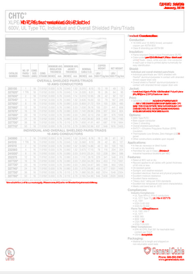
Last year I inherited a publishing company, which used a FrameMaker workflow. I have strong opinions on such thing as FrameMaker versus InDesign, WMF versus AI, low res versus high res, and default PDF distiller settings versus custom distiller settings. So when I took over the workflow, I changed pretty much everything about it. My workflow is much more efficient now, but due to the fact that I'm using Creative Suite on a mac, working from legacy windows Framemaker files, I have glitches from time to time, and I have to find unusual workarounds.

Previously, all PDFs in this workflow were made using "Standard" distiller settings. If you've ever attempted to create a high quality PDF using Distiller, you understand that you have to tweak the default settings to get it to do such things as embed the fonts.

In addition in inheriting a publishing company, I inherited thousands of PDFs without embedded fonts. And I have to find a way to use these PDFs from time to time, because my InDesign workflow does not allow me to open up the native FM files.

So, today's task: edit the footer of a PDF without embedded fonts.
  • Problem is, the footer was created in Framemaker, so I can't just go in Acrobat to Document > Header and Footer > Update. Updating footers in Acrobat only works if the footer was created in Acrobat.
  • So next, I tried editing the text using the Text Touch-up tool. Again, I can't because the fonts weren't embedded. (See Author note at the bottom of this article)
  • So next I thought about putting white boxes over all the footers, and the using the typewriter or text box tools to put the correct text back in.
  • But wait, what I really needed to do was to hide the text and then put new text in it's place. And then I remembered Redaction.
Redaction is Acrobat's version of a Digital Big Black Marker, to be used when you want to eliminate sensitive information. The cool thing about Redaction is that it's not just black. You can make it whatever color you want. And you can use it to cross out text, photos, whatever. You can even put in replacement text at the very same time you're crossing out the text you don't want. And the coolest thing about redaction? It works on documents with un-embedded fonts!

So go here in Acrobat: Advanced > Redaction > Show Redaction Toolbar. Use the Reaction Properties button to set your properties. I chose a white background and cyan text.


You can set your properties differently for each line you want to redact. So on the header pages, I used a different font and all caps.

Today's mission: Accomplished!


Author note: Leonard Rosenthol posted a correction to part of my article (actually, the title, upon which the entire article was based), so I have added some additional information here.

The purpose of this workaround to editing the text was that I needed a quick and dirty solution to change some text. I think before this experience, the only PDFs in which I've ever had to edit the text, were PDFs that I personally had made. So prior to this experience, I would've had all the fonts necessary already installed on my system.


So I guess a better title for this article would have been: "A Quick and Dirty Workaround to Editing Text in a PDF When You Don't (and Won't Ever) Have the PDF's Fonts Installed on Your System."

Monday, June 28, 2010

Data-less Tables: InDesign meets Knitting

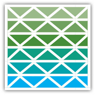
One of my recent projects took me to the Outer Banks of North Carolina, where after work one day, I played in the Atlantic for the very first time. I grew up on the west coast, near San Diego, and found the Atlantic to be quite different than the Pacific. On this particular beach, missing were the throngs of people, giant parking lots, and McDonalds. Other than one or two other families, my husband and I were the only ones on the beach. It was a wonderful day, plenty hot to enjoy a nice time in the water. Since most of my days are spent in my small home office, behind a giant computer screen, I was struck by the beauty and rhythm of the waves. I decided to design an afghan based on the colors and pattern I saw there.


I am a knitter, and I love geometric patterns. Years ago, I read a book entitled “Number Knitting” which is based entirely on knitting geometric shapes in garter stitch. In case you aren’t a knitter, garter stitch is the simplest type of knitting, named because it was the pattern used on the garter of hand-knit stockings. It is wonderfully elastic, and lies perfectly flat. It goes like this:

Row 1: Knit.
Rows 2-end. Repeat row 1.


It doesn’t get any simpler. Another one of the beauties of garter stitch is that is has a magical 2:1 ratio of (rows:stitches). This perfect 2:1 ratio allows you to create geometric shapes with precision: Triangles, squares, rectangles, trapezoids... Using these shapes, you can create beautiful designs. There are a few really great books that discuss in detail about using these shapes to create designs: Woolly Thoughts (written by two mathematicians), and the aforementioned Number Knitting (which is actually a patented knitting method!). One of knitting’s most beloved authors, Elizabeth Zimmerman, was also a proponent of garter stitch, and used it’s magical proportions to create fascinating garments, often made entirely in one piece. Though Elizabeth passed some years ago, her daughter, Meg Swansen, continues the family legacy with her business, and web site: Schoolhouse Press.

So how does this relate to InDesign?
In my first feeble attempts to work through design concept I had envisioned, I tried Illustrator. But it wasn’t working for what I wanted to do. It is very difficult to get the align and distribution correct on diagonal lines. I could have gotten out a pencil and paper, a protractor, and an angle, and tried to design it freehand on paper, but I can’t draw very well and I would have to know what I wanted to draw before I attempted to draw it. I am not a draftsman or a sketch artist. What I really needed was just a simple way to make horizontal, vertical, and diagonal lines. Wait! Diagonal lines are a feature in InDesign tables! I’ve never had a need for them before, but being stuck in an airport on my way home from the east coast, (with no internet connection) this seemed like the perfect opportunity to get some creative work done. Here are the features I used to create my afghan design.
  • Tables
  • Diagonal Lines
  • Swatches
  • Cell Styles

  1. First, make a table, equal in width and height. 6 rows by 6 columns
  2. Fill it with cyan.
  3. Add a 10 point white stroke to the exterior border of the table.
  4. Add 10 point white stroke to the top and bottom border of each row.
  5. Select a single cell, and add a 10 point right slanting diagonal stroke.
  6. Make a cell style based on each the right and left slanting cells. Apply those cell styles to each cell in the table, in a checkerboard pattern.
  7. Now choose your colors. I chose solid colors for each row, to simulate a gradient from cyan to light green. Yarn don’t come in gradients (at least not like this), so I needed to simulate one with my color choices.
I will likely buy this yarn from a website, and I will likely choose Cascade 220, as they have a HUGE selection of colors, and I am familiar with that yarn and am a big fan. Alternately, I could commission a spinner to spin me some yarn and hand-dye it. That would be the coolest thing to do, and there are a lot of handspinners in my area of the country, so I won't have a problem finding someone to make the custom yarn for me.


So my afghan design is complete, but I started experimenting with diagonals and found that you can acheive some pretty cool effects. After applying some different stroke types to the diagonals, I learned a few things:
  1. I wasn’t getting the diagonals to line up perfectly, so after a bit of thinking, I realized that the proportion of the triangles wasn’t quite right. It appeared that the 10 point white row strokes were encroaching on the colored squares, so after a little bit of experimenting, I figured out that to make a perfect triangle, you need to account for the difference in width between the 10 point row stroke and the 0 point column stroke. This is because the row stroke pushes up the contents of the cell (and therefore the cell’s diagonal). I tried decreasing the width of each column by 10 points. And it worked. Now I had perfect squares and triangles.
  2. For fun, I tried adding changing the stroke type from Solid to Thin-Thick, but it doesn’t apply the way you would think. The thick side is always on makes the base of the left-most side of the stroke, and the thin side is makes the base of the right-most side of the stroke. So it fixed that asymmetry by changing the diagonal stroke type every other row.
  3. Another interesting thing I noticed is that because the first and last column have 10 point column strokes, you’ll need to add 5 points to the width of the first and column to account for the edge strokes encroaching on the column.
Following are a few examples of different type of diagonal strokes. For these examples, I reduced the number of colors from 6 to 3, so you can easily see the different patterns.


Here is the final afghan:


Would you like to purchase the pattern for this afghan?

And here is a video about how I made it, and then translated it back into my graphic design software. Scroll to 6:07.


Author Note: Did you like this article? Check out another article on diagonal lines in tables here.

Monday, May 24, 2010

Examining 2 PDFs - they look the same, but are they really? (PDF Comparator Review)


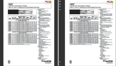
I worked on a project today that required incorporating two technical datasheets into a PDF portfolio. One datasheet was given to me about a year ago. The other was given to me today. Other than the data in the top right hand corner, both pages looked roughly identical.

Now, I have come to realize that I have a high tolerance for digging through monotonous details. However, this project was on a deadline, and if I tried to compare both documents manually, the changes are fair that I might miss one of the minuscule details.

However, a few months back, I was fortunate enough to beta-test a new PDF comparison utility, by PreMedia Systems. PDF Comparator examines the PDFs, pixel-by-pixel, and instantly display the results. So it was easy for me to determine that there was more differences in these two files than just the date in the top right corner. This utility only works on OSX (as opposed to Windows). Awesome tool! Check it out.


Tuesday, May 18, 2010

Bulletproof, flexible files for Adobe Reader users

I often send files to my local copy shop in order to have them printed. My copy shop isn't a traditional printer, but is actually more of a shipping center that also runs color copies. In addition to shipping, they sell greeting cards, packaging tape, and bubble wrap. You get the idea. They are not designers or prepress folks. They use Publisher. But I love this little copy shop because they give me good pricing and offer great service. And they are happy to see me every time I walk in the door. So I keep sending them my business. However, for certain projects I must go to greater lengths to make sure that my files for them are bulletproof. For instance, I send only flattened PDFs, and try only to use standard page sizes.

I recently did a project which required them to print a CD label. Ideally, digital color printers would actually print precisely according to the margins I set up. But I have never found this to work exactly as I hope it would. This is complicated by the fact that Adobe Reader users typically aren't aware of the default Page Scaling setting in Reader's print dialog box: "Shrink to Printable Area" (which, when checked, messes with my carefully planned layout.)

So I needed a way to send a PDF to my copy shop that they could actually manipulate. In the past, I've seen coworkers take my 1-up PDF, flatten it in Photoshop (including the text) and then import it into their page layout program of choice... just so they could move each CD label around on the page.
It was specifically for this scenario that I started preparing certain files so that my associates without the Creative Suite could still have the ability to move the individual CD labels around on the page (without butchering my files).

So how to accomplish that? They've only got Reader, so they need a PDF (as opposed to an InDesign or Illustrator file). But I need to make the parts and pieces on the PDF moveable. Starting in Acrobat 8, there has been a setting that will allow you to Enable Reader Usage rights. I think in the later version it's called Extend Features for Adobe Reader. Either way, by enabling that feature, Reader users can now do very basic things to the PDF, like save form data and make comments. And since stamps are a type of Commenting Tool, with the Extend Features setting activated, Reader users can now move existing stamps around on the page.

In one of my previous blog posts, I discussed how to create custom stamps with a Multiply blend mode and then use them to "highlight" the document. Using this same idea (creating a custom stamp) will allow us to create a flexible layout for Reader users.
  1. Create a 1-up CD label in InDesign or your layout program of choice.
  2. Export a PDF.
  3. Create a custom stamp in Acrobat using the 1-up CD label you just made.
  4. Stamp the document twice, one in the upper left and one in the lower right (or however your CD label stock is set up).
  5. Extend Features for Adobe Reader.
  6. Save the PDF and send it with confidence to a Reader user.
  7. Send along extra label stock...just in case.

Wednesday, March 31, 2010

Pointer Lines for Technical Writers

I write technical manuals. Each of our photo-heavy documents requires hundreds of photos, most of which have multiple pieces of equipment in view that need to be identified using captions and pointer lines. I recently converted a legacy FrameMaker 7.0 production workflow to a much more efficient InDesign CS4 workflow.

In my old Framemaker workflow, the pointer lines were created by placing a 2 point white stoke with rounded caps behind a .5 point black stoke. I often had to work with legacy (AKA ancient, and created by someone other than me) documents and the pointer lines were neither the same length nor aligned at the same angle. So instead of writing, I spent hours fiddling with those dreaded pointer lines.


Ideas that Didn’t Work

In converting the workflow to InDesign, and in my quest for improved efficiency and perfect pointer alignment, I had to find a better way. I thought about using a drop shadow for  my lines, but that would involve transparency and would perhaps be subject to the mercy of a new InDesign user not familiar with transparency flattening. And besides that, I just really like to clean lines that vector offers.

I tried the old dreaded FrameMaker method: two lines stacked on top of each other. But alas, it worked the same in InDesign as in Frame. The only way to make sure that the two grouped strokes stayed properly aligned was to use the Direct Select tool (white arrow) to drag a box around the end points of both at the same time and move just the end points. Never in my wildest dreams would that be an acceptable work flow in a production environment. And besides, I would still be dealing with two separate objects. So whenever I wanted to make a new pointer line, I would have to: draw a line, apply a style, copy it, paste it, send to back, apply a new style, and finally Group them together. No way Jose!

I knew how to make the perfect pointer line in Illustrator. It would be a simple graphic style with two different strokes. But a placed Illustrator stroke would act as any placed artwork, and its size and proportions could easily be scaled disproportionately.

However, an offhanded comment of mine about dash and gap on the InDesign forums led to a brief comment from Peter Spier which launched me into research mode into stroke styles. Admittedly, the only time I ever used InDesign stroke styles prior to this was in playing with the Christmas lights Easter egg a couple versions back. So I had some learning to do.


Using GAP settings in a non-dashed line

Apparently, dash and gap setting in the stroke styles aren’t just for dashed lines. Hmmm. The GAP portion of the stroke style effectively creates a second stroke behind your main stroke. The GAP occupies 100% of the width of your stroke. So if you have a 2 point stroke with a dash, the GAP will be 2 points. In a standard dashed line, the stroke itself also occupies 100% of the width of the stroke (in this example, it is 3 points). So by using a gap color, you would simply see another color peeking through the gaps in your dashed line.


To activate the Gap Color drop down menu in the Stroke palette, you have to first make the line type something other then “Solid.” I chose dashed during my experimenting. The choose your gap color, and the concept of dash and gap is readily apparent. But wait, we don’t want a dashed line. What now? The stroke “Type” options that appear in the Stroke palette are the default InDesign Stroke Styles, plus a couple of other like Wavy and Japanese Dots. You can create your own stroke style and it will show up in the bottom of this list. If you create your own stroke style, you can still specify a gap color, even if your stroke style is not a dashed line.

In this case, I want the bottom stroke (the GAP) to be white. That means that somehow I need to create a small black stroke on top.

Create Your Stroke Style

In the stroke styles dialog box, click New. Now choose type: Stripe. By playing around with the built-in stroke styles, I found that I could have a stroke with as many stripes as I want. All have to do is specify where the stripe starts and what percentage of the total stroke width it is to occupy.

So, I need a 2 point white stroke behind a .5 black stroke.


2 points is the total width of the stroke, and what will appear in the Weight section of the stroke palette. So I need to work down from there to get the center portion of the stroke. I need the black portion to be .5 points. Do a little math, and you’ll find that .5 (black stroke) is 25% of 2 points (total stroke width). That means I have 75% of the stroke that is going to show up as white (or whatever gap color you choose) and the little section in the middle will show up as the main stroke color. To make it even, I adjusted these values to: Start: 37% and Width: 26%.

When you create a new Stripe stroke style, InDesign automatically starts you off with two stripes. The black portion represents the part of the line that will be visible. So in this instance, we’ve got the center portion knocked off of a black line. That’s close to what I need, and I’m getting excited…until I apply the rounded end caps…Plus there’s that little black halo on the edges. Not good.


I realized that what I need was not a white stroke with the center knocked out, but a black stroke with the sides knocked out. So I went back to the stroke styles dialog box and found that I could edit each of the black stripes independently. Next to each stripe, in the percentage bar on the left, are two little arrows. The arrows are highlighted, indicating, that stripe is active. Grab the top of one of the arrows and drag it all the way down. That stripe will fall right off the dialog box into oblivion. Now, you are left with a single stripe you can edit. Plug in the values mentioned above: Start: 37% and Width: 26%.


Create an Object Style

So we’re getting closer. However, a stroke style alone won’t give me all the features I need for my pointer lines. You can’t specify a gap color, a stroke color, or end caps in a stripe stroke style. (Incidentally, you can specify End Caps, but only in a Dash stroke style, not in a Dotted or Stripe stroke style.) I found that I can assign all the remaining attributes I needed: gap color, stroke color, and end caps in an object style. So I made a new object style containing rounded ends, a 2 point black stroke, a gap color of Paper, and my newly created pointer line stroke style. Be sure to preview this on a colored background, or you’ll be left scratching your head, wondering why it didn’t work.


Author Edit: 4-25-16
Please take a few minutes to read Part 2 of this topic: Pointer Lines for Technical Writers: Part 2, written approximately five years after this article.

This technique was also discussed by Anne Marie Concepcion in a Lynda.com course: "Creating Better Callout Lines with Effects and Object Styles."

Friday, March 19, 2010

When InDesign Paste No Longer Works

My technical publishing workflow involves figures, lots and lots of figures. I often put callouts on the photos, with pointer lines. Then I group the whole bunch together and paste it inline into my text. But last night I ran into a problem. You see, it started because I like to try to find features that no one else has ever heard of or used. And a couple of times, my ideas were even featured on my favorite podcast, InDesign Secrets. In case you're curious, I came up with a couple of the "Obscure Feature of the Week (Eek, eek, eek!)"s. They were Shared Hyperlink Destination and Sort Bookmarks.

Well, I'm having so much fun hearing my name briefly mentioned on my favorite podcast, that I decided to see if I could come up with another Obscure Feature. This time I suggested "Autotag." 

To be honest, I've never used Autotag, nor XML publishing. I don't know that I ever will, and probably at least 99.9% of my fellow InDesign users never will either. But the nifty thing about Autotag is that it somehow automatically applies XML tags to the parts and pieces of your InDesign document. Interesting? Somewhat. Useful? Probably to somebody, somewhere in XML publishing land. But not to me...except for the fact that Autotag is so obscure that virtually no one except the publishing super heros have heard of it. And that level of feature obscurity could very well get me mentioned in another podcast. Which (for a geek like me) is pretty darn exciting!

So last night, I started playing around and I autotagged one of my text frames. Here is what I am usually able to achieve without any problem: Inline graphics.


But suddenly, last night, my Paste function no longer worked. After a restless night of sleep, and nearly posting this question to the entire world on the Adobe forums, I investigated a little further and found the problem: Autotag.


Autotag is easily accessible under the right-cick contextual menu when you select an object. Normally, nothing is tagged—because I don't do XML publishing. But late last night, as I was playing and dreaming of InDesign greatness, I autotagged a frame. See how "Story" is now highlighted in light blue?

Because the Rudder Angle Indicator frame is tagged, I will no longer be able to paste that text frame into another text frame. I can group with other frames, copy it, and paste it until the cows come home... just NOT inline into another text frame. InDesign cannot be fooled. And in case you're curious. If the frame is tagged as as Story, Root, and Graphic, it doesn't matter. You still can't paste it inline into another text frame.

Thursday, January 21, 2010

InDesign Crashing and Making me Crazy

So for years, I thought that I knew the way to fix InDesign when it was crashing. Simple, right? Hold down the four buttons in the bottom left keyboard while launching the program. That's what the Adobe help file and forums say. For the past 2 weeks, I have had crashing issues like nothing I've ever seen. Deleting preferences didn't work. Deactivating Suitcase auto-activation didn't work. Uninstalling the program didn't work...

The crashes were so bad that not only did the InDesign "submit crash report to Adobe" dialog box pop up, but another one for Apple came up as well.

So a couple of days of and lost productivity, I finally found a multi-step solution. Perhaps not all of these steps are necessary to fix the problem, but here's everything I did, just in case.
  1. Delete the ID lock files that are associated with the files you were working on during the crash.
  2. Unplug (or force eject) any external hard drives you have plugged (Note: when ID crashed, the files I was working on were located on an external hard drive).
  3. Restart the computer (I had to do a hard shut-down).
  4. Launch ID with the external hard drive unplugged.
  5. You may get a series of errors like, 'The recovery data for "" could not be found. Delete recovery data?" ... or something along those lines. I chose to delete recovery data, just so it would quit looking for those files.
  6. Close and reopen InDesign another time just to make sure it opens without getting any more error messages.
  7. Plug in the external hard drive.
  8. Try opening your selected files again.
Apparently, InDesign saves recovery data in more than one place. I thought that all the recovery data was saved in the lock file, but not so! Even after deleting the lock files, and even unplugging the hard drive, InDesign was still looking for recovery data. Apparently, there is something in the architecture of InDesign that tells it to look for recovery data... even after a complete reinstall!

I am astounded and amazed.

After originally writing this post, I got some additional input from one of my favorite InDesign trainers and a fellow Geek: Anne Marie Concepcion:
"Though I don't think ID stores recovery files in more than one place (and it's not the Lock file). I think if you would've deleted the entire recovery folder that's inside your User > LIbrary > Caches > InDesign folder, and then restarted, that would've done the trick."
Note for Lion users: I recently upgraded to Lion and now the Library folder is hidden by default. Here are the instructions on how to access it in order to delete your recovery files. 

Thursday, November 26, 2009

The Undocumented Back Door to Organizing Your Stamps

I am a big fan of Acrobat stamps. The ones that come included with Acrobat are marginally useful, but very generic. But since most of my work with PDFs involves researching engineering drawings, I have created my own set of "highlighter" stamps to assist me in keeping track of my on-screen research. I originally started out with about a dozen stamps, just to see if I liked using them - and if they really made my work more efficient. And they did! So, shortly after I made my original dozen stamps, I made more - in about 25 different colors. And since Acrobat stamps only scale proportionally, I found that I needed several different shaped stamps, in each of the aforementioned 25 colors.

So after a month or so of working with my stamps, I had a hodge-podge of colors, shapes, and sizes. There was no organization to the mess. And I had no easy way to organize them from within Acrobat. I would have to delete them all and start over, reimporting and renaming them individually...But what I really wanted was the ability to drag-and-drop my stamps into a order that made sense visually.

So after my long-winded feature request to Adobe, I finally stumbled across to solution. When a user creates a custom stamp library, Acrobat stores the stamp in an obscure location in the computer. And instead of naming the file something logical, like "Kelly's Custom Stamps," the file is named something like, "hfu74hj173890hgG89k453Xs.pdf"


No wonder I couldn't find it!

The name of the custom stamp library is actually the TITLE of the Acrobat-created PDF that contains all the stamps in your stamp category. So if you open up that PDF, you'll find that Page 1 is a blank page, and all the stamps in that library are each a separate page with the PDF document.

The pages panel! It is in the Pages Panel that I have the ability to reorder pages within a PDF document. So I opened up each of my custom stamp libraries, and reordered them according to the order of the color spectrum.


Now what I needed was a way to share my stamps with my coworkers, without first having to create a stamp library within the clunky Acrobat "Manage Custom Stamps" interface. I needed to be able to distribute PDFs directly to my coworkers and have them be able to drop the stamp PDF into a specific folder and just have it work.

Here is the location to put your stamp files:
Mac OSX /Users/USERNAME/Library/Application Support/Adobe/Acrobat/9.0_x86/Stamps

Mac OSX /Users/USERNAME/Library/Application Support/Adobe/Acrobat/DC/Stamps

WinXP C:\Documents and Settings\USERNAME\Application Data\Adobe\Acrobat\9.0\Stamps

Win Vista or Win7 C:\Users\USERNAME\AppData\Roaming\Adobe\ Acrobat\9.0\Stamps

Once you have placed stamp files here, restart Acrobat.

For another good article on stamp locations, read this.
If you would like to use these stamps, you can download them by clicking here.

Edit: 9-13-18
If you'd like an easier way to manage these types of annotations, check out my article on Bluebeam Revu. It's an amazing program designed specifically to meet the needs of users in Architecture, Engineering, and Construction. With Revu, you can choose your own custom stamp location: simply point to the folder of your choosing!


Saturday, July 4, 2009

Highlighting a PDF that contains no fonts

I love the Acrobat's commenting tools. I especially enjoy the highlighter tool, with it's dozens of colors and ability to change opacity levels. Using Acrobat's highlighting tool, I have infinitely more control over colors than I do using traditional hardcopy highlighters. However, with Acrobat's highlighting tool, I've encountered a few problems that make it less than suitable for my highlighting needs:
  • I can only highlight actual fonts, (as seen in the document Properties dialog box).


    • In my daily workflow as a technical communicator, I also encounter scanned documents and CAD files, both of which typically contain no fonts. I can run OCR and then highlight the text, but often, the OCR is unpredictable, as Acrobat doesn't always go a great job of recognizing text blocks. (The following example shows how Acrobat skipped an entire paragraph of text.)


      • Finally, there are times when I need to highlight circular objects, but alas, I cannot. So in order to highlight these documents, I have to print them out. I have tried using the rectangle tool and ellipse tools, but they obscure the text. Even when I add a fill color and reduce the opacity, the text and objects that I'm trying to make more obvious, in reality become more obscured.


        So I got to thinking about what makes key behavior of the highlighter tool different than the rectangle tool. It has to do with how the comment's color interacts with the objects beneath it. Sounds like a blending mode to me… Multiply!

        So Acrobat's comments are capable of interacting with the document using the multiply blending mode...but I needed a way to make my own comments that can use take advantage of blending modes. For that, I went to Custom Stamps.

        Acrobat's canned stamps are very business-like: "Sign Here," "Approved," and so forth. But you can make your own custom stamps for whatever purpose you like. You can even harken back to the early days of stamps, back in (I think) Acrobat 5, when the out-of-the box stamps were wacky monster-face clip art. (I remember thinking, "Why would anyone want to use stamps? That's dumb.") But Adobe wised up and included stamps that business professionals would actually use.

        So I went into Illustrator and make a plain yellow circle and set the blending mode to Multiply. Then I save the file and create a custom stamp in Acrobat. Then I took a deep breath and then clicked on top of some text. WOOHOO! The text shows through! (The truly geeky among you will surely understand my anticipation and excitement.)


        While experimenting with my new stamps, I started playing. Clicking frantically (actually, just to see how many stamps I could put down in just a few seconds). If the stamps interact with the document using a blending mode, how would the stamps interact with other stamps that use a blending mode? They multiply, as expected. But what I also discovered was that by clicking and dragging, I can control the size of my stamp. So a single stamp can make the same shape in varying sizes. And no need to hold down Shift. The down-side to this, however, is that the proportions are locked. I cannot turn a circular stamp into an elliptical stamp, or a square stamp into a long thick rectangular stamp. Bummer.

        But let's say you just need to colorize drawings (CAD files, for example) and need a way to color code different circles and match them up to a parts list. The colored circles are sure a good start, but let's see how much more useful we can make this! Just for fun, I also made a circle using a gradient. Isn't it beautiful?


        So let's say I have a parts list on one page that I need to match up with the drawing later in the document. I made some corresponding rectangular stamps in order to stamp the parts list. But I need to keep flipping back and forth between the two of them (parts list and drawing), color coding them simultaneously. I can't keep track of dozens of numbers in my head, but fortunately, I don't have to. Acrobat will let me see both pages at once. Go to Window>Split.

        Now, I can see both my parts list and my drawing, all in one window, without my desk being cluttered by excess papers, and without being limited to the five colors of highlighting markers I have in the cup on my desk.

        It did take some time to create my stamps and get them set up in Acrobat, but once I did, keeping track of technical details on engineering drawings became much easier and more efficient. And those CAD files were never so beautiful to me as when they had been stamped with sunshine gradient circles.

        And so ends another day in my quest to bring visual interest to boring technical documents around the world.

        Edit: 9-13-918
        If you need an easier way to create highlighting objects in your PDF, check out my article on Bluebeam Revu. It's an amazing program designed specifically to meet the needs of users in Architecture, Engineering, and Construction. The drawing tools in Revu have a "highlight" checkbox, enabling any shape to act as a highlighter.

        Saturday, June 13, 2009

        Personal Studies

        People have often asked me how I got into graphic design. I chuckle. Then I share my story, starting my degree in a completely unrelated field.

        But the more important question is not how I got started in graphic design, but rather: how did I get where I am today? The answer is hard work and daily application. I have devoted many evenings and weekends  of personal time to independent study. (Thanks goes out to my loving husband for being so patient while I spend hours studying at my computer). Also, I have been blessed to have opportunities, both at my day job and in my freelance work, and to experiment with all the nifty tricks I learned the during my personal study time. The result has been the equivalent of nearly a decade of daily study, application, more study, more application.

        While in college, my studies were crammed into short three or four month sessions, with the subject changing from semester to semester, typically with no application of knowledge. So consequently, I forgot most of what I learned. Now that I have a career of my choosing, I can research desired topics to my heart's content, and have the opportunity for immediate application of what I have learned. And it's a heck of a lot cheaper than college! As both an employee and a small business owner, my personal study has infinitely more value to my productivity and abilities than my college diploma (which is actually in a box in my garage).

        In addition to my enjoyment of reading Creative Suite application manuals in their entirety, I love techno-books containing the kind of information that can't be found in the software manual. They offer history, design theory, and personal experience from some of the industry's top experts. Here are a few of my favorites:
        • Stylin with CSS (Charles Wyke-Smith)
        • Bulletproof Web Design (Dan Cedarholm)
        • A History of Graphic Design (Phillip Meggs)
        • From Gutenberg to Opentype (Robin Dodd)
        • Dynamics in Document Design (Karen Schriver)