On the last evening of the conference, my husband and I took some time to tour the National Mall. Since I was recovering from the aforementioned (self-induced) InDesign overload, all I could think of was patterns. (If you've read my blog for awhile, you may have read some of my other posts about patterns.)
While I was touring the several-hundred-year-old buildings and streets, I snapped a few photos of some of the more interesting patterns in the architecture, with plans to recreate the geometry using InDesign tables.
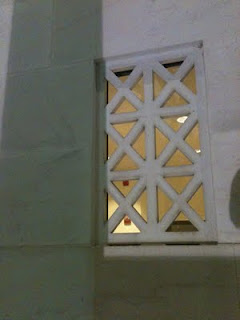
This photo is of the concrete window-type architectural details on the Lincoln Memorial. If you're inside the memorial, and about to head back down the stairs, stop and turn to your right. Walk two columns past the main entrance and look at the face of the wall. That's where you'll see these window cutouts. These tiny little windows are so small when compared to the rest of the memorial, that they're nearly impossible to see on most of the Lincoln memorial photos I found on the web. But fortunately, I found a photo that displayed the little windows on both sides of the Lincoln Memorial. See the little windows? (By the blue arrows.)
 | |
|
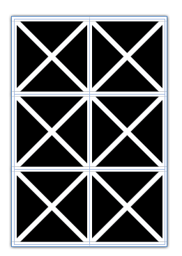
Since my plan was to recreate the geometry of the windows in InDesign, let's get started. There are a couple of different ways to create these windows. Both methods use Diagonal Lines.
Table Cells with Crossing Diagonal Lines
Make a table with two columns and three rows, with crossing diagonal lines, as shown below. Using the Crossing Diagonal Lines method, each cell has an X through it, and so if you choose to fill your cells with colors, they will be limited in that the entire cell has to have the same fill color. This is definitely the easier of the two methods, as each of the cells have the same stroke and diagonal lines settings.
 |
| 2 Columns, 3 Rows, Crossing Diagonal Lines |
 | |
|
Another way to create this window pattern is by making a table with 4 rows, and 6 columns, and manually formatting each of the cells with a single diagonal line. I explored this idea in another blog post: Data-less Tables: InDesign Meets Knitting.
Using this method, you have more flexibility in your color choices because there are so many more cells.
Something interesting that I discovered while working with diagonal lines with that they can have different stroke properties than the other cell strokes. By increasing the vertical and horizontal stroke weight (and leaving the diagonal lines at a smaller stroke weight), you can create some interesting effects. For this example, I created a separate orange-filled frame behind the table. I also added a drop shadow to the table frame.
Something interesting that I discovered while working with diagonal lines with that they can have different stroke properties than the other cell strokes. By increasing the vertical and horizontal stroke weight (and leaving the diagonal lines at a smaller stroke weight), you can create some interesting effects. For this example, I created a separate orange-filled frame behind the table. I also added a drop shadow to the table frame.
By adding some color to the strokes, and then shearing the table, you can create some very unique geometric designs.


Oh my God. Don't let Mike Rankin see this. His head will explode with new ideas for InDesign FX.
ReplyDeleteVery cool, Kelly!
Thanks Anne-Marie!
ReplyDeleteThis is awesome!!
ReplyDelete(BTW, I did not know you knit, too. You must tell me your ravelry name so our geek symbiosis will be complete!)
Awesome trick . . . is this just one of the unintended benefits of perhaps a little too much down time at work? :-?
ReplyDelete