In my career, my time is spent at the intersection of two industries, of multiple programs, and generally wherever two typically unrelated topics converge. Those areas are often of the greatest interest to me, because they remain largely unexplored. Come with me friends, as I take you on a tour of a bit of that dual existence in my life: at the intersection of multiples worlds, where knitting, font design, and graphic design software merge.
It's important to understand the reasoning behind the necessity of creating this knitting font. Upon searching for
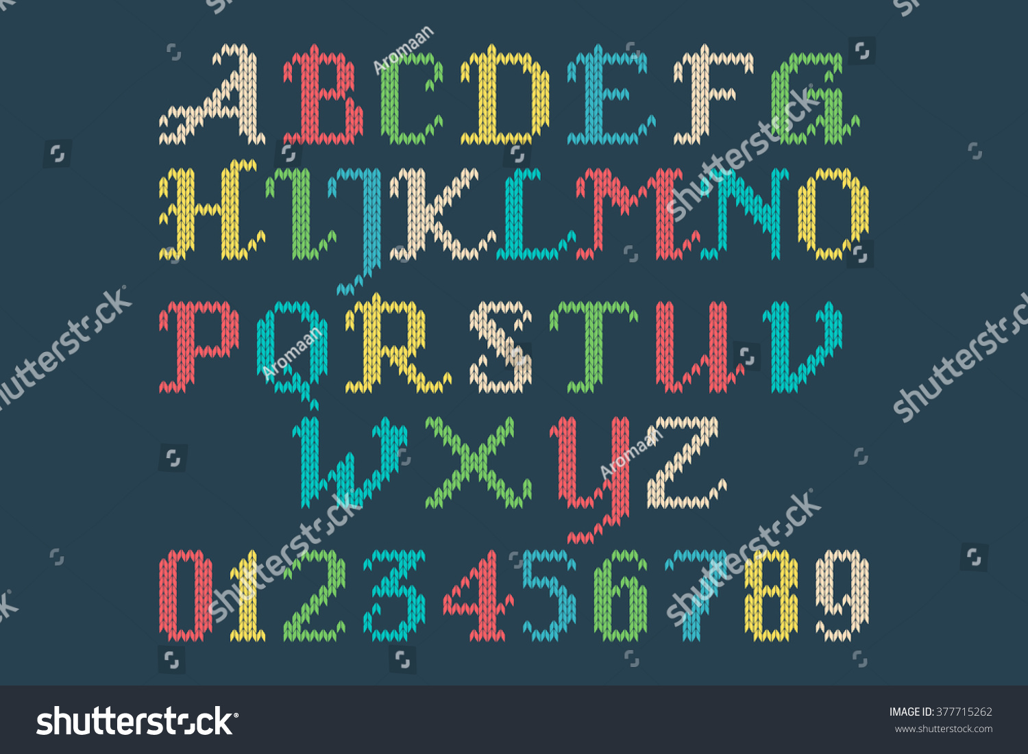
Knitting fonts online, you'll come upon a mish mash collection of cross stitch letters, letters made to look like string, and stitches that don't line up... the list of inaccurate knitted alphabets goes on and on. As a knitter, I think it's important that if you're going to design a "knitting font" that you get the details right. Most of the knitted fonts that exist don't get the details correct, and obviously made by non-knitters.
Here are some of the issues I've encountered:
1. The alphabet is actually not a font, but a vector stock art alphabet.
2. The stitches aren't curved like actual knitted stitches are. They're made of straight lines.
3. The letters are regular letter shapes, used as a clipping path for a raster image.
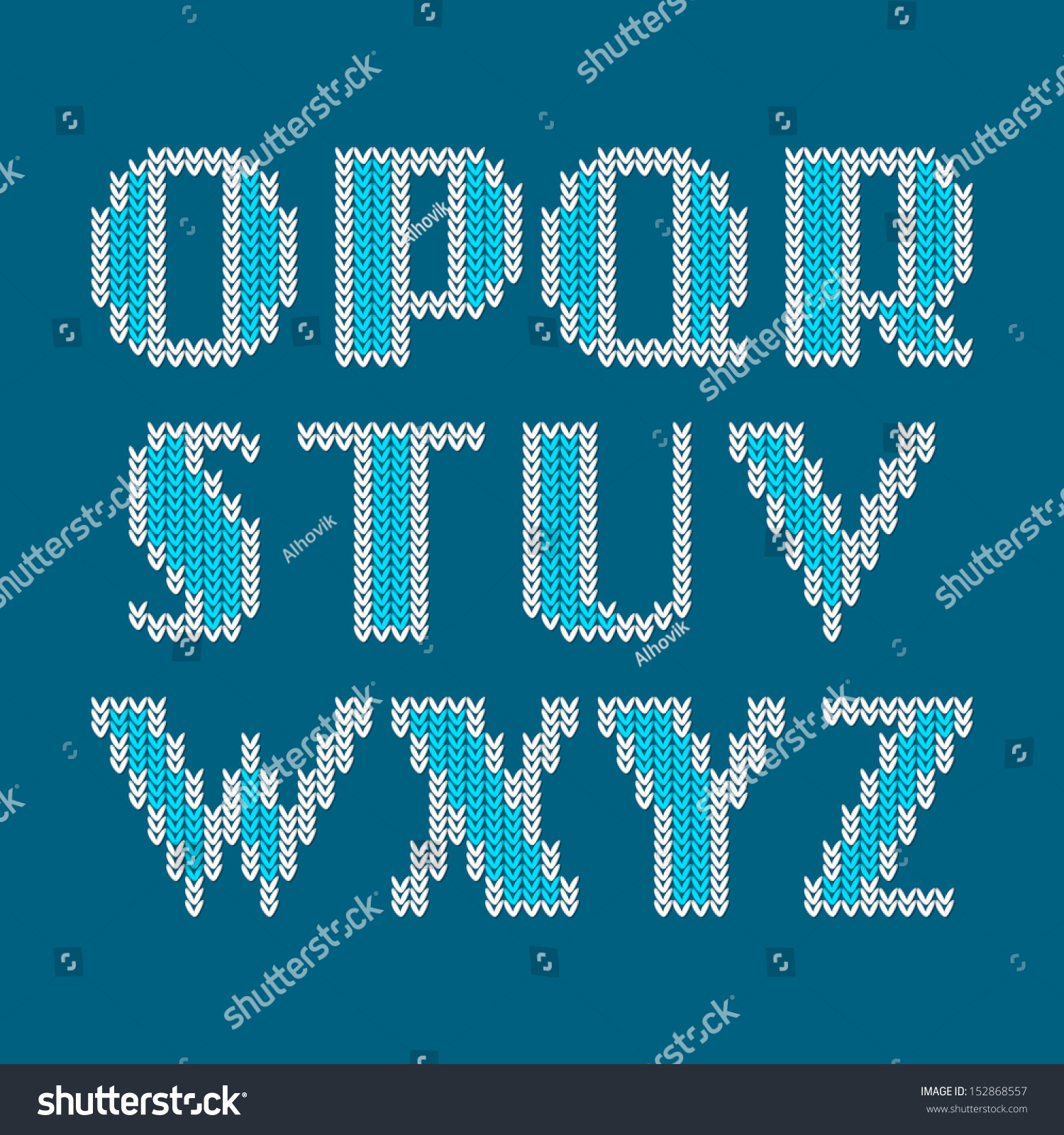
4. The stitches don't line up. The left and right hand side of the stitches should be on the same vertical plane. While the technique below adds visual interest, it is not representative of the true shape of knitted stitches. Plus, the stitches look like little grains of rice. This example, however, does an excellent job of incorporating both sides of the stitch into the design of the letterforms (and not chopping off one half where it is deemed unsightly).
5. The right and left side of each stitch are joined. Knitted stitches are not little hearts. Knitted stitches are actually horseshoe shaped, and mirror each other on around a vertical axis, with a little bit of space in between each half of the stitch.
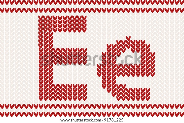
5. No background stitches. When knitting letters in a design in a physical piece of knitting, they are integrated into the fabric itself, they don't float magically in the air. Hence, the need for background stitches. The background stitches are just as much part of the design as the letters themselves. While it's true that the letterforms can be used without the background stitches (as in the example below), for maximum usability, as well as accuracy in representation to a physically knitted fabric, there should be background stitches available, either as alternate characters, or as a second member of the font family.
6. Spaces not handled properly. When uses spaces in a knitted design, there are background stitches in the fabric. This font gets a some of the other technical details correct, but it makes no account for the spaces between the words.
Once spaces are added, things break down. The background stitches are gone. We can work around this using some special characters and GREP Styles in InDesign, but in this particular font, the character sets don't match, and the necessary glyphs weren't made to allow the background stitches to be used.
7. Stitches chopped off. Here in another font that makes a fair attempt at knitted stitches. Like the font above, it has no background stitches.
If you look closely, it's clear that the details are wrong. In the corners, the side half of the some of the stitches are chopped off. While that does make the diagonals look a little smoother, it's not technically accurate. This was obviously not designed by a knitter.
8. Incomplete character set. This is the closest one that I found to an actual knitting font. The shapes of the stitches are correct, the stitches line up, the style of the letterforms is accurate for what knitters use; it's pretty great. It's even in a style common to what a knitter would actually use when knitting names into a garment. The issues that I encountered are that it doesn't have a full character set, and there are no background stitches built into the font itself. So when using this for graphic design it must be used in conjunction with the vector background that is packaged with the font.
So why make a my own custom knitting fonts?
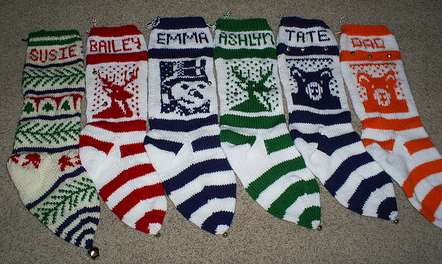
While I can manually create these fair isle letters in Illustrator each time I need them, it's a tedious process to do just every once in awhile. I wanted an alphabet that I can quickly use whenever I need to plan some knitted lettering. For example, I've been making family Christmas stockings for over a decade. I've lost track of how many I've made. It would be really great to just type up my name chart quickly each time I go to start a stocking, rather than get out graph paper and draw it.
By incorporating advanced typographic features like ligatures, I can have more flexibility when working with a set number of stitches. Take these stocking for example. Each name needs to fit within 28 stitches. That's why in the BAILEY and the ASHLYN stockings, the Ys are different. Bailey's name is 6 letters long. Ashlyn's name is 7 letters long and required the stitches to have tighter tracking. The Y is very closely aligned to the L in front of it. Having ligatures and alternate characters in the font allows this to happen either automatically or manually.
Plus, if I have these alphabets as actual fonts, I can quickly and easily typeset knitting letter charts for other knitters on my
Etsy shop. I can also use these fonts to personalize my
KnitSwag products.
I wanted my knitting fonts to meet the following criteria:
- Accurate curves (to reflect the way the yarn forms each stitch)
- Stitches aligned to a grid (not offset in any way)
- Proper gauge (not too horizontally or vertically compressed). They should be about a .67 height to width ratio.
- Incorporate the use of ligatures so that character placement can be adjusted to fit a set number of stitches
- Available in different number of stitches high, in order to be used for different types of projects
- Available in both Regular and Bold versions
- Uses a second font with each font family, for background stitches
- Has a complete character set, including punctuation, numbers, and most special characters
How I made the fonts
I used Adobe InDesign and
IndyFont Pro to create my custom knitting fonts. IndyFont Pro is a dream come true! It lets me use the software that I know and love to create fonts. The free version lets you create a single character (for bullets), but the Pro version lets you create full character sets. It's well documented, and the
user manual is one of the best I've ever seen!
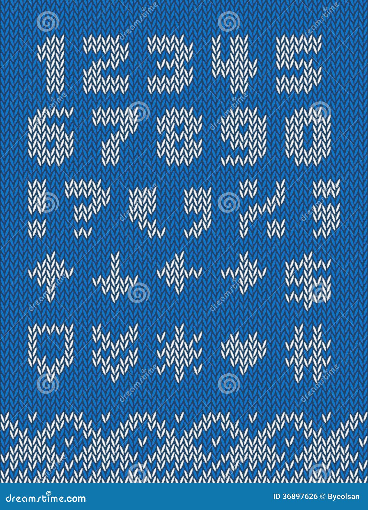
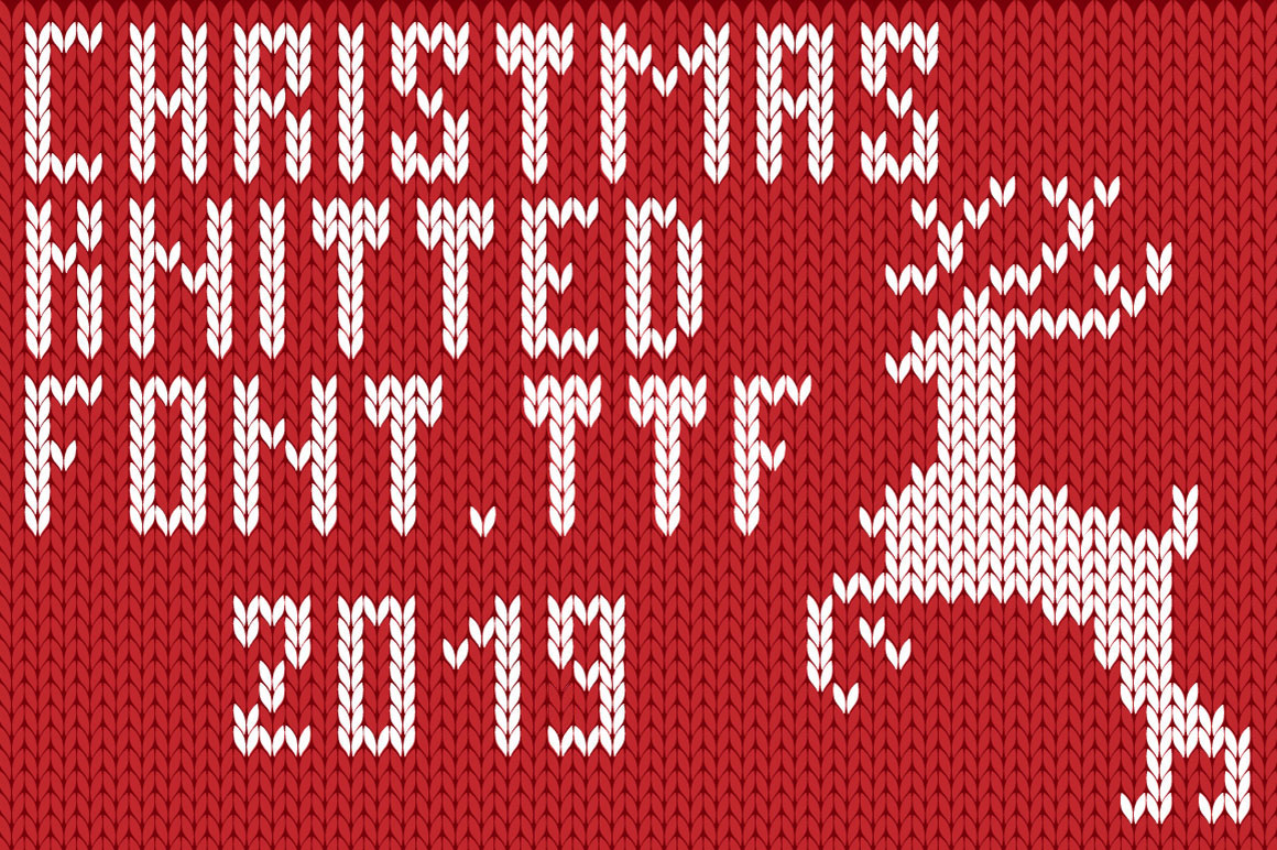
So far I've created two versions of stockinette stitch fair isle knitting fonts: an 8 stitch high and an 11 stitch high version. They are the only knitting fonts of their kind! I'll be designing more in the coming weeks. Would you like to have a
custom name chart in these fonts? Head on over to my
Etsy shop and I'll set you set up! I made these fair isle alphabets with specifically with knitters in mind.