Tuesday, October 16, 2018

Things I Love About Bluebeam Revu: Part 2

There are so many things I love about Bluebeam Revu that it is impossible to fit them all in one article. So I am dedicating an entire series to it. Read Part 1 of the series here.

Keyboard Shortcuts

  • Customizable Keyboard shortcuts
In Revu 2.0 for Mac, users have the ability to set their own keyboard shortcuts! I've seen a fair number of keyboard shortcuts interfaces in my years in publishing, and I have to say that this is the best one I have seen. It clearly divides the shortcuts into two categories: Tools and Commands. It also has the ability to let users search for a specific command. 

Keyboard Shortcuts: Tools

Keyboard Shortcuts: Commands
Now, the terms may be slightly different than what I'm accustomed to, but that's no problem. For example, what I know as the "Hand" tool is actually called "Pan" here in Revu; and it's located under the Commands tab.

The list of shortcuts automatically filters itself so that only functions which contain the search term are listed. This is very similar to how the Illustrator keyboard shortcuts work.

Users can search for shortcuts!

User Interface

I'm a huge fan of the UI in Revu. It puts a priority on efficiency and ease of use. I can tell that the people who designed and built Revu actually use it. 
  • Graphical Icons are built right into the dropdown menus, and the shortcuts for each function are displayed in the dropdown as well.

Revu for Mac 1.0: Document > Pages

Revu for Mac 1.0: Measure
The graphical icons became a bit more streamlined in Revu 2.0 for Mac, but I really like the fact that they still have colors associated with them. The menus were also slightly redesigned in Revu 2.0 for Mac (relocating some of the menu items), but the tools are still very easy to locate. 

Revu for Mac 2.0: Tools > Measure

All of the markup tools are available in the menus.

Revu for Mac 2.0: Tools > Markup
Something noteworthy about the location of the text markup tools is that they not located with the drawing tools. If you are familiar with Acrobat, you're probably used to the Sticky Note and the Highlighter tool having top bidding, base on their prominence in the menu bar. However, with Revu, the most prominent markup tools are actually the drawing tools. It took me a bit to locate the text annotation tools, but I found them in a submenu: Tools > Markup > PDF Content. I think that's an important distinction because, to me, it clearly separates out the intention of those tools. They are to markup existing PDF text content.


I also really appreciate how all the drawing markup tools are also permanently located as icons in the far right side of the program. And the program has very Fast UI, no waiting for any panels to load, ever!

The drawing markup and commenting tools are always available for easy access!

There are so many things I love about Bluebeam Revu that I will be doing a series of article explaining how awesome its features are. Please subscribe and join in learning this amazing program with me!


Follow by Email

Monday, October 8, 2018

How to Email a PDF using Bluebeam Revu

This process is so simple that it seemingly doesn't seven warrant a blog post. And yet, I'm posting this to demonstrate not how simple the process is, and how simple it should always be.

Email a PDF from Bluebeam Revu
What's so great about how Revu handles this task is that it will take the PDF in exactly its current state, and attach it to an email. Somehow, it even magically works when your document has comments in it that haven't been saved. It is a single step! And if you don't like the default keyboard shortcut for Emailing a PDF, you can give it a customized keyboard shortcut.

Customize your keyboard shortcuts

If Bluebeam Revu is new to you , and you'd like to know why I have found that it's such a great piece fo software, read this article.

Friday, October 5, 2018

How to Get the Old Version of Acrobat back

Earlier this week, my Acrobat updated it self without any intervention on my part. What the heck?! If you are like me and are disappointed with the user interface changes, there is a way to get the 2018 version of Acrobat back.

Why should we be limited to just one version of Acrobat? Keep them all!

1. Uninstall CC2019
I tried uninstalling through the Creative Cloud app and it didn't work, so I had to navigate to Acrobat CC in my applications folder and uninstall it there (double click on "Acrobat Uninstaller.")

2. Download CC 2018
I didn't see the 2018 download link on the Adobe website, but I was able to find it here:
https://prodesigntools.com/acrobat-dc-2017-2018-direct-download-links.html

3. Install Acrobat CC 2018.

4. Move CC2018 to the desktop and rename the folder (only if you want to also install CC 2019)
This is important because if the 2018 version is still in your app folder, it may just update to 2019 and you'd have to start this process over again.

5. Download and install CC 2019 (if you feel so inclined). Rename it's folder.
https://cloud.acrobat.com/acrobat
The latest two version of my Acrobat installations were a little buggy after this process. I don't know if that's because I was running both 2018 and 2019, or if they are just buggy. Acrobat does crash pretty regularly for me (even prior to this update), and I've read complaints from other users that 2019 crashes frequently, so I suspect the program is just buggy. Just be forewarned.

6. Turn off automatic updates for Pete's sake!
If you don't want automatic updates, be sure to turn off automatic updates in Acrobat Preferences > Updater.

Turn o
ff automatic updates if you don't want Acrobat updating on its own!

If you are using Adobe Reader, there is no option in the UI to turn off automatic updates; which means that you are stuck with the new version. Sorry!


For little bit of insight as to why people might want to revert to the earlier version, visit this thread in the Adobe forums: https://forums.adobe.com/thread/2541730

You can also visit the Acrobat User Voice forum here and share your thoughts with Adobe.

Please check this page containing the known issues of Acrobat and Reader.

Wednesday, October 3, 2018

MoreInfo Improves Notes, Conditional Text, Tracked Changes and More

Much of my workflow involves obscure, little understood technical features of InDesign. Two of the features I use the most are Conditional Text and Notes. They were introduced many years ago and haven’t been improved since then. However, from time to time, independent developers decide to tackle some of the challenges faced by users of these obscure features. And for these developers I am extremely grateful! In this post I’d like to introduce you to a new commercial plug-in called MoreInfo by Kerntiff Publishing Systems. MoreInfo combines the information from several features and displays it all in one handy spot. With MoreInfo, you can see, well, more info, on conditional text, notes, tracked changes, overset text, and index entries.

MoreInfo Panel

Read the entire article at InDesign Secrets.

Tuesday, October 2, 2018

How to Make a Multiple Color Highlighting Palette in Bluebeam Revu

I've recently switched PDF commenting programs and I'm excited to be learning new and more efficient ways to work. Normally, when I need help with software, I visit the product forums, but for some reason, Bluebeam decided to remove their forums in the name of privacy. So I'm left to figure things out on my own.

Today I wanted to set up a palette of highlighters a a custom tool set. It took a little bit to figure it out, but it works great and makes highlighting in multiple colors so easy!

1. Choose the Pen tool and draw a line. Be sure to NOT hold down the shift key. For some reason, this doesn't work when the shift key is held down.

2. Check the Highlight checkbox and change the line width to something thick. I used 12.

Draw using the pen tool, change the properties to Highlight and thicker

3. Right click on the line and select Add to Tool Chest. I had already set up a custom Tool Ste called "Highlighers." That's why it's listed right below "My Tools."

Add to Tool Chest

Manage Tool Sets
4. Go to the Tool Chest. Double click on the icon. That's it!
Viewed in Drawing Mode

Viewed in Properties Mode

Multiple Color Highlighting Palette!

Things to be aware of

It took a little bit of fiddling to figure out how to get this to work. The thing with commenting in Bluebeam is that the tools are so adaptable, they'll behave pretty much however you want. By holding down shift when drawing your line, Revu will recognize it as a line and will force it's behavior in the Tool Chest accordingly.


1. Line (properties mode)
2. Highlighter created from Pen
3. Line (in Drawing mode, works as a stamp)
4. Highlighter (Drawing mode, works as a stamp)
5. Highlighter created from the highlighter tool (buggy and doesn't work)
6. Pen (in drawing mode)
For you my beloved blog readers: I am sharing my set of Revu highlighters. Enjoy!

If you aren't familiar with Revu and want to learn more about why this software is so great, read this article.

Friday, August 31, 2018

Introducing my Favorite Features of Bluebeam Revu PDF Editing and Markup Software

After using the same PDF editing software for many years, I recently discovered a new one, tailored specifically to meet the needs of people in the AEC fields (Architecture, Engineering, and Construction). I downloaded a 30 day free trial and purchased it right after my trial ended. 

This new software is called Bluebeam Revu. It is cross platform, although the PC version is a bit more full-featured than the mac version, from what I have been told. But the mac version is still mind blowing. I can't even imagine what more can be added! The PC version is $349 and the Mac version is $199, and it is worth every penny! Apparently, I'm not the only one who thinks this software is amazing. According to Bluebeam, they have over one million users worldwide.

The work I do on my engineering-related PDFs involves mostly commenting and markup. With that in mind, I wanted to share with other folks some of my favorite markup features of Revu. Buckle your seatbelt! This is fantastic!

Note: These are screenshots from Revu Mac version 1. A week after I wrote this article, version 2 was released! Soon I will update this article with a link to my experience using version.

  • There are only one set of colors to choose from, and they closely resemble those in Acrobat 9.
Color Options
  • No Fill Option for drawing markups. Can I get an AMEN on that one?!

  • Toolchest lets you save regularly used tools so you don't have to recreate the settings every time. You can also export your Tools to share with others. This is also a great way to store drawing markups and text boxes or things that you regularly need to use. It's like a spin on the Acrobat stamps pane or the Illustrator symbols panel. 
ToolChest has a bunch of shapes already made and waiting for you!
  • Streamlined comment pop-up. Just a place to type your comment. Nothing more, nothing less.

  • Drawing mode has a highlighter option. The beauty of this is that users can simply draw shapes around whatever they want to highlight! This affects the blending mode of the shapes and makes the shape tools act just like a highlighter. No more scribbling over large areas to attempt to highlight them.

  • The highlighter tool is smart enough to be able to highlight vector objects that are not fonts, without me having to rasterize the document. 
  • Module based UI whereby I can put whichever modules wherever I choose in the left, right, and bottom panes. The UI is truly customizable!
Module based UI

  • The comment/markup pane harkens back to Acrobat 9, where it was docked at the bottom and had no wasted space. This is a great use of space!

  • Handy Dandy Markup Toolbar

  • The Markups pane is also fully customizable, so I can choose which columns I want displayed, as well as in what order they display.
Customizable Markup Pane

  • Stacking order options for comments!

  • The opacity of Drawing markup Fills and borders can be adjusted independently

  • Collapsible Categories in the Panes. Hide what you don't need!
  • XY coordinates for all comments, right in the Properties Pane
Collapsible categories! XY Coordinates! Oh my!
I'm sure once I get more familiar with this software, my list of favorite features will grow. Give it a try and see how you like it!

Read the next article in this Bluebeam series here.

Tuesday, July 24, 2018

Caution, Warning, and Danger Styles

In my work as a technical publisher, my documents use quite a few "Cautions." I see requests on the Adobe forums about this from time to time, so I thought I would share my method for formatting these styles.

There are a number of ways to set these up, including tables, but I have found that tables can prove a bit cumbersome. I've decided to incorporate the use of InDesign Paragraph Shading and Paragraph border settings. Disclaimer: These features were introduced in InDesign CC 2018. If you open this file in an earlier version of InDesign, it will not behave as expected.

Because I like my manuals to have plenty of white space, with nice wide margins, these styles are set up to have a large left indent. Here are some of the features of these styles:

  • Both Warning and Danger styles are set up based on Caution, so if you need to make any adjustments for the spacing or font, you just have to do it in one place.
  • The CAUTION, WARNING, and DANGER text auto-populates (they utilize the bullet feature to accomplish this).
  • The little triangle dings are vector anchored objects, so they are easily editable. 
  • The dings each have their own object style, so they sit in the correct spot based on which paragraph style uses them. "WARNING" is  longer than "DANGER", so the triangle ding sits a little farther to the left.
  • The CAUTION TEXT is set up as a "Next style".
  • Caution Text displays borders even when over over threaded frames.
  • All styles auto fit the width of the frame.

Download the IDML file here.


Caution Styles

Caution: Paragraph Shading

Caution: Paragraph Borders

Caution Text: Paragraph Borders
Caution Text works over threaded frames and auto resizes to frame width

Thursday, July 5, 2018

Compare and Contrast: Page Thumbnails vs. Organize Pages Tool

With the release of Acrobat DC, a number of the longstanding functions of Acrobat were duplicated into new tools. What’s not readily apparent is that the a number of the old methods were left in place. I wrote about one of those (the Properties Bar) here. In today's article, I’ll be discussing another one of the deprecated tools: Page Thumbnails.

The Page Thumbnails are located in the left-hand pane of Acrobat DC. If your left-hand pane isn't open, simply click on the triangle in the left-hand side of the UI, and the pane will pop open. To view the various buttons, right click anywhere in the pane.

Navigation Page Buttons

Once the Page Thumbnails are open, click on the Options button to reveal various functions.

Page Thumbnails Options

Most of the functions that exist in the Page Thumbnails were duplicated in Acrobat DC's "Organize Pages" tool.

"Organize Page" Tool
The Organize Pages tool has the options listed across the top, in a graphical format, rather than in a singular dropdown list. Some of the functions have additional options, which are listed in either dropdowns or secondary dialog boxes. 

Split Files: Output Options

Split Files: Split By options

Compare and Contrast: Page Thumbnails vs. Organize Pages Tool

Acrobat Function
Page Thumbnails
Organize Pages Tool
Drag and Drop page insertion
Delete pages
Insert pages from blank file
Non sequential page extraction
(Only through drag and drop to the desktop, not through the menus)
Split Pages
--
Bates Numbering
--
Set Page Boxes
(Labeled in the menu as “Crop Pages”
Page Labels (formerly "Page Numbering")
Page Transitions
Page Templates
--
Set Page Properties
Rotate Pages
View thumbnails while concurrently viewing full size document
--

So why do I prefer using Page Thumbnails?

Since most of the functions are duplicated in both tools, which tool I use depends upon which functions I use the most. For my work, much of what I do in Acrobat involves printing double sided documents. Page Thumbnails allow me to view thumbnails while concurrently viewing the full size document. That feature helps me to spot errors when printing. The one and only function that is missing from the Organize Pages Tool is the very reason that I prefer the Page Thumbnails tool.

Page Thumbnails

My work does not require the use of:
  • Split Pages
  • Bates Numbering
  • Page Templates
Those are the three functions that are in the Organize Pages tool but not in the Page Thumbnails tool.

Which method do you prefer when viewing thumbnails?

Edit: 9-14-18
I learned to day that the Organize Pages tool has another unique capability that does not exist in the Page Thumbnails tooL; You can drag in images and drop them into the Organize Pages pane and it will automatically convert the images to pages, and add them into the PDF. It do so in one batch, alphabetically.

Friday, June 29, 2018

How to Create a "Custom Tool" in Acrobat DC

I spend a fair amount of time on the Acrobat User Voice pages, and wanted to deal with a hot-button issue for people. Many users would like to be able to customize their toolbars, and it is not readily apparent how to do so. They are much more customizable than it first appears.

I think the main reason for this is the nomenclature used. This video helps to explain the various types of tools within Acrobat, and compare them to the UI elements that are consistent among other Adobe applications (but totally inconsistent with Acrobat).

This is really part 2 of a topic I began in previous video about how to customize toolbars in Acrobat DC.


If you enjoyed this video, please visit my Lynda course:
Adobe Acrobat DC: PDF Commenting for AEC by Kelly Vaughn

Click here for a 30-day free trial to Lynda.com

Edit: 9-13-18
If you'd like an easier way to customize the UI of your PDF editing software check out my article on Bluebeam Revu. It's an amazing program designed specifically to meet the needs of users in Architecture, Engineering, and Construction.

Thursday, June 21, 2018

How to Make a PDF Drawing markup with "No Fill"

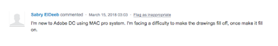
Somewhat regularly on the Acrobat forums, I see people asking for help making a shape with "No Fill" option when drawing shapes. Like this post for example.


In Acrobat DC, the old properties toolbar (which I discuss here, here, and here) was deprecated in favor of a new way of doing things.

The multi-tool Properties bar was broken apart into several tools, all of which combined do not accomplish the same things as the old faithful Properties Bar. The new tool include "Color Picker" and "Line Weights", as well as the Text Properties tool. I went into those at some length here, but I realized today that I have never gone into much detail about the biggest glaring omission of the new tools. For me, the most important thing that was left out of the new DC tools is the ability to set a "no fill" option in your drawing markups. That's odd, especially considering that the default setting of the drawing markup tools is "No fill." Notice how NONE of the giant color swatches are checked? That's because you cannot accomplish "No fill" using this new tool. You must bring up the old Properties bar.


On this feature request Acrobat User Voice page, this user proved my point that once the default no-fill is filled in, there doesn't seem to be a way to un-fill it.


People can't find the no Fill option because it is hidden in the old UI!

It's quite frustrating for many users to not have the 'No Fill" option, as illustrated here.

People want to set "No Fill"


Not even clicking on the sprocket Options icon will give you anywhere to set the "No fill" option. That will, however, bring up the secondary Properties dialog box, which is useful if you need to access one of the other properties not available in the redesigned tools, namely "Line Style."

Properties Dialog Box

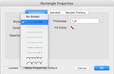
Line Style was also omitted from the redesigned tools in Acrobat DC

But I digress. Let's take a look back at the fill options available in this dialog box. Let's compare these options with the options available in the Properties Bar. The Properties Dialog box uses the same color options available within the Mac OS. (Yours will likely be different if you are on a PC.) It makes sense that there wouldn't be a "No fill" option for setting color in the mac OS. Why would you want "No fill" when changing the color of the type in your email program, for example? (More on the topic of color choice dialog box here.)

Fill options in the Properties Dialog Box
Compare that with the old Acrobat-specific Properties dialog box which had a thoughtfully designed set of colors, complete with a No Fill option. Of course we want the option of no fill creating PDF markups. Even more so when creating drawing markups! Thankfully, the Acrobat designers from a decade or so ago considered that and built it for us.

Properties Bar: The only place to set a No Fill option

Having a good method of highlighting and doing drawing markups has been a huge issue for me for years. And I am not unique in this. Entire industries (Architecture, Engineering, and Construction) rely upon the ability to set a No Fill option on their drawing markups.

Let me be clear. I love Acrobat! I think it is the best PDF editor on the planet and I even did an entire Lynda course all about PDF commenting in Acrobat. But it is really missing the mark in some areas, and I'd like to help fix that. With a few changes and additions, Acrobat would be hands-down the best tool for doing drawing markups. But in my experience of working with engineers and builders across the country, only one person I've worked with uses Acrobat DC. Most of my clients are on old versions of Acrobat (one of them just recently got Acrobat 8 installed!), and some of them are starting to use competitor software. And that makes me sad.

Here's what I would like to see:

Will you take a few minutes to visit the UserVoice page and vote for each of these features?

Edit: 9-13-918
I recently discovered a different software called BlueBeam Revu. They have a No Fill Option! Check out my article on Bluebeam Revu. It's an amazing program designed specifically to meet the needs of users in Architecture, Engineering, and Construction.

Edit 9-26-19
I did a little more digging and it appears that there is another way to have "No Fill" on a comment. Read about that here.