Tuesday, December 4, 2012

The Elusive Stroke Style Units of Measurement

Why does my Stroke Styles dialog box always display strokes in inches? Find out the source of this annoyance, and how to fix it. This article can be found in its entirety at InDesign Secrets.

http://indesignsecrets.com/the-elusive-stroke-style-units-of-measurement.php


Wednesday, November 21, 2012

Not According to My Plan...Better than My Plan


For the last three years, I have been self-employed. Prior to becoming self-employed, I had nine jobs in nine years. Yes, you read that correctly. For roughly half of the jobs I had, I was laid off because the company or department I worked for ceased operation and the entire staff was laid off. So I jumped from job to job, just trying to stay afloat.

In my ideal plan, I would've gotten a good job right out of college, at a stable company with great benefits, and plenty of opportunity for growth. But that's not what happened. However, all these job changes prepared me for something much better than I could have ever planned out on my own.

During this season of Thanksgiving, I'd like to share with you some of the valuable things I learned while working for these nine different companies. Ironically, the most valuable lessons were at the companies who were in the process of going out of business. I've found that stable companies want to stay that way, and so, are pretty careful about how they spend their money.

But the companies who are on the verge of losing it all... well, that's another story entirely. Before the employees find out that the companies are shutting down, the bosses want to save face, and will agree to things that would probably never be considered in a larger, more stable company. For example:

Me: I am done with the work you assigned to me. What else should I do?
Boss: I don't have any more work for you to do. Why don't you read these software training books and just spend some time going through the tutorials?

Me: Can I introduce a new file format into the production workflow?
Boss: Why not?

Me: Can I spend thousands of (your) dollars on an untested marketing campaign? (And I had never done a marketing campaign before.)
Boss: Go for it!

Me: Can I change the software that the company uses for its main graphic production?
Boss: Sure thing.

Here are some things I've learned at my various jobs, half of which were at companies going out of business. The companies where I got laid off are colored in red.

Job #1: (went out of business, exciting, fun job!) 
  • Pagemaker
  • InDesign
  • Interactive PDFs
  • The importance of font embedding
  • Field documentation (behind the scenes tours of marine wildlife parks!)
  • Foreign travel
  • The importance of having enough billable work to make payroll
Job #2: (stable, crazy long hours)
  • RGB versus CMYK
  • Preparing files for 2-color printing
  • The trials of corrupted fonts
  • Rich black
  • How to clean up horrible black and white scans so that they print respectably
  • Keyboard shortcuts
  • Bezier curves
  • Communicating graphic file requirements to non-graphic designers
  • Quark
  • How to get along with difficult coworkers
  • Make friends with people in other departments. Show a genuine interest in what they do, and they'll treat you like gold.
Job #3: (stable, great benefits, established company, boring!)
Job #4: (close to home) 
  • Business cards, letterhead, designing lots of different types of documents
  • File imposition
  • File archiving and backup
  • Paper types: laid, linen, glossy finish, text vs. cover, etc.
  • Grain direction
  • How to avoid cracking on a print with heavy coverage
  • The importance of laser-compatible paper
  • Digital vs. offset printing: choosing the appropriate printing method
  • The importance of outsourcing printing when the job is beyond in-house capabilties
  • Working with dielines
  • Logo recreation
Job #5: (the best job to date, company went out of business right before the holidays) 
  • Sheetfed litho
  • Preflighting
  • Printing! I have found where I belong!
Job #6: (one of my favorite jobs, tons of overtime, company went out of business) 
Job #7: (company hit hard times and couldn't afford to keep me on staff) 
  • The importance of a live production status monitoring system
  • Making clipping paths in Photoshop
  • Learning to work for a boss who makes his employees cry
Job #8: (close to home, my department got shut down) 
  • FrameMaker
  • How to make cross references and tables of contents
  • The importance of using modern software and modifying document production workflow to increase efficiency
  • The direction of a company is determined by the executives, rather than hourly wage employees. No amount of effort on my part can change that.
Job #9: (same parent company as Job #8, but in a different department) 


Thanks to all my employers for giving me a job. An extra special thanks to those employers who continued to pay me for my work, even as their companies were collapsing around them.

And thanks to God for moving me from job to job, where I was able to gain new skills and capabilities at each one. It is because of all of these seemingly random job experiences that I can now be self-employed, doing work that I truly love.

Happy Thanksgiving!

Saturday, November 17, 2012

Making Slanted Strokes

Don't settle for the default right hash! Learn to make custom slanted strokes using a dashed stroke style and Skew. This article can be found at InDesign Secrets. http://indesignsecrets.com/making-slanted-strokes.php


Tuesday, October 16, 2012

Adobe Reader XI for Knitters

In my knitting bag, you'll find several mangled, folded up, scribbled-on patterns. To keep track of where I'm at in a pattern, I used to use paper sticky notes. I like the light yellow ones, because the paper is thin enough for me to be able to slightly see what is underneath it. Yet, because they are adhesive, I can easily more the sticky note after each row, keeping track of my progress.

If you are a knitter with a tablet or laptop, I'd like to introduce you to a different, perhaps easier way to keep track of your place in your pattern. With the recent release of Adobe Reader XI, knitters now have a great resource for their tool bag. This tutorial will use a charted color pattern, but this technique will just as easily work with a charted lace pattern. First, you'll need a PDF of your pattern.

Open the PDF in Adobe Reader. There are two options for opening files in Reader: Opening from your local hard drive and opening from an online account.


The first option is to open a file on your local hard drive...which is pretty self-explanatory. It's just a PDF located on your computer.

The second is opening a file from an online account, such as Acrobat.com. (Side note: The drop down for Open from Online Account is not exactly clear. I think that Open from Online Account should be outside of the drop down (like Show); it should not be the first item the the drop down. Regardless, if you are opening a file from your local hard drive, you can ignore this confusing drop down menu.)

However, storing your patterns on an online service such as Acrobat.com may be a good solution for you if you don't want to carry hardcopy patterns, have a tendency to lose papers, or need to have access to your pattern on multiple devices.

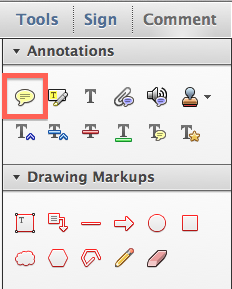
Once your pattern is open, click on the Comment pane. If you are used to used paper sticky notes, your first inclination may be use the Sticky Note tool to track your progress in your charted pattern. Let's explore why this isn't the best tool for the job.


When you first click on the page with the sticky note tool, two things happen simultaneously: 1) A sticky note icon placed on the page. 2) Near the sticky note icon is a light yellow pop-up where you can type notes. The pop-up note will by default line up on the edge of the document. So if you zoom in and out, the location of the pop-up note will not stay constant relative to your pattern. It will always align to the side of your page.


Now you can choose a different color, icon, and opacity for your sticky note. This can be useful if you need to increase or decrease contrast between your sticky note and the page's content. You can easily type notes to yourself in typing area of the sticky note.


You can also move the pop-up note separately from the actual sticky note itself. However, the size of the sticky note and icon remain relatively constant on the page, no matter if you're zoomed in to 800% or zoomed out to 50%. This means that the size of the sticky note and placement of the pop-up are completely independent of the zoom level. So you can't count on them to visually stay where you put them.

What neat about sticky notes (and all other comments for that matter) is that you can change their color and opacity. Right-click on the sticky note and choose "Properties." There are a whole host of icon and color choices.


While sticky notes are great for other uses, in order to more easily track my progress in a charted pattern, I prefer to use a different tool. 
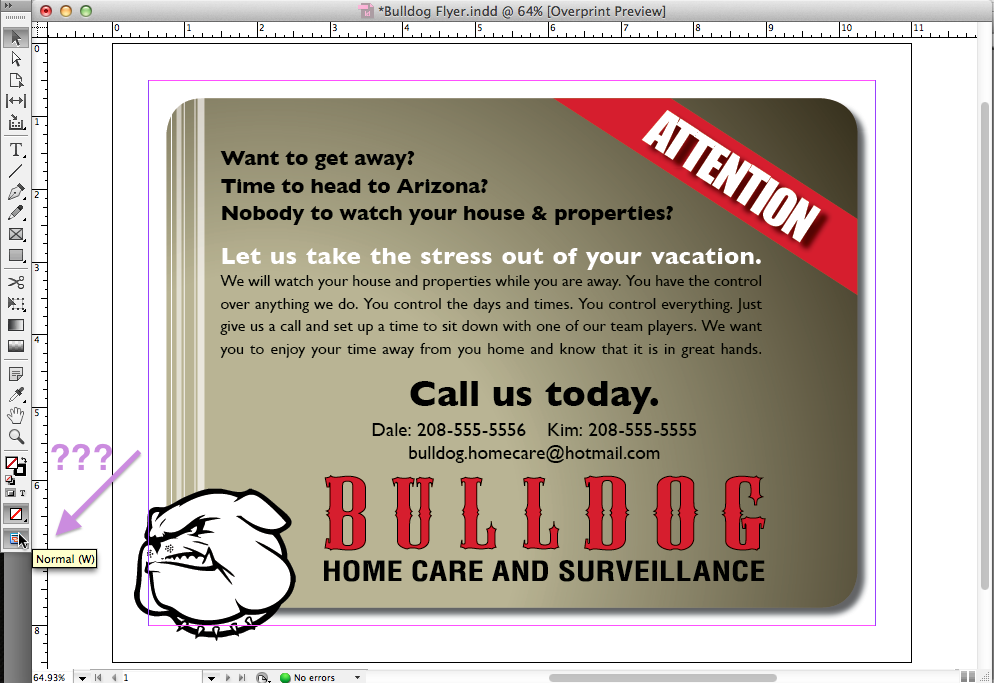
I like the Rectangle tool.


To make a rectangle, click on the rectangle tool and draw a rectangle on your page. The default rectangle is has a red stroke and no fill. But we can easily change this.


Right click on the rectangle and choose Properties (or press Cmd/Ctrl + I).


Here you can change the stroke and fill colors, as well as the opacity.


You may need to experiment with your Rectangle properties in order to find what works best for your pattern. See how my yellow rectangle has low contrast against my pattern?


By changing the color and opacity, now we have a sticky note that has a higher contrast between the different colors in the pattern.


The beauty of the rectangle tool is that the size of the rectangle stays constant relative to the zoom level. So when viewing the page at 400%, the rectangle will be four times larger than when viewing the page at 100%. Basically this means that the rectangle will stay where you put it, and remain correctly sized and proportioned.

100% Zoom

400% Zoom

In previous versions on Reader, users only had access to the Sticky Note Tool, not any Drawing Markup tools. But with the release of Reader XI, users can "comment" on any PDF you want (barring any security settings that the publishers may have imposed). Better still, you can Save the PDF, and your "comments" will still be there in the exact same place the next time you open the PDF.

Edit: 9-13-918
If you regularly use PDF annotations, check out my article on Bluebeam Revu. It's an amazing program designed specifically to meet the needs of users in Architecture, Engineering, and Construction.

Thursday, October 11, 2012

Where Did My Hidden Characters Go?

Dumbfounded once again, as I discovered a way to lose my hidden characters. But then I found them! Read the entire article at InDesign Secrets. http://indesignsecrets.com/where-did-my-hidden-characters-go.php


Thursday, October 4, 2012

Saving PDFs for Reader Users: the How and Why

In a recent Raleigh InDesign User Group meeting, we discussed how to collaborate with non-InDesign Users. The most popular method is by using PDF commenting tools. While my ideal workflow might include a copy a Acrobat Professional for every user, I realize that most people only have a copy of the free Adobe Reader. However, even with this free software, the other people in your workflow can still comment on your PDFs. The trick is that you need to save your PDFs with a setting that allows Reader users to comment on the document.

Here is what a standard PDF will look like when opened in Reader X. The Comment Pane is fairly stripped down. Users can either add Sticky Notes or Highlight Text. That's it. But what if they want to replace text? Or cross out text? Or add a text box? They can't.


The trick is to save the PDF with the aforementioned special setting. However, this setting is located in two different places, depending upon which version of Acrobat you are using.

If you are in Acrobat 9, this setting is located under Advanced>Extend Features in Adobe Reader.


If you are using Acrobat X, this setting is under File > Save As > Reader Extended PDF>Enable Additional Features. This will give Reader Users access to the most features.


Once your PDF is saved with this setting, here is what it will look like in Reader. Under the Comments Pane, they now have access to all the Annotations tools (not just sticky notes and highlighters).


Further down in the Comment Pane are the Drawing Markup tools.


There 's also a whole new Pane that is now accessible to Reader users of this PDF: the Extended Pane. Here, Readers users can place a signature, add a time stamp, or use the "Add or Edit Text Box" tool (which was formerly known as the Typewriter Tool).


The upcoming Adobe Reader XI makes it even easier for Reader Users to comment on your PDFs. Stay tuned!

Make PDF Sticky Notes in your InDesign Document

Create PDF Sticky Notes, right from InDesign. Two great solutions! This article can be found at InDesign Secrets.

http://indesignsecrets.com/make-pdf-sticky-notes-in-your-indesign-document.php


Thursday, August 23, 2012

Follow the Yellow Brick Road

Learn to use Illustrator to expand your stroke styles; then apply several of them in sequence. This article can be found at InDesign Secrets: http://indesignsecrets.com/follow-the-yellow-brick-road.php

Saturday, July 28, 2012

Gift Ideas for the InDesign Geeks in Your Life

I've been collecting cool gift ideas for InDesign users and I wanted to share them with you. Honestly, these ideas were mainly ideas I gave to my own  family members. But some of these ideas are so great, I think that other InDesigners should know about them as well. While there are plenty of generic-graphic-design-y gifts, these are primarily relating to InDesign.

Custom License Plates: $30-60

My husband got me this for my birthday. I'm still kind of shocked that the plate was even available. I thought for sure another InDesign user in North Carolina would've already snagged it. But lucky for me, they didn't!


InDesign-inspired glass: $15 and up

I found this glass on Etsy. I was looking for a local artist here in Raleigh from whom I could buy something pink.


But if Illustrator, Photoshop, or Acrobat are more your thing, she also has nice designs in orange, blue, and red. Sure, normal people might not know what the colors represent, but your software geek definitely will. I think the red business card holder would be especially appropriate for anyone who makes interactive PDFs.


File Extension Jewelry: $24

How much do I want this necklace? A lot. This artist has a variety of other Creative Suite extensions as well (.psd, .ai, .fla), plus necklaces for Save and Undo. How fun would it be if she also started offering .idml and .icml? Or maybe .indb, .inx, .indl, or .idms?


Pink Pillows: $15

These pillows come in a variety of sizes. The little ones would make great ornaments. The company who makes them used to be backordered for 6 weeks, but they've recently ramped up production and you can get your pillow relatively quickly now. Like any smart business catering to graphic designers, they also have pillows for  all the other Creative Suite applications (even Bridge!). The photos of the large pillows on their home page are CS3 branding. The mini pillows have been upgraded to CS5. I'd be curious to see if they will be doing any new pillow designs for CS6.


Pink Yarn: $84.99

Now, I know that most InDesign users don't knit, but I also know a fair number that do (myself included). This yarn is a sampler pack of fingering weight, 100% wool. I just finished making an afghan using this yarn (worked using #4s, in garter stitch, in case you're interested.) Plus, this yarn is at a truly amazing price! If your software geek is into a different program, they have other colorways as well

Tuesday, July 10, 2012

American Flag Stroke Style

I recently wrote an article on how to use a custom striped stroke style to make the stripes of the American flag. You can find the complete article over at InDesign Secrets. http://indesignsecrets.com/american-flag-stroke-style.php


But I wanted to show you some other cool things you can do with this custom style. Continuing on the patriotic theme that inspired the original design, you can apply this stroke style to a star.


You can apply this stroke style to a circle and make your very own gold record. I copied and pasted some gradients swatches in from Illustrator so I didn't have to recreate the gold gradients in InDesign.


Or you can apply this stroke style to rounded rectangles and stack them on top of each other. For this purple design, I took advantage of a bug in InDesign that automatically expands Live Corners when you try to move the individual anchor points with the direct selection tool.


In case you want to use this stroke style and not have to create it yourself, click here to download a snippet of the waving flag stroke shown at the top of this article. When you place the snippet into InDesign, it will automatically bring in the stroke style and gradients. Enjoy!

Tuesday, June 26, 2012

Make a Mondrian using InDesign Tables

Want a Mondrian, but can't afford the real thing? You're not alone. Don't worry, you can make a similar design using InDesign tables. Take it one step further and have it printed large format on canvas, and hang it in your office.


Congratulations! You just saved yourself $27 million.

Sunday, June 3, 2012

Why Does My CMYK Illustrator Document have a 4-color Default Black?

For months now, I have been plagued by an unusual Illustrator problem: 4 color default black. I've always been told pressing the letter D will revert the fill and stroke to their default colors. Like so:

Illustrator default black

But I have a vast collection of Illustrator documents which have a different default black. Instead of getting the expected result of 0, 0, 0, 100, Illustrator gives me this:

Mysterious 4-color default black

Early on, I assumed that perhaps I had made an amateur mistake of working in a RGB color space for my print documents. But nope.


I thought perhaps somehow the default black had gotten edited within the Illustrator master templates, so I checked those. But those all had the correct black definitions as well...

What plagued me about this problem was that it occurred on ALL the files for a particular project, and NEVER for any other project. So I figured that since all the files for this particular project were created from a single Illustrator template, the problem must be within that template. But all was seemingly correct with the template. It was a CMYK document, with CMYK swatches. What was interesting about this version of 4 color black was that it appeared to be a CMYK representation of an RGB black.

So, out of curiosity, I started at the beginning of the lifespan of a file, and created a bunch of new documents, using all the different New Document Profiles. Eventually, I was able to replicate the problem. The problem can be replicated by creating a new document using one of the RGB profiles and then changing the Color Mode (in the lower "Advanced" portion of the dialog box) to CMYK.


You see, you can use any of the new document profiles to create a CMYK document. The new document profiles come with a default color mode. But you can change it to whatever you want! However, these New Document Profiles correspond with actual .ai files that Illustrator uses to create new documents. Adobe has a good writeup about new document profiles here.


So if you start with an RGB file and simply change the document color mode to CMYK, Illustrator still remembers that the files started out as RGB. But since you changed the color mode to CMYK, Illustrator assumes that you want CMYK swatches, so it reinterprets those original RGB swatches and displays them as CMYK. 

So after months of wondering, I finally figured out the original source of the problem.
  • I opened a screenshot (which is an RGB raster image) in Illustrator in order to trace it.
  • I changed the color mode from RGB to CMYK.
  • I added my own CMYK swatches and symbols.
  • I saved this file as a template and created hundreds of other files from it.
But Illustrator still remembers that the original file was RGB. Of course, the original file as a screenshot, and had no swatches of its own to begin with. But it was RGB. And so forever more, this file, and all of its descendants, have a four-color black as their default.

So, the moral of the story is:
  • If you have a CMYK workflow, don't open an RGB raster image in Illustrator. Instead, place the image into an new CMYK document.
  • Alternatively, you can open an RGB image in Illustrator, but be sure to copy and paste it into a new CMYK document.
Author edit on 2-19-13: I recently included this at a lesson of the Raleigh InDesign User Group. Here is a video illustrating this blog post.


Sunday, May 20, 2012

Mysteries of the Elliptical Overset Cell Symbol Revealed

Fo many years, I have followed InDesign Secrets as a huge fan. I've attended their conferences, given them unsolicited Obscure Feature ideas, and relied on their website and podcast as the primary source of my InDesign education. Whenever I encounter a problem in InDesign, their website is the first place I look for answers. 

I am so thrilled that David and Anne Marie have welcomed me to "the team" of InDesign Secrets Contributors! That was truly a momentous day in my life. So, please, check out my latest blog post, which  I am honored to have published at InDesign Secrets.


Sunday, May 13, 2012

Making a Chevron Pattern Within InDesign

This is a pattern I saw recently while in the stationary aisle at Target. I like this pattern because it reminds me of the brightly colored crocheted chevron afghans that my grandmother made when I was a child. We had a number of these afghans around our house growing up, and after learning how to crochet at age eight, some of my first projects were efforts to duplicate her handiwork. My early efforts were not as well crafted, but they were good practice for me as I learned to be diligent in improving my craft.


So, how to create a chevron pattern in InDesign? At first, it's not clear. Usually, when creating a pattern in InDesign, I use TeaCup PatternMaker. Other times, I'll use tables and apply interesting stroke styles to them. But to create a chevron pattern, neither one of those methods will work. But I eventually found a suitable method.

But first, let's explore why my standard go-to pattern creating methods won't work.

TeaCup PatternMaker has a pattern type called "Waves," but it is exactly that: wavy. It's a really nice pattern, and I even wrote an entire blog post about it. But in this case, I need my "waves" to have sharp points, not curved points.


The "Waves" pattern is neat because you can change the amplitude stroke weight, and angle. But...you can't specify sharp corners.


Another limitation of the Waves pattern (or any Teacup pattern) is that it must fill a graphic frame: you cannot apply Patterns to strokes. Nonetheless, the Waves pattern is pretty neat, and one of of favorite TeaCup patterns.

My second go-to pattern creating method involves tables and stroke styles. In a couple of instances, I've used the "Wavy" strokes style on a table. While the Wavy stroke style is great because you can (obviously) apply it to a stroke, you have virtually no control over how it is applied. You can't change the amplitude, wave length, number of waves... nothing. All you can do change the stroke weight.  There seems to be a fairly strict limitation on the shape of the wave, and the number of waves will change in order to keep the built-in wave shape relatively constant. Thinner strokes get more waves. Thicker strokes get fewer waves.


Now that we know why my first two ideas didn't work to give us the pattern we're after, let's talk about the method that will give us the pattern we're after.

But first, let's take a step back and look more closely at the image.


Do the blue wavy lines it remind you of anything in InDesign? No? Well, how about if the lines were red? Now do you see how it looks similar to the squiggly underline beneath a mispelled word?


So, we know that InDesign has the capability to create a chevron pattern, as demonstrated by the squiggly red underline of dynamic spelling. But we need to find a way to translate this chevron pattern into a printable, editable object. Now, I don't know of a way to print the dynamic spelling underlines (why would anyone want to? See note below...), But I do know of another feature in InDesign that also has a wavy underline. This feature is "Conditional Text."

In case you've never used Conditional Text before, it is a great feature. It's got to be among my top ten favorite InDesign features. Basically, conditional text let's you show and hide different bits of text. For example, if you are doing a textbook with both a teacher and a student version, you can use conditional text to hide the teacher's portion of the document (such as the answer key). You can also use conditional text to hide bits of text that perhaps you don't need right now, but might want to save for use later. But in this case, what's so cool about conditional text is that you can show AND print text indicators!


So, now we have a way to create a chevron pattern, and to also print it. So how to get a whole frame of these wavy conditional text indicators, but not have any text to get in the way and obstruct the pattern?


First, let's attempt removing the letters, while still having the conditional text indicator. The solution is a right-indent tab (Shift + Tab). Right indent tabs are neat because they are dynamic. However wide your text frame is, a right-indent tab will extend all the way to the right-most edge of the text frame.


Now, we need to get a whole bunch of these little conditional text indicators stacked on top of each other. You may think that we would simply add a bunch of paragraphs, and the tighten up the leading to zero. That will work, but it would be very difficult to edit. Plus, it limits you to one color of chevron. Instead, we simply need to make more Conditions. InDesign will by default, want to make them all different colors, so you'll have to change the colors one by one.


Because I want to replicate the chevron pattern I saw at the store, I'll make all my conditions Light Blue.


Now, select your text (which is just a right-indent tab), and apply all five conditions. You have a chevron pattern!


You can add as many new conditions as you want, apply them, and the little chevrons will just be added to the top of the stack.


If you want to change your chevron colors, simply double click on the Condition, and change the color.   Here, I changed all the odd conditions to Blue (as opposed to Light Blue). Note that the conditions at the top of the panel are actually displayed at the bottom in the text frame. The conditions are sorted alphanumerically (top to bottom) in the Conditional text panel and in the reverse order (bottom to top) in the text frame.


So now that we have a chevron pattern that will show and print, and it's the colors that we want, it's fully dynamic and will extend as high and as wide as we want it to... what if we want to edit it further? What if I wanted real live strokes instead of just conditional text indicators?

A few weeks ago, I heard about a new plug-in from Markzware that converts a PDF into an InDesign layout. There is another piece of software (PDF2ID) that's does something similar, but I haven't tried it. During the course of my experiments with chevrons, Markzware was calling for beta testers for their new plugin, so I leaped at the opportunity. I think the original intent of the plugin was to translate recognizable patterns in text formatting of PDF documents, and recreate that text formatting as InDesign character and paragraph styles. But the cool thing about the Markzware plugin is that it will allow you to OPEN a PDF and have live, editable vector objects right in InDesign. Wow!


So, I exported my chevron pattern as a PDF, and then converted it using the PDF2DTP plugin. Once it's converted, when you select all the blue lines, you'll see that they are now fully editable strokes (click on image to enlarge).


If I wanted to, I could further stylize these strokes. And you can see that I can now easily change the stroke width, the amplitude, the stroke height, the colors, and pretty much whatever I want to change about them. I now have a fully editable chevron pattern, created right within InDesign.


Author edit on 6-10-12: If you don't have a copy of PDF2DTP, you can still use this method to create a chevron pattern. Simply open your PDF in Illustrator. If you like, you can simply copy and paste the strokes from Illustrator back into InDesign. The PDF2DTP plugin is very neat, because it allows you to "open" PDFs and edit them without ever having to leave InDesign.

Author edit on 8-24-12 regarding dynamic spelling underlines: I found a plugin that will include dynamic spelling indicators when exporting to PDF.

Did you like this article? Then check out my article about Chevrons at Creative Pro. That article discusses how we see chevrons and the simplest way to create a chevron in Illustrator.