Monday, February 28, 2011

Using Teacup PatternMaker to Mimic Knitted Garter Stitch

This is a continuation of my pursuit to use InDesign to help me more effectively design knitted afghan patterns. One of my previous blog posts, "Data-less Tables: InDesign Meets Knitting," focused on replicating perfect right-angle triangles using diagonal lines in InDesign tables. Today's post will focus on my attempts to use InDesign to accurately mimic garter stitch, so that I can create more realistic illustrations of my designs.

In case you haven't read my previous post about garter stitch, I'll summarize it here. Garter stitch has a 2:1 proportion of rows : stitches. So if you knit a piece of garter stitch 40 rows tall and 20 stitches wide, it will be perfectly square, perfectly flat, and will look exactly the same on both sides. Knitting each row gives you a ridge. So if you knit two rows, you get two ridges, one on the front, and one on the back. Taking it a little further, if you knit 40 rows, you'll have 20 ridges on the front, and 20 ridges on the back.

So the effect I am trying to replicate is getting InDesign to make wavy lines where the number of waves equals the number of lines, with just a little bit of space in between. The trick is getting this to fit perfectly inside of a square frame.


The above photo shows the effect I'm trying to replicate. After a bit of trial and error (and admittedly a few months of wondering how and if it could be done), I finally stumbled upon the solution. It is Teacup PatternMaker. The solution is deceivingly simple, and I've had the capability for quite some time and didn't even realize it.

In case you're not familiar with PatternMaker, it's a very cool plugin that generates customizable postscript patterns on the fly, right inside of InDesign. As an attendee of the InDesign Secrets Live 2010 Print and ePublishing Conference, I was thrilled to receive the entire Pattern Pack as part of what I'll call my digital gift bag. I am fascinated by geometric patterns, so this Pattern Pack was like an early Christmas present.


As you can see in the graphic above, my square has 8 ridges and 8 stitches (called "Waves" in Pattern Maker). By saving this pattern as a preset, the next time I want to design anything in garter stitch, all I need to do is fill the appropriate frame with this pattern, and then edit the colors.

And case you're wondering what the little red rectangle is at the top left corner of my  pattern, that's FrameReporter,  by Rorohiko. It gives little snippets of information about the selected frame...and happens to be one of my favorite plugins.

More articles on InDesign and Knitting coming soon!

Tuesday, February 8, 2011

Hey Rounded Corners—Quit Messing with my Paragraph Rules!

This post is about a rounded corner workaround I found that will work in both InDesign CS3, CS4, and CS5.

This all started because I had a project which required me to create call-out boxes. I had been analyzing the callout boxes in my favorite study bible, and I wanted to duplicate the effect in InDesign. The top edge of the box had two lines (different tints and different thicknesses). The bottom edge of the box had rounded corners. I knew I could accomplish this effect with a couple of frames, grouped together (one for the rounded corners, and one for the text frame), but I wanted the flexibility to resize my text frame as needed, without having to ungroup, regroup, and risk distorted text and corners...

So my first task was to create the top rules, using two paragraph rules in the top line, one Rule Above, and one Rule Below.


My next task was to add the rounded corners at the bottom. At first, I tried the popular method of running the Corner Effect script. This script doesn't actually use live corner effects (like CS5 does), but actually edits the corner anchor points.


The script is less than intuitive. You have to know which points (first, second, third, and fourth) correspond to which point on the rectangle. After a little experimentation, I figured that I to get bottom rounded corners on my rectangle, I would need to choose the last two points. I was so perplexed at the logic behind the order of the rectangle points that I wrote an entire article about it: A Designer's Guide to Understanding Polygon Point Order when Using InDesign's Corner Effects Script.

So, the Corner Effects Script seemed to work pretty well, until I took a look at the paragraph rules in the top line of my text. For some mysterious reason, adding rounded corners messes with the paragraph rules in the top paragraph. They now no longer extended to the edge of my text frame, despite the fact that I had set paragraph rules to span the entire column width. My guess is that somehow the rounded corners alter the object geometry which determines how wide the paragraph rules extend. But I'm just guessing. I really don't know.

I was working in CS3, so I figured that this was probably fixed in CS4...but it did exactly the same thing. Here is the same text box with the colors nice and bright to highlight the problem.


So I next tried rounded corners using in CS5. I rounded just the two bottom corners...but again, the same thing happened to the paragraph rules in the top line. It seemed to work at first, until I resized the text frame. As a workaround, I adjusted the paragraph rule Right and Left Indents to account for the short paragraph rules. But not all of my text boxes needed to be the same size, and when I made the text box wider or narrower to fit my design, the paragraph rules were almost always the incorrect width (the correct width being equal to exactly the column width).

I also tried the CS5 new Rounded Corner Effect, but again, the paragraph rules did not function as expected. See the little magenta peeking out behind the right side of the header?


So I decided to try a solution that had nothing at all to do with real Rounded Corners, and everything to do with Faking Rounded Corners. I would achieve rounded corners at the bottom of the text frame using a big, fat, paragraph rule. Here are the settings I used:


By making the paragraph rule the same color as the text frame, the rule has the same effect as rounded corners, but without messing up the object geometry in the paragraph rules in the top line. And I can also now resize the text frame at will, without inadvertently changing the corner size. And the best part is that this workaround isn't just for the latest version of InDesign, but works exactly the same in earlier versions as well. Here is the text frame with a gray paragraph rule and frame fill, so you can see how it all worked together.

Thursday, February 3, 2011

Designing for Small Non-Profits: Preparing Flexible Files to Be Used with Consumer-Grade Software

Some of my clients are small non-profits. These hardworking folks are typically volunteers, managing teams of volunteers. They work with limited resources and have to find very creative ways to get things done on a limited budget. I have a deep appreciation for the effort required to run a successful non-profit. That's why, for special clients like these, I adjust my workflow in order to better meet their needs.
In addition, when designing for small non-profits, I never truly know how the files are going to be used or where they will end up. The graphics I create could end up in an email campaigns, newsletters, newspapers, on t-shirts, websites... you name it. So in addition to choosing file formats that my clients can actually use, I also try to make the files as editable as possible, all while maintaining a high quality. If any of these files do end of at a professional printer, they'll print reasonably well.

Small non-profits want to have attractive graphics, but typically lack the tools and knowledge to create them on their own. Their tools usually include consumer-grade programs such as MS Word, MS Publisher, and Photoshop 6 or earlier.

As much as I may urge my non-profit clients to switch to the Creative Suite, I understand that learning professional software is not something to be done casually, and so I never actually expect any of them to convert to the Creative Suite. These wonderful clients want to create their own graphics using the tools they own and already know how to use. Though I may help them with certain special projects, most of their day-to-day designs are done in-house, by volunteers.

To assist my clients in creating higher quality graphics while still using their existing tools, I choose file formats based upon what is compatible with their tool set. These file formats are very different from what I use in my professional high-end projects, but work perfectly for my non-profit clients and their tools. The file formats I choose are:
  • WMF
  • EMF
  • PSD
WMF
As modern professional designers don't typically use WMFs, your experience with WMFs is likely limited to clip art books such as the somewhat fictitious "10,000 Cheesy Clip Art Images for $49."

There are several reasons I don't like WMFs: they don't support bezier curves (all curves are converted to a path with bunches of corner points - see image below), they are incapable of containing XMP metadata, they only have an RGB mode. WMFs were originally developed for a 16 bit windows operating system, and some websites say they cannot be placed inside graphic programs, but interestingly, WMF can be placed into InDesign documents, even on a mac. However, WMF's can't embed fonts, so you'll either need to have the fonts available wherever the file is being output, or outline the fonts and then go to great lengths to make sure the final result looks acceptable. We'll explore how to do that below.


Different software programs seem to have different methods for converting their native file formats to WMFs. For a brief period of time, I had a job where I had to use Corel Draw. It converted WMFs quite differently that Illustrator does. Corel gradients export as vector, but AI gradients export as raster. But if you want to achieve vector gradients in an AI WMF, you can create your gradient using a blend. If you have more than one vector editing software available, test which one does the best job of converting your files.


But for as much as I dislike WMFs, they are useful in a few circumstances. WMF stands for Windows Meta File. It is a vector format compatible with MS Office products. While using EPS files in Office products has varying degrees of success (depending on how far you backsave the EPS), WMF files work well with the MS Office suite. WMF files preview properly, are scalable, and print crisply. Within an MS Office program, you can even ungroup them, and they will act as native shapes drawn with the Office drawing tools. As a designer, the challenge lies in generating a WMF file that is respectable by modern day graphics standards.

I found that converting the curves to straight lines results in very ugly type. After some trial and error, I found that by enlarging the text (or graphics) prior to exporting a WMF from Illustrator, the distortion of the curves is not as bad. It's still ugly, but workable with a few adjustments. The image below illustrates the difference in curve conversion (in)accuracy at 12 and 24 points.


The trick is:
  • Design your AI file at at least 10 times the size you finally need it.
  • Outline the type.
  • Export a WMF.
  • You'll need to resize the WMF when you place it into the Word doc.


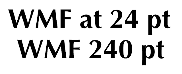
The larger curves in the 240 pt example result in a larger number of points during the WMF export, and correspondingly, more accurately resemble the original shape of the outlined text.

EMF
This is pretty similar to WMF, with the main difference (for my purposes) being support of curves. Well, in theory anyway. The curve conversion at 24 point actually looks worse than the WMF version at the same size.

PSD
I use this file format for clients who like to use Photoshop for page layout. By copying the paths from Illustrator and then pasting into Photoshop as a Shape Layer, you have a scalable vector logo with a transparent background, and can very intuitively edit the color. Be sure to maximize compatibility when saving the file. If I was ever to give my clients a logo as a jpeg, they eventually will want to have it with a transparent background, and they would likely attempt to erase the background using the magic wand tool. This format prevents magic wand attempts and it retains the accuracy of the original Illustrator paths.


Again, I want to emphasize that these formats are not recommended for high-end production workflows, but will assist organizations with consumer-grade software to have attractive graphics. Having spent my entire adult life in Christian ministry, I always look for ways to do more with less. I recently read a great book that illustrates how non-profits get more accomplished while spending no money. I highly recommend this book: Zilch: The Power of Zero in Business

If you need to prepare files for people using consumer grade software, may I also recommend these articles:
Adventures in Flexible File Prep: New Twist on PDF Form Fields
Bulletproof, flexible files for Adobe Reader users