I've been an Acrobat user for nearly 20 years. I also daily monitor the Adobe Acrobat forums and answer questions from other Acrobat users. I've even recorded a
LinkedInLearning course on Acrobat. I've pushed Acrobat as far as I can take it for my PDF commenting needs. I still use Acrobat daily for other functions, but for nearly all my PDF commenting, I now use Bluebeam Revu.
Bluebeam Revu was designed by engineers, for reviewing engineering drawings. And since much of my work involves doing just that, I've found that Bluebeam Revu meets my needs like no other PDF editing software. Today, I'd like to show in detail one of the reasons I like it so much.
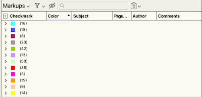
I have an 11x17 mechanical arrangement which I've color coded by system. At first, the two programs don't look that much different.
 |
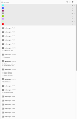
| Comments Sorted By Color: Acrobat DC |
 |
| Comments Sorted By Color: Bluebeam Revu |
While both sets of comments are listed in collapsable groups, the comments in Revu also display important categories in columns, much like a spreadsheet.
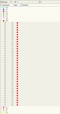
Here they are expanded. Notice how the color and a checkbox are both displayed in each and every comment. Because the comments pane is totally customizable, I've chosen to hide the irrelevant information, such as author name and date.
 |
| Expanded Comments: Bluebeam Revu |
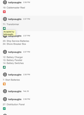
Now take a look at the same set of comments in Acrobat DC. Notice how prominent the author name and date are in the Acrobat comments pane. The icons are also huge, and gray (and
unpopular). And the checkboxes are not there. (If you want to mark something as checked, you first have to click on the comment to have the checkbox display, then you have to click on the checkbox. Each. And. Every. Time.
 |
| Expanded Comments: Acrobat DC |
Now let's take a look at how the comments display when additional information is added. I've chosen to display the author name, page, and comments. Again, all the content is displayed in a handy grid, making it very simple to scroll through the list and look for the information I need. Easy!
 |
| Expanded comment detail: Bluebeam Revu |
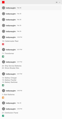
Here is the same information displayed in Acrobat. Since the Comments pane is not customizable, it still displays information which is irrelevant to me for this document: the date and the author name. And the text in the comment pop-ups are not displayed in a grid view, but rather, tucked underneath the author name, making it harder to find them. And since the icons are gray (And not the comment color), it's easy to scroll down an no longer be able to see which color the comment actually is.
 |
| Expanded comment detail: Acrobat DC |
According to Adobe, you can resize the Comments pane, but it's basically useless, since the information isn't listed in a grid view. So much wasted space!
 |
Acrobat DC Comments Pane Resized
|
Here is the comment pane in Revu, resized, with lots if useful information displayed. Great stuff! You can customize not only which columns to display, but their order and width.
 |
| Customized Comment Pane: Revu |
Here are the same comments viewed in Acrobat. Making the panel wider serves no benefit. The panel cannot be customized, and important information is left out. It does not display the subject, the status names, or who set the status.
 |
| Comments Pane: Acrobat DC |
One must hover over each status icon (which is the green thumbs up, green checkmark, red X, and yellow thumbs down. Only when you hover over each status icon does it say what the status is and who set the status.
 |
| Comments Pane: Acrobat DC, hovering over a Status icon |
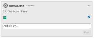
If that wasn't confusing enough, the "Completed By" status icon is a green checkmark, not to be confused with the regular checkmark (the blue one on the right).
 |
| Acrobat DC: Two checkmarks are confusing |
Another noteworthy difference between the comments panes of Revu and Acrobat is how easier it is to see the selected comment in a list. In Acrobat, when you click on a comment, it expands, and takes up even more space, assuming that you want to type something in the comment box. The third comment down is selected, and the fourth one down is simply hovered over.
 |
| Acrobat DC: One selected comment, one hovered over |
In Revu, it's WAY easier to see which comment is selected (because it's blue, the way it used to be in earlier versions of Acrobat). There is no change in comment appearance when it's hovered over.
 |
| Bluebeam Revu: One selected comment |
It's worthwhile to note that Acrobat 9 has a very similar layout to Bluebeam Revu. Each comment icon is colored, and the information is somewhat listed in a grid.
- The status is written out, as opposed to being an icon
- The Subject is listed (in this case, "Electrical").
- Each comment has a checkbox.
- The author name and date are still displayed, and that can't be changed.
- The selected comment has a thick black border, making it easy to see which comment is selected.
- Acrobat 9 also has a handy commenting pane which displays all kinds of useful functions.
While I prefer the layout of Acrobat 9 Comments pane when compared to later versions of Acrobat, it's still not as useful or user friendly as that of Revu.
 |
| Acrobat 9 Comments Pane with Handy Commenting Toolbar |
PDF comments in Revu can be exported as three different formats:
 |
| Export Comments As: Revu |
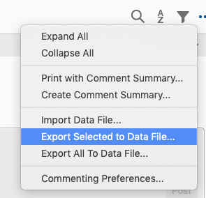
PDF Comments in Acrobat can be exported as FDF or XFDF files, but not as CSV, or PDF Files.
 |
| Export Comments As: Acrobat |
It's clear that the difference between Bluebeam Revu and Acrobat is HUGE! Plus, Revu has the added benefit of sold as box software, meaning that there are no monthly subscriptions fees to pay. Pay once, use forever.
If you like'd to learn more about Bluebeam Revu check out these articles:

