In my career, my time is spent at the intersection of two industries, of multiple programs, and generally wherever two typically unrelated topics converge. Those areas are often of the greatest interest to me, because they remain largely unexplored. Come with me friends, as I take you on a tour of a bit of that dual existence in my life: at the intersection of multiples worlds, where knitting, font design, and graphic design software merge.
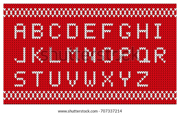
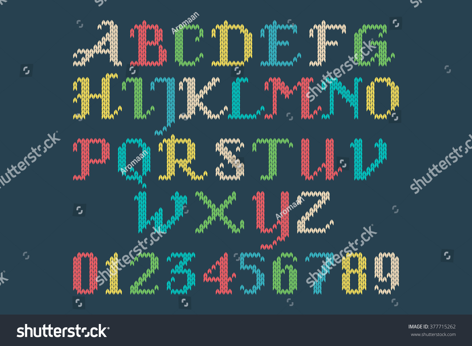
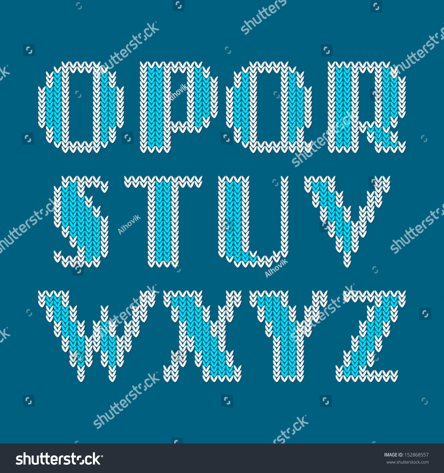
It's important to understand the reasoning behind the necessity of creating this knitting font. Upon searching for Knitting fonts online, you'll come upon a mish mash collection of cross stitch letters, letters made to look like string, and stitches that don't line up... the list of inaccurate knitted alphabets goes on and on. As a knitter, I think it's important that if you're going to design a "knitting font" that you get the details right. Most of the knitted fonts that exist don't get the details correct, and obviously made by non-knitters.
Here are some of the issues I've encountered:
1. The alphabet is actually not a font, but a vector stock art alphabet.
2. The stitches aren't curved like actual knitted stitches are. They're made of straight lines.
3. The letters are regular letter shapes, used as a clipping path for a raster image.
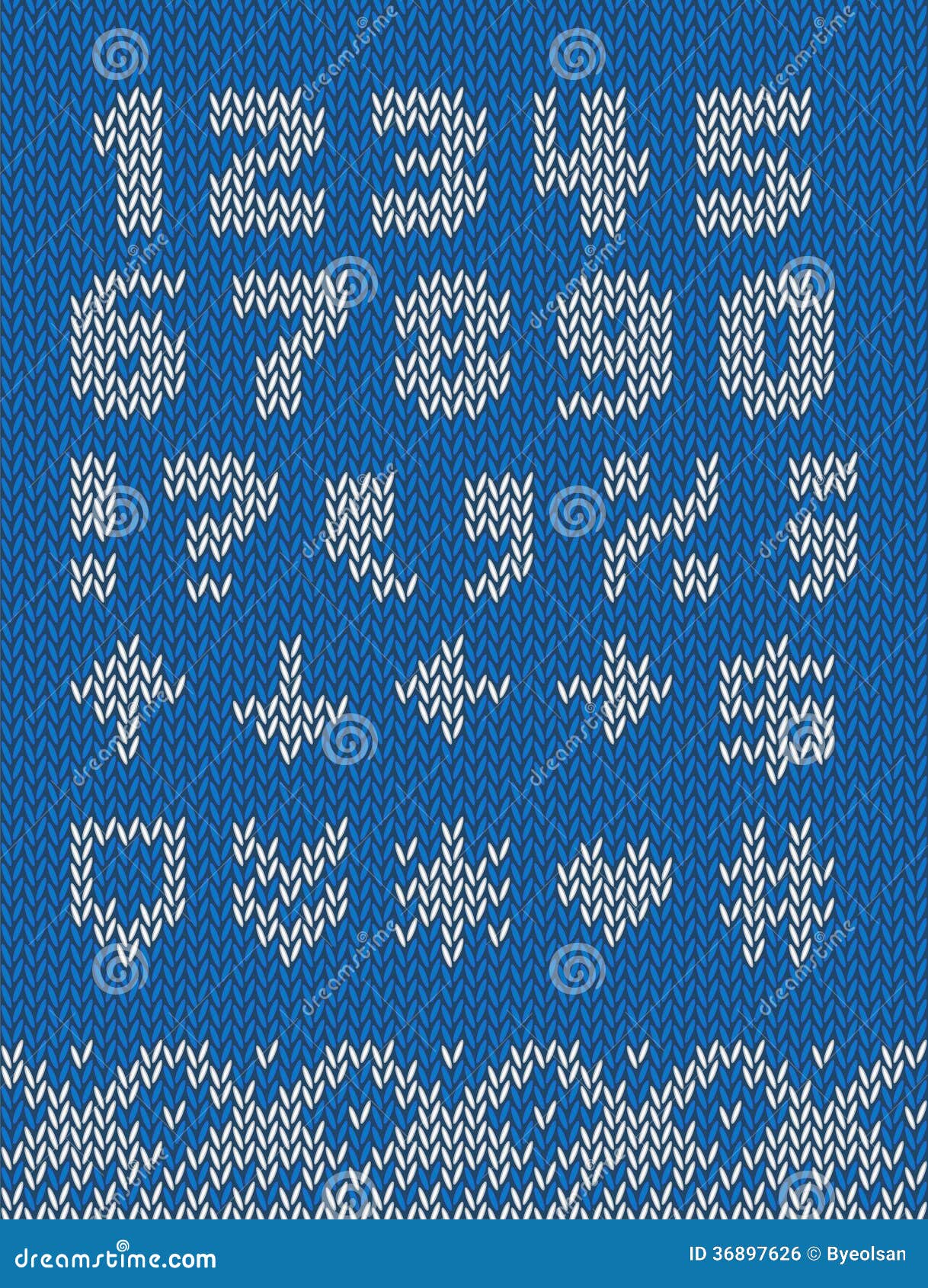
4. The stitches don't line up. The left and right hand side of the stitches should be on the same vertical plane. While the technique below adds visual interest, it is not representative of the true shape of knitted stitches. Plus, the stitches look like little grains of rice. This example, however, does an excellent job of incorporating both sides of the stitch into the design of the letterforms (and not chopping off one half where it is deemed unsightly).
5. The right and left side of each stitch are joined. Knitted stitches are not little hearts. Knitted stitches are actually horseshoe shaped, and mirror each other on around a vertical axis, with a little bit of space in between each half of the stitch.
5. No background stitches. When knitting letters in a design in a physical piece of knitting, they are integrated into the fabric itself, they don't float magically in the air. Hence, the need for background stitches. The background stitches are just as much part of the design as the letters themselves. While it's true that the letterforms can be used without the background stitches (as in the example below), for maximum usability, as well as accuracy in representation to a physically knitted fabric, there should be background stitches available, either as alternate characters, or as a second member of the font family.
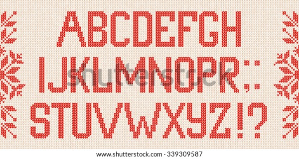
6. Spaces not handled properly. When uses spaces in a knitted design, there are background stitches in the fabric. This font gets a some of the other technical details correct, but it makes no account for the spaces between the words.
Once spaces are added, things break down. The background stitches are gone. We can work around this using some special characters and GREP Styles in InDesign, but in this particular font, the character sets don't match, and the necessary glyphs weren't made to allow the background stitches to be used.
7. Stitches chopped off. Here in another font that makes a fair attempt at knitted stitches. Like the font above, it has no background stitches.
If you look closely, it's clear that the details are wrong. In the corners, the side half of the some of the stitches are chopped off. While that does make the diagonals look a little smoother, it's not technically accurate. This was obviously not designed by a knitter.
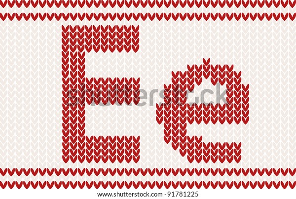
8. Incomplete character set. This is the closest one that I found to an actual knitting font. The shapes of the stitches are correct, the stitches line up, the style of the letterforms is accurate for what knitters use; it's pretty great. It's even in a style common to what a knitter would actually use when knitting names into a garment. The issues that I encountered are that it doesn't have a full character set, and there are no background stitches built into the font itself. So when using this for graphic design it must be used in conjunction with the vector background that is packaged with the font.
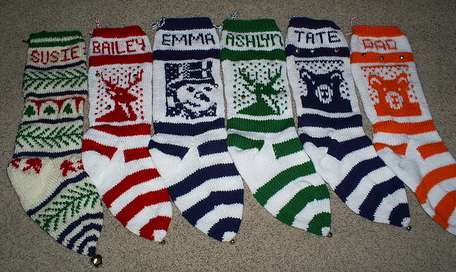
While I can manually create these fair isle letters in Illustrator each time I need them, it's a tedious process to do just every once in awhile. I wanted an alphabet that I can quickly use whenever I need to plan some knitted lettering. For example, I've been making family Christmas stockings for over a decade. I've lost track of how many I've made. It would be really great to just type up my name chart quickly each time I go to start a stocking, rather than get out graph paper and draw it.
By incorporating advanced typographic features like ligatures, I can have more flexibility when working with a set number of stitches. Take these stocking for example. Each name needs to fit within 28 stitches. That's why in the BAILEY and the ASHLYN stockings, the Ys are different. Bailey's name is 6 letters long. Ashlyn's name is 7 letters long and required the stitches to have tighter tracking. The Y is very closely aligned to the L in front of it. Having ligatures and alternate characters in the font allows this to happen either automatically or manually.
Plus, if I have these alphabets as actual fonts, I can quickly and easily typeset knitting letter charts for other knitters on my Etsy shop. I can also use these fonts to personalize my KnitSwag products.
I wanted my knitting fonts to meet the following criteria:
Accurate curves (to reflect the way the yarn forms each stitch)
Stitches aligned to a grid (not offset in any way)
Proper gauge (not too horizontally or vertically compressed). They should be about a .67 height to width ratio.
Incorporate the use of ligatures so that character placement can be adjusted to fit a set number of stitches
Available in different number of stitches high, in order to be used for different types of projects
Available in both Regular and Bold versions
Uses a second font with each font family, for background stitches
Has a complete character set, including punctuation, numbers, and most special characters
How I made the fonts
I used Adobe InDesign and IndyFont Pro to create my custom knitting fonts. IndyFont Pro is a dream come true! It lets me use the software that I know and love to create fonts. The free version lets you create a single character (for bullets), but the Pro version lets you create full character sets. It's well documented, and the user manual is one of the best I've ever seen!
So far I've created two versions of stockinette stitch fair isle knitting fonts: an 8 stitch high and an 11 stitch high version. They are the only knitting fonts of their kind! I'll be designing more in the coming weeks. Would you like to have a custom name chart in these fonts? Head on over to my Etsy shop and I'll set you set up! I made these fair isle alphabets with specifically with knitters in mind.
I am a lifelong knitter. I am also an avid user of Adobe Illustrator. Occasionally, my two loves collide and the result is something useful and unusual. This tool is one of those results.
In my knitting life, I sometimes do a type of knitting called Fair Isle. In popular culture, this is associated with Ugly Christmas sweaters. But in the knitting world, this has been a sophisticated and much loved technique that has existed for centuries before. Do a quick search for stranded color work knitting or fair isle knittingand you'll find hundred of beautiful designs.
The essence of Fair Isle is that it follows a color chart to indicate which color of yarn to use on which stitches. Usually, two strands of yarn are used on each row, and the unused strand of yarn is held at the back of the work. Usually, the color charts for this type of knitting are created in a spreadsheet program.
As a knitter, the issue that I've run into is that knitting stitches are not square. It's simple enough to make the spreadsheet cells roughly proportional to the dimensions of a knitted stitch (roughly 1 wide by .75 high). But once those designs are knitted, the result can be disappointing, because not only are knitted stitches not square, they're not rectangular either. They are horseshoe shaped. Many times, illustrators will draw them as Vs because that's the part of the stitch that is visible from the front of the work. This is especially apparent when using fair isle to design letterforms. Shapes that would normally have lovely curves and smooth diagonals, can have jagged edges.
You may notice that the Vs in the knitted piece below are actually upside-down; this is because this stocking was knit from the top-down, so the knitting is actually upside down while being knitted.
Traditional graph-paper style charts cannot account for this end result. So help knitters better visualize how their final designs will look when knitted, I designed an accurate fair isle chart, made not of rectangles, but of actual knitted stitches.
This is a BLANK fair isle knitting chart (available in both landscape and portrait). This chart comes with two versions: one has gridlines and the other does not. On the gridded version, every fifth row and column is a darker shaded outline.
It works for both top-down as well as bottom-up knitting. If you are a knitter and want a better type of knitting graph paper, then this is for you!
If you are a knitter, please visit my KnitSwag Etsy shop and see all the other lovely knitterly items I have for sale. I have designed them with you in mind!
I recently stumbled across RagingHull, which is a very cool script from Indiscripts. Indiscripts's tagline is "InDesign Scripting Playground."
According to the Indiscripts website:
"While studying bounding boxes and transformations I realized we could get nice patterns based on successive rotations applied to a given shape. As InDesign instantly determines the coordinates of the enclosing rectangle whatever the page item transform state, I had fun in drawing those boxes while varying strokes and angles. Jongware made similar experiments with its famous Spirographs script. RagingHull is just another free toy that reveals the bounds of a spinning object…"
The samples in the original article all used solid colors and "Exclude Overlap" in the Pathfinder. It creates amazing patterns! But I wanted to see what would happen if I used gradients instead of solid colors.
Now, if you've ever tried to make a complex gradient in InDesign, you're probably familiar with how difficult it is. In one of my other articles, I outlined a case for creating your gradients in illustrator, rather than InDesign. Illustrator has an expandable gradient panel so it's easier to work with. Plus, you can copy and paste objects from Illustrator right into InDesign, and they will bring the gradient swatches with them.
But did you know that Illustrator already has a large selection of pre-built gradients? Go to Window > Swatch Libraries > Gradients.
Choose one of the gradient libraries, and it will open up in a new panel.
I wanted all these gradients, so I made a bunch of rectangles, and applied the gradients swatches to them.
Then I copied and pasted them into InDesign, where they show up in the Swatches panel. Now you can delete that mess of rectangles.
Now, run the script according to the instructions on the RagingHull page.
Now you can start experimenting with all the gradients you copied over from Illustrator. I also added played with the blending modes. Note that you will get very different results, depending upon which Transparency Blend Mode you use (RGB or CMYK).
CYMK Transparency Blending Mode
RGB Transparency Blending Mode
Here are some of my other experimentation results.
You can different results just by changing the gradient type from Linear to Radial.
Linear Gradient, Red, White, and Blue, Lighten
Radial Gradient, Red White and Blue, Lighten
Linear Gradient, Soft Light
Linear Gradient, Hard Light
Linear gradient, Color Burn
Luminosity, Hue
By adding a shape with a different color on top, you can create even more interesting effects.
Mixed gradient swatches and blending modes
For this one, I scooted the objects a bit and it gave me what resembles a zygote.
Radial Gradient, Lighten, With objects scooted a bit
Sometimes the results look like a dance party.
Sometimes, you can even turn it into a globe-like effect.
Which, for some reason, when I grouped and pasted it into a tan colored circle, became green.
The original Raging Hull article discussed using the Exclude Overlap button in the Pathfinder. So I did that, then I went to Object > Paths > Release Compound Path, and ran the script again. Add some corner effects, a stroke style, and voila! Fancy!
Fancy! (Note that this will last one will take a large amount of processing power).
Now, for me, if I ever used any of these objects, I would probably just take a screen shot of the part I wanted, and use it as a design element. But however you choose to use your Indesign tie-dye designs, have fun!
Valentine's Day is coming up, and so for me it's time to take a break from the serious work in order to make a design full of fun and whimsy. Learn how to make this design using Conditional Text and a quirky little Rorohiko script.
I started this afghan after I did the Atlantic Triangle Waves afghan. The original afghan was done using six colors of greens and blues, and one color of white.
Would you like to purchase the pattern for this afghan?
I had such a good time with the first afghan that I wanted to make it again in a different colorway. A year or so after I finished the first Atlantic Triangle Waves afghan, I came across the opportunity to purchase a small portion of KnitPicks 150 Palette Sampler.
According to the Knit Picks website:
"Indulge your fiber senses in a world of color with the 150 Palette Sampler! This fingering weight wool is ideal for projects that let you play and experiment with new and exciting color combinations. And with one ball of each of the 150 colors that make up the Palette yarn line, the sky is the limit for what you can create. With an updated and expanded selection of colors, the 150 Palette Sampler covers the entire range of the gradated color wheel alongside an extensive range of supporting neutrals, soft and muted pastels, and complementing heathers."
I was able to purchase this small portion of all the colors from a woman on Ravelry.com. For you non-knitters out there: Ravelry is a combination social media, e-store and self-publishing platform just for fiber enthusiasts.
So, here's how I got all the colors: some amazing woman on Ravelry purchases the entire sampler for $419, then personally winds down itty bitty little butterflies of each color, for each person, according to how many portions they purchased. So if she had ten people who wanted to split the sampler, she would wind down 1500 tiny little butterflies of yarn. She even labels each color with the color name and dye lot, and make itty bitty ball bands! I think my single portion cost around $40.
When I received my small portions of each of the colors, they came neatly wound in color-coordinated groups of about 10. I would have taken pictures of all the yarn butterflies in advance, only I didn't think about it at the time. These browns are the only Palette yarns I have left and they didn't make it into the final afghan. See how neatly they are wound?
So back to my multihued triangle afghan...
Multi-hued Afghan made in Palette Yarn
The challenge of using this yarn was the very limited amount of each color with which I had to work. I suspect it was about ten yards of each color, though I never measured.
Designing with yarn as a medium is very diferent then designing for printed piece. One of the reasons for this is because the length of yarn is finite: each ball of yarn contains only so many yards. But when designing a printed piece, you're not limited by the amount of ink you have to work with. You may be limited by the number of colors you'll be printing, but not in the volume of ink you have to work with. It's not like you'll run out mid-way through the production process.
So, I had small amounts of 150 different colors to for with. Since this afghan was based on the Atlantic Triangle Afghan, I knew that I needed a thin white yarn to use for the diagonals. While I suppose I should've used a few balls of white Palette (which is the yarn I would be using in the rest of the afghan), I was itching to get started I decided to use a hank of white sock yarn I had on hand. The weight was close enough for me.
I ended up running out of the white sock yarn a couple of strips in, and I figured I could just call up the yarn store I bought it from (four years previously) and order more. Ha! It turns out I didn't have the ball band (which contains the yarn company name, color, and dye lot number), so ordering more was impossible. Calling up a yarn store and asking for more of that "white yarn" is akin to calling up a clothing store and asking for more of those "blue jeans."
I ended up buying some Lorna's Laces natural sock yarn. The weight was close enough to the multicolored yarns, and really, who would be looking at the white stripes when they had all those beautiful colors at which to gaze?
Lorna's Laces Natural Sock Yarn
So why Lorna's Laces? Lorna's Laces is a yarn company that specializes in hand dyed yarn of interesting colorways. Her yarn is very popular and is a joy to knit with. You can find it in most every yarn store across the county. Because her hand-dyed colors are so popular, it was surprisingly difficult to find plan white Lorna's Laces sock yarn. None of the local shops I checked carried white Lorna's Laces sock yarn. The only reliable source I found online was Jimmy Bean's.
So, after purchasing a few skeins of white sock yarn, I was ready to get started. I rarely rely on formal patterns (I typically stick to knitting afghans). I usually draw a rough sketch (or sometimes not), grab some needles and yarn, and cast on! After just a couple tries, I managed to get a triangle dimension that worked with the amount of yarn I had in each color. The basic idea is the same is on the Atlantic Triangle Afghan, only that I changed colors on every triangle instead of on every strip. I also did all small triangles, instead of both small and large triangles.
Once I was done with the knitting, I wanted to figure out a way to create this design in Illustrator without having to draw dozens of little triangles by hand.
But first, let's back up and look at the completed afghan.
Multi-hued Afghan made in Palette Yarn
The design was knitted in strips, one hue at a time. I did all the pinks first, then moved onto the reds, then the yellow-oranges, etc., all the way down the color wheel.
After each strip was completed, I knitted a white strip onto the side and then grafted it to the adjoining strip. (Incidentally, there was supposed to be more blue in this afghan, but I had accidentally misplaced the entire bag of all-blue yarns until after I was done and all the rest of the strips were sewn together.)
So, back to the task at hand: how to recreate this design in graphic design software. The original Atlantic Waves afghan I designed in InDesign. That pattern was well-suited for inDesign. You see, InDesign has a great table feature that allows you to use diagonal lines in your table cells. What that means is that by adding a diagonal line to a table cell, you can take a square cell and instead turn it into two triangles that, together, for a square.
But InDesign won't work for this multi-hued version because InDesign only allows you to have one color per table cell, not two. And this colorway has requires each triangle to be a different color, so I would have to use Illustrator.
We'll create all those triangles in just a bit. But first we're going to start by extracting all these colors from the image and creating them as swatches in Illustrator.
Step 1: Make a new document in Illustrator and place the image of the afghan into it. Now (for you knitters out there) I need to give a disclaimer: you'll likely notice pretty quickly that I did not block this afghan before I photographed it. So there are all kinds of lumpy-bumpies and weird shadows. Sorry. But keep in mind that this is a graphic design blog, not a knitting blog.
Step 2: Get out your trusty eye-dropper tool. But before you start eye-droppering, double click on the eye-dropper tool in the tools panel. Have you ever done that before? No? Well, you're in for a treat! The top-most setting for the eye-dropper tool is Raster Sample Size, and incidentally this is the only setting with a drop-down menu. The default setting is Point Sample. But you're may have gotten changed to one of the other options in that drop down. So just verify that it is set to point sample and not 3x3 Average or 5x5 Average. For our purposes today, nothing else in that dialog box matters. Click OK.
Step 3: Zoom in nice and close on the first triangle and then click the New Swatch button at the bottom of the Swatches panel. Be sure to click on one of the lighter areas. You'll get the following dialog box.
But what if you want to just eye-drop your colors and create swatches without having to click OK through that dialog box 70 times? You're in luck!
Step 4: Click on the lightest part of the next triangle. The Opt+Click on the New Swatch button. See how the swatch automatically gets added to the Swatches panel without you having to click through that dialog box? It's like magic!
Step 5: Repeat Step 4 for the remaining colors in the first strip.
Step 6: Select all the 10 swatches you just made and click the New Color Group button.
Give the Color Group a name.
See how all 10 swatches have moved into the new color group? Nifty!
Step 7: Repeat Steps 4-6 for the remaining triangle colors in the design. Ooh! Pretty! You may want to rearrange the colors a bit in the color group to get them in the correct tonal order.
Now it's time to make the triangles!
Step 8: Be sure that your document units are set to points. I like to work in inches when I am laying out a page, but when I am dealing with effects, I really prefer working in points, as it gives me greater control.
Step 9: Create a rectangle the same proportions as one of the strips. You can fill it with whatever color you want, as we're going to change it later. For now we just need a color that will stand out nicely against the colors of the triangles.
Step 10: Effects > Scribble. Now I've seen the scribble effect misused quite a bit, especially right after it was introduced. But when you customize the settings, and use Scribble in conjunction with other effects, it's pretty powerful.
The Scribble dialog box has 11 different built-in settings, but you can customize the settings however you want. Don't just settle for the default Scribble settings. Customize them!
But so you have an idea of the default settings, here they are used on my peach colored rectangle.
Default Scribble Settings
Childlike
Dense
Loose
Moiré
Sharp
Sketch
Snarl
Swash
Tight
Zig-zag
Okay, so now that you have an idea of how the scribble effect can be customized, let's customize it! I added a little variation to my scribble so that it would more closely resemble the original knitted afghan.
Custom Scribble Settings
Step 11: Transform Effect. Since the original afghan has seven strips, I went to Effect > Distort and Transform > Transform... That brought up this dialog box, where I made six copies of my scribble shape, with an 82 pt horizontal move.
Note: Apparently, my original photo was taken at a slight perspective, so they strips aren't perfectly rectangular in the photo. So I moved the photo up above my scribble drawing, so that I can see they both, and I'm not worried about trying to exactly line up the drawing to the photo, but instead, just using the photo for reference.
Step 12: Click on the Live Paint Bucket Tool. The Live Paint Bucket Tool is hidden under the Shape Builder tool. Note: The next couple of paragraphs I got from the Adobe website.
Select the Live Paint Bucket tool . Click and hold the Shape builder tool to see and select the Live Paint bucket tool. See Select a tool to learn other methods for selecting tools. See Tools panel overview to locate all the tools.
Live Paint Bucket Tool
Specify the fill color or stroke color and size you want.
Note:
If you select a color from a the Swatches panel, the pointer changes to display three colors . The selected color is in the middle, and the two adjacent colors are on either side. To use an adjacent color, click the left or right arrow key.
Thanks to the helpful writeup from the Adobe website, we know that that the cursor will give us an indication how the colors in the swatches panel. So it becomes easy to paint in the colors into the correct triangle, by arrowing through the swatches in the swatches panel as we click into each triangle.
Step 13: Start live painting! But wait! What is this error message?
Step 14: Object > Expand Appearance. This step will allow you to start filling all the triangles with color. Now, resume painting!
Step 15: Start Live Painting! Next I I chose the Live Paint Bucket Tool, and then clicked on the object to make it a Live Paint Group. then started clicking inside each one of the triangles, while at the same time, using my arrow keys to cursor through the swatches. Pressing the right arrow will fill your Live paint Bucket with the next swatch on the left. Likewise, pressing the up arrow will fill the Live Paint Bucket tool with the next swatch up.
Watch this video to see how I painted in all the triangles.
After the triangles were filled with the appropriate colors, I then selected the peach strokes and changed them to white.
After painting all the triangles
Strokes changed to white
Step 16: Flip every other rows of triangles. After I stepped back from the design and compared the original photo to the scribble illustration, I realized that I forgot to flip every other row of triangles. So I expanded the live paint group and selected every other row and flipped them.
Right Click > Transform > Transform Each...
Reflect X
Step 16: Adjust the white and add a filter. Since the original white yarn was not put white, I added a little under color to it to. Then I experimented with raster effects from the Filter Gallery.
Step 17: Finish it off with a drop shadow, just to set it off from the rest of the page.
Multi-Hued Afghan, Recreated in Illustrator
And for reference, here is the original afghan.
Multi-hued Afghan made in Palette Yarn
If you'd like to learn more about this history of this design, read about my Atlantic Triangle Waves afghan. Happy knitting!
Would you like to purchase the pattern for the Atlantic Waves Triangle Afghan?


