If you’ve ever tried to use numbering in a table, you’re likely familiar with the behavior of how InDesign determines where to place the numbers. As demonstrated in this article, you’ll see that InDesign will scan the table from left to right and then from top to bottom and apply the numbering this way.
But what if you want the numbers to be assigned from top-to-bottom and the left to right? It’s possible, but not inside of a table. With Western languages, text flows from top to bottom, and right to left. So what we need to do is construct our numbered list in a way that matches that flow. And then add the borders.
Read the entire article at InDesign Secrets.
Showing posts with label Tables. Show all posts
Showing posts with label Tables. Show all posts
Wednesday, July 24, 2019
Monday, September 18, 2017
Solving Problems With Complex Table Formatting
I recently had to design a calendar in InDesign using complex table formatting with very specific requirements for row and column strokes:

Initially, I tried to use InDesign’s row and column strokes to accomplish this, but that proved to be impossible. After mentally chewing on this issue for a week, I decided to almost completely ditch the idea of using row and stroke formatting for this. This table is so complex and unusual that I thought I would share how I created it.
Read the entire article at InDesign Secrets: Solving Problems With Complex Table Formatting
- Thick lines separating each month, spanning across the columns
- Names of the months in white, with a colored background
- Individual days with row dividers, but not column dividers
- Row dividers could not span across the columns
- Weekends formatted like the weekdays, but with blue row dividers
- Weeks starting with Monday

Initially, I tried to use InDesign’s row and column strokes to accomplish this, but that proved to be impossible. After mentally chewing on this issue for a week, I decided to almost completely ditch the idea of using row and stroke formatting for this. This table is so complex and unusual that I thought I would share how I created it.
Read the entire article at InDesign Secrets: Solving Problems With Complex Table Formatting
Thursday, February 11, 2016
An Easier Way to Apply Gradients to Table Cells
For years now, it has been extremely difficult to apply gradients to individual table cells. David Blatner wrote an article nearly seven years ago dealing with the subject, and since then it has never gotten any easier to apply gradients to table cells... until recently.
Previously, gradients would by default stretch across the entire width of the table, by my new technique uses Paragraph Shading and Paragraph Styles to easily contain the gradients to a single cell. Read the entire article at InDesign Secrets.

Previously, gradients would by default stretch across the entire width of the table, by my new technique uses Paragraph Shading and Paragraph Styles to easily contain the gradients to a single cell. Read the entire article at InDesign Secrets.
Wednesday, July 1, 2015
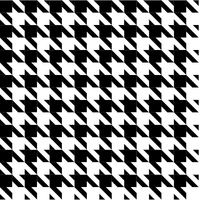
Creating Houndstooth Patterns
Tables are the prefect tool for creating patterns in
InDesign, even ones as seemingly complex as the
hallowed houndstooth.
Read the entire article in InDesign Magazine, Issue 75.
And in case you don't know, InDesign Magazine is included as part of the premium membership to InDesign Secrets. Don't have a membership? Well, why not? It's only $5.95/month! What a deal!
Read the entire article in InDesign Magazine, Issue 75.
And in case you don't know, InDesign Magazine is included as part of the premium membership to InDesign Secrets. Don't have a membership? Well, why not? It's only $5.95/month! What a deal!

Monday, May 4, 2015
How to Check Tint Shades the Using Separations Preview Panel
I recently designed a large table (900+ cells) for a client. I used cell styles, paragraph styles, and character styles. We went through several iterations as the client decided how she wanted various tints to appear in the design. At the very end of the project, the client asked me to double check the tint shade of the gray cells.
Read the entire article at InDesign Secrets: http://indesignsecrets.com/check-tint-shades-separations-preview-panel.php


Read the entire article at InDesign Secrets: http://indesignsecrets.com/check-tint-shades-separations-preview-panel.php


Thursday, March 19, 2015
Supercharge Your Graphics with Cell Styles
I am in the process of building raised garden beds and I needed a way to plan the beds and easily edit what is planted in each square. Learn how I used InDesign Cell Styles to aid me in planning my new raised garden beds. Read the entire article at InDesign Secrets.
 |
| Square Foot Garden Bed Plan using InDesign Cell Styles |
Thursday, October 30, 2014
How to Make Lumberjack Plaid
How do you think this plaid was created? Squares: stepped and repeated? Or perhaps using a plugin? Or maybe a table? Learn how by reading this article over at InDesign Secrets.

Tuesday, April 30, 2013
Ignite! 2013: Making Patterns in InDesign
This was the slideshow I created for my Ignite presentation at the 2013 Print and ePublishing conference. The original presentation was 5 minutes long, with the slides auto-advancing every 15 seconds. In this video, I opted to take a bit more time for each slide, so I could better explain each pattern and how it was created. I discuss TeaCup PatternMaker, InDesign tables, Illustrator graphic styles, InDesign stroke styles, type on a path, and knitting.
Tuesday, June 26, 2012
Make a Mondrian using InDesign Tables
Want a Mondrian, but can't afford the real thing? You're not alone. Don't worry, you can make a similar design using InDesign tables. Take it one step further and have it printed large format on canvas, and hang it in your office.

Congratulations! You just saved yourself $27 million.

Sunday, May 20, 2012
Mysteries of the Elliptical Overset Cell Symbol Revealed
Fo many years, I have followed InDesign Secrets as a huge fan. I've attended their conferences, given them unsolicited Obscure Feature ideas, and relied on their website and podcast as the primary source of my InDesign education. Whenever I encounter a problem in InDesign, their website is the first place I look for answers.
I am so thrilled that David and Anne Marie have welcomed me to "the team" of InDesign Secrets Contributors! That was truly a momentous day in my life. So, please, check out my latest blog post, which I am honored to have published at InDesign Secrets.
Please take a moment to read: Mysteries of the Elliptical Overset Cell Symbol Revealed.

Wednesday, December 7, 2011
The Trick to Getting Column Strokes to Be in Front
Yesterday I was working on a table that needed to have red column strokes and white column rows. The column strokes needed to be on top. I thought it would be easy. I went to the Table Options dialog box (or command+Shift+Option+B...similar to the Text Frame Option dialog box, with a couple other modifier keys thrown in.)
The screenshot below shows the dialog box as it was set initially. I thought, "This should be simple. I just nee to change the stroke drawing order." So I then changed the stroke drawing order to Column Strokes in Front.
 |
| Row Strokes in Front |
But nothing happened. I attempted it several times, but gave up, thinking I could tackle the problem again after a good night's rest. But the next morning, I came back and the problem was still there. Row Strokes were in front, even though I told them not to be.
I thought maybe it a screen issue. For example, sometimes when viewing a page in Acrobat, if the page has a table with all the same stroke weights, sometimes some of the row strokes seem thicker than others. But I've never seen InDesign display stroke weights incorrectly before, so that couldn't be it. I thought maybe by modifying the weight of the column strokes, I could fatten them up enough visually that they would seem like they were in front. Sort of like visual dot gain.
 |
| Column Strokes should be in front, but they are not! |
So I changed the column strokes to 2 pt and they were now magically in front. I changed them back to 1 pt just to see what would happen and they were still magically in front. After a little experimenting, it turns out that InDesign doesn't actually change the drawing order unless you go back and modify the strokes (whichever ones you want on top) again. For example, if you change the settings to be Column Strokes in Front, after exiting the dialog box, you'll need to then go back into the table and modify your column strokes somehow. Change the color, change the stroke weight, whatever you want. But somehow, the act of modifying the column stroke tricks InDesign into doing what you had asked it to do in the first place.
Likewise, if you change your settings to be Row Strokes in Front, you'll then need to go in and somehow edit your row strokes for the setting to actually take effect.
 |
| Now column strokes are really in front |
Monday, October 17, 2011
When Text Won't Left-Align
I recently came across a bit of text that wouldn't left align. It would center-align and right-align just fine, but it wouldn't left align. (Note that my left-indent was set to zero, and my left-cell padding was set to only 0.08 inches.)

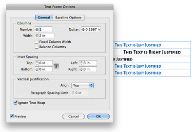


I tried what normally works to fix alignment isues: I went to the Text Frame Options. I figured that maybe there was a mysterious text-wrapping on an object nearby. So I checked the Box "Ignore Text Wrap." I figured that would solve the problem. But no.

So then I went though all the paragraph settings and tried to see what would cause left aligned text to NOT left align. I didn't find anything that would cause weird indent issues. However, I found that this paragraph style (H4) was based upon another paragraph style (H1).

So I applied the H1 paragraph style to the text in my table, and it magically left-aligned as it should.

I then reapplied the H4 style, and tried copying and pasting the offending H4 text into a new text frame, and it left-aligned as one would expect it to.

So then I went back to the H4 paragraph style options and examined the differences between the H1 and the H4. After a little digging, I found that the H4 had an "align to decimal" tab stop.

I removed the tab stop, and presto! The text now left-aligned as it should. (See the fourth row?)

I'm not sure why the "align on decimal" tab stop was there... I most certainly put it there intentionally at some point in time, though I don't know when, nor why. For some reason, I was trying to align digits, and had set the tab to align on a dollar sign. (Click on photo to enlarge.)

Based on the fact that the same text behaves differently when placed in a table, I am inclined to think that there is a bug in inDesign, that when you use an "align on" tab stop within a table, InDesign will not honor your left-align paragraph settings. Though I have used the words "Left Justified" in my screenshots, this issue holds true for both left aligned, as well as left justified text within a table.
Edit on 4-23-12: I recently came across a great article that explains this behavior. Apparently, this falls into the category of: "it's a feature, not a bug." Check out the InDesign Secrets article on this topic: Tab Stops in InDesign Tables.
Saturday, October 8, 2011
Diamonds, Dots, and Waves: Stroke Style Options for InDesign Tables
For today's episode of Fun With InDesign Tables, I started out by to experimenting with the White Diamonds stroke style.
I made a table 4 columns by 2 rows and gave it a 35 point White Diamond stroke. Just a note: "White Diamond is the name of the stroke, but you can color the diamonds however you want. I suspect that the name "White Diamond" has to do with the fact that the center of the diamonds appear as white (paper-colored)...that is, unless you give the stroke a gap color.
Then I colored the outside border red, and the inside column strokes to yellow.


Next, I took the same table and gave it a stroke style of Japanese dots. Notice how the black gap color now extends to fill out the rounded corners. This one sort of reminds me of the beaded counting toys that I remember from my childhood

I made a table 4 columns by 2 rows and gave it a 35 point White Diamond stroke. Just a note: "White Diamond is the name of the stroke, but you can color the diamonds however you want. I suspect that the name "White Diamond" has to do with the fact that the center of the diamonds appear as white (paper-colored)...that is, unless you give the stroke a gap color.
Then I colored the outside border red, and the inside column strokes to yellow.

Next I took the same table and widened it a bit, and then added a black gap color to the table strokes. I thought it was interesting that the gap color stayed confined to the border of the diamond shapes, and made inverse white knockouts in the corners of the table.

Next, I took the same table and gave it a stroke style of Japanese dots. Notice how the black gap color now extends to fill out the rounded corners. This one sort of reminds me of the beaded counting toys that I remember from my childhood

Here are a few more tables, with different stroke styles.
 |
| Straight Hash Stroke Style |
 |
| Think-Thin-Thick Stroke Style |
 |
| Wavy |
 |
| Dashed |
Note that the only thing I changed in these 6 tables is the stroke style. The stroke width, stroke colors, and gap color remained the same.
Friday, September 30, 2011
The British Flag as an InDesign Table
This post is a continuation of my other posts about diagonal lines within tables. Now for those of you who are British, please don't get upset that I didn't get the diagonals quite right. But my goal was to: using a single InDesign table, replicate the British flag as closely as possible.
Technically, the diagonals should line up exactly from one corner of the table to the opposite corner of the table, but InDesign: diagonals run from one corner of the cell to the opposite corner of the same cell. In this case, our table is 2 cells wide by 2 cells high, so the diagonals aren't perfect. But you get the idea.
My mental starting point for this table was a graphic containing geometric specifications for the British flag. You can find it here.
Because the specifications graphic listed proportions for the stripe width, I was able to create custom stripe stroke styles based on those proportions.
First, I made a table; then I filled the table with Blue and then started working on my strokes. I made a three custom stroke styles: one for the horizontal and vertical lines, and two for the diagonals. Then I applied a thick white stroke, set the gap color to Red, and applied my new custom stroke styles.
So, download my sample files, make 2 row by 2 column table, with the cells each 15 points high x 30 points wide. Then apply these cells styles to it. Voila! An almost British flag.

 |
| The stroke style for the horizontal and vertical table strokes (10 pt white stroke with gap color set to Red ) |
 |
| Stroke style for the right-slanting strokes (6 pt white stroke with gap color set to Red) |
 | |
|
Thursday, September 29, 2011
The Case of the Possessed InDesign File - Mystery Solved
I recently encountered a problematic file that locked up every time I got to a certain point in my editing tasks. After restarting InDesign a few times, I attempted to go right back to where I left off, only to have the program lock up again. Here are the things I attempted before I was able to pinpoint the problem:
- Restarted InDesign
- Deleted preferences
- Deleted my InDesign recovery files
- Restarted my computer
- Tried editing the file from a different machine
Then I tried editing another section of the file (a different page), and all was fine... until I went back to that troublesome editing spot, which, in this case, was a table. Every time I touched the right-hand border of the table, InDesign locked up. I found that I could edit the text, and pretty much anywhere else in the file, just not the right hand border. So I decided to get rid of the table.

But I didn't really want to retype the whole thing, so I converted the table to text, then converted the text back to a table. And now I was able to move the right border without my program freezing.
But I didn't really want to retype the whole thing, so I converted the table to text, then converted the text back to a table. And now I was able to move the right border without my program freezing.
For instructions on how to delete your InDesign Recovery files, see Anne Marie's instructions at the bottom of one of my other posts: "InDesign Crashing and Making Me Crazy.
10-8-11 Edit: After thinking on this for a few days, I suspect the problem may have to do with Keep options. I had all the cells in my table set to "Keep with next row," but I also had a few paragraphs to "Keep with the next 1 line." I think there may have been a conflict between the two, and when I tried to make move the right-hand border of the table, InDesign just didn't know what to do, and so it froze up.
The next time this happened (and I'm confident that it will), I will closely inspect the keep options and document my findings here.
Thursday, August 25, 2011
Fun with Geometrics! Stripe Stroke Style + Tables + Diagonal Lines...
I came up with this stroke style idea while driving around town, slightly distracted at the geometric patterns used in traffic signage. Perhaps I should pay more attention the street names, and less attention to geometric patterns around me. Needless to say, I often get horribly lost. Here is what I saw that made me inspired to combine a stripe stroke with diagonal lines. This is offically known a "bicycle priority lane."

Here is my version: It is a 2-column, 2-row InDesign Table. The cells are filled with blue, and I made a custom Striped Stroke Style, which I then applied as 48 pt crossing diagonal lines at 50% tint.

There is a trick to getting the diagonal lines to line up perfectly both horizontally and vertically. You must have the space at the top of the top stripe be an equal distance from the bottom of the bottom of the bottom stripe. In this example:
- The top stripe starts at 5% and extends 10% of the width of the stroke. That makes the ending point of the first stripe is 15%. Then I have a 10% blank space.
- Then second stipe begins at 25% and extends down to 35% . Another 10% blank space.
- Third stripe goes from 45% to 55%.
- Fourth stripe goes from 65% to 75%
- Fifth stripe goes from 85% to 95%
So there is a 5% blank space at the top (from 0-5%) and another 5% blank space at the bottom (from 96-100%).

Here are the diagonal lines settings that I used for these cells.

In this next example, I changed the diagonal lines from crossing diagonal to right slanting diagonals. Then I added a 48 point cell stroke (using my aforementioned custom stroke style) around all the cells. (Click on the pictures to enlarge them so you can see the stroke panel). This one is orange because I had the cells highlighted so the stroke settings I used would show up in the panel.

Here is the same design, unhighlighted, so you can see the original blue.

Something cool that I discovered is that because the pattern is created within the cell settings, when you increase the number of rows and columns (by holding down Alt/Option and then dragging on the table or cell borders), when more rows are added, they inherit the same size and styling as the cell you're dragging from. So it works like a dynamic step and repeat, only it's accomplished through just option-dragging. The pattern enlarges magically, right before your eyes.

Here is another example of a 2 row by 2 column table, 48 pt wide x 108 pt H, with a 108 pt crossing diagonal lines cell stroke. Because the cell diagonal lines are equal in stroke weight to the width of the column, they line up perfectly and make tidy little diamonds.


You can more easily utilize reversed gradients by first making one gradient swatch, then swapping the colors and making a second swatch. Like so:

If you're want to investigate this technique further, or use my stroke style for your designs, here you go. I made a zip file with an CS 5.5 INDD, an IDML, and a PDF. Enjoy.
Monday, August 15, 2011
Using InDesign Tables to Duplicate the Window Structure Outside the Lincoln Memorial
Last May, I was able to attend the 2nd annual InDesign Secrets Print and ePublishing conference in Arlington, VA. I spent each day at the conference surrounded by fellow InDesign aficionados, talking about prepress, interactive graphics, searchable PDFs, and best practices for publishing workflows. Those conferences are more fun for me than any theme park. I was on InDesign overload, and loving every minute of it.
On the last evening of the conference, my husband and I took some time to tour the National Mall. Since I was recovering from the aforementioned (self-induced) InDesign overload, all I could think of was patterns. (If you've read my blog for awhile, you may have read some of my other posts about patterns.)
While I was touring the several-hundred-year-old buildings and streets, I snapped a few photos of some of the more interesting patterns in the architecture, with plans to recreate the geometry using InDesign tables.
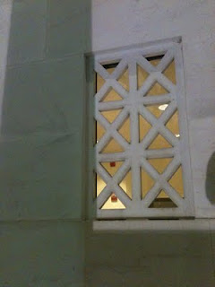
This photo is of the concrete window-type architectural details on the Lincoln Memorial. If you're inside the memorial, and about to head back down the stairs, stop and turn to your right. Walk two columns past the main entrance and look at the face of the wall. That's where you'll see these window cutouts. These tiny little windows are so small when compared to the rest of the memorial, that they're nearly impossible to see on most of the Lincoln memorial photos I found on the web. But fortunately, I found a photo that displayed the little windows on both sides of the Lincoln Memorial. See the little windows? (By the blue arrows.)
Here are the windows up-close.
Since my plan was to recreate the geometry of the windows in InDesign, let's get started. There are a couple of different ways to create these windows. Both methods use Diagonal Lines.

Table Cells with Crossing Diagonal Lines
Make a table with two columns and three rows, with crossing diagonal lines, as shown below. Using the Crossing Diagonal Lines method, each cell has an X through it, and so if you choose to fill your cells with colors, they will be limited in that the entire cell has to have the same fill color. This is definitely the easier of the two methods, as each of the cells have the same stroke and diagonal lines settings.
Table Cells with Single Diagonal Lines
Another way to create this window pattern is by making a table with 4 rows, and 6 columns, and manually formatting each of the cells with a single diagonal line. I explored this idea in another blog post: Data-less Tables: InDesign Meets Knitting.
On the last evening of the conference, my husband and I took some time to tour the National Mall. Since I was recovering from the aforementioned (self-induced) InDesign overload, all I could think of was patterns. (If you've read my blog for awhile, you may have read some of my other posts about patterns.)
While I was touring the several-hundred-year-old buildings and streets, I snapped a few photos of some of the more interesting patterns in the architecture, with plans to recreate the geometry using InDesign tables.
This photo is of the concrete window-type architectural details on the Lincoln Memorial. If you're inside the memorial, and about to head back down the stairs, stop and turn to your right. Walk two columns past the main entrance and look at the face of the wall. That's where you'll see these window cutouts. These tiny little windows are so small when compared to the rest of the memorial, that they're nearly impossible to see on most of the Lincoln memorial photos I found on the web. But fortunately, I found a photo that displayed the little windows on both sides of the Lincoln Memorial. See the little windows? (By the blue arrows.)
 | |
|

Since my plan was to recreate the geometry of the windows in InDesign, let's get started. There are a couple of different ways to create these windows. Both methods use Diagonal Lines.

Table Cells with Crossing Diagonal Lines
Make a table with two columns and three rows, with crossing diagonal lines, as shown below. Using the Crossing Diagonal Lines method, each cell has an X through it, and so if you choose to fill your cells with colors, they will be limited in that the entire cell has to have the same fill color. This is definitely the easier of the two methods, as each of the cells have the same stroke and diagonal lines settings.
 |
| 2 Columns, 3 Rows, Crossing Diagonal Lines |
 | |
|
Another way to create this window pattern is by making a table with 4 rows, and 6 columns, and manually formatting each of the cells with a single diagonal line. I explored this idea in another blog post: Data-less Tables: InDesign Meets Knitting.
Using this method, you have more flexibility in your color choices because there are so many more cells.


Something interesting that I discovered while working with diagonal lines with that they can have different stroke properties than the other cell strokes. By increasing the vertical and horizontal stroke weight (and leaving the diagonal lines at a smaller stroke weight), you can create some interesting effects. For this example, I created a separate orange-filled frame behind the table. I also added a drop shadow to the table frame.


Something interesting that I discovered while working with diagonal lines with that they can have different stroke properties than the other cell strokes. By increasing the vertical and horizontal stroke weight (and leaving the diagonal lines at a smaller stroke weight), you can create some interesting effects. For this example, I created a separate orange-filled frame behind the table. I also added a drop shadow to the table frame.

By adding some color to the strokes, and then shearing the table, you can create some very unique geometric designs.

Subscribe to:
Comments
(
Atom
)