A little history...
This project came about as an attempt to market a newly formed large format printing company. A month or so after I got hired, the company announced that they were going to expand by starting a large format division. We were to get 10 foot wide solvent printer, a 5 foot x 10 foot UV flatbed printer, a digital die cutter (camera guided computer driven table router), and a really big laminator. I was tasked with developing a workflow and a marketing campaign for the new division of our company. So armed with about 3 pages of instructions and $350,000 in equipment, I was off on a new adventure.Prior to purchasing the large format equipment, this printing company did strictly sheetfed work (shockingly, we did not even own a color laser printer). So there was a considerable amount of education to do with regard to large format printing.
The challenge:
Educating traditional print buyers (designers and print brokers) about large format substrates and capabilitiesMy personal objectives:
- To design a mail piece so cool that people not only would not throw it in the trash, but would pin up on their cubicle wall and show it off to their friends.
- To push to the limit the complexity of what my team and equipment was capable of producing.
The project:
Customized MarketMail pieces (non-rectangular) on Sintra board, with variable data graphics, text... and engraving.
Each postcard that we would product would be completely unique. I had seen custom printed postcards before (utilizing different pictures and text). I had also seen CMM postcards before, batch produced by the thousand. But our postcards were going not only combine an unusual shape and custom printing, they were going to have the recipient's name engraved on the front.
The USPS website has a fairly decent writeup about CMM. Basically, it's unusual shaped postcards. They can be weird shapes, have holes die cut through them, they can be even have stuff hanging from them. I heard about a business that sent out flip-flops as CMM mail pieces. Pretty cool!
I chose to use 3M Sintra board for our postcard. Sintra board is an extruded PVC material. It is waterproof, stiff, has perfectly squared edges, and comes in big sheets and various thicknesses. It's great for engraving, and the UV ink doesn't flake off of it like some other substrates.
Here are the step-by-step instructions for creating your own engraved diecut mailers. These instructions are intentionally brief. I am assuming that if you attempt this, you'll already know how to set up templates, do data merge, use InDesign and PDF layers, clean up files in Illustrator, etc. This is more of an overview of a process rather than a tutorial on specific software features.
Note: In many large format workflows, they actually set it up so that the software does the work of imposition, creating cut files, and so forth. You can send a single PDF to the RIP, and the RIP will separate out the Cut file and the Print file. In an ideal world, our workflow would have been set up that way. But for reasons beyond my control, our RIP software didn't communicate with our cutting software. So we did everything manually.
Step 1: Create a 1-up postcard template in InDesign
Front:- Graphic placeholder (Orange Oval)
- First name placeholder (Data Merge placeholder
for engraving) Note: I chose Arial Rounded for the font, and just gave it stroke, no fill. - Cut Path (magenta line)
- Drill holes (green circles)

Back:
- Graphic placeholder
- Address info
- Salesperson contact info
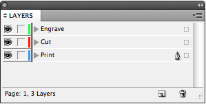
Step 2: Arrange objects on layers in InDesign
- Print layer: everything that is going to be printed
- Cut layer: everything that is going to be cut or engraved (Cut path, drill holes)
- Engrave layer: name for engraving

Step 3: Data Merge
- Choose your data source and merge your data.
- Now, depending upon your version of InDesign, save the merged file for placing into the imposition, OR
- Export a PDF for imposition (including Acrobat layers).
Step 4: Prepare an imposition file, page 1
- Prepare a template.
- Make four layers: Print, Cut, Engrave and Registration Marks.
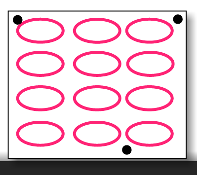
- Put placeholder frames on the Print layer.
- Add registration marks in a triangular position. (The registration marks are what the camera guided table router uses to know where to cut. They work so well you can even put your board on the table crooked and the router will still cut correctly because it uses the registration marks as reference points. These registration marks have nothing to whatsoever with litho registration marks that a pressman uses to align various plate colors. They are similar in the sense that they help with alignment, but that's about where the similarity ends.)
Step 5: Prepare an imposition file, page 2
- Duplicate the placeholder frames onto a second page.
- Add registration marks on the first page.
Step 6: Prepare an imposition file, part 2
- Duplicate placeholder frames from Print layer onto the Cut and Engrave layers.
Step 7: Impose 1-up, only Print layer
- Front: left to right, top to bottom
- Back: Right to left, top to bottom
Step 8: Prepare Cut Paths in Imposition
- Place a page (any page) of the 1-up file into the placeholder frames on the Cut Path layer.
- Be sure to Show Options: show ONLY the Cut layer.

Step 9: Prepare Engrave Paths
- Do a multi-page import of the 1-up front file
- Be sure to show options: show ONLY the Engrave layer.
Step 10: Export Print File
- Hide the Cut and Engrave layers.
- Showing only the Print and Registration Marks layers, export a PDF.
- Depending on your RIP, you may want to rasterize and save as a TIFF.
Note: I know traditional litho prepress folks may gasp in horror over this statement, but large format RIPs typically use this as a workflow. As much as I liked the idea of sending to the RIP unflattened PDFs with native transparency, it just didn't work well. Since TIFFs are the preferred file format and the industry standard for large format RIPs, I figured I was not going to change an entire industry. So we used TIFFs.
Step 11: Export Cut/Engrave File
- Hide the Print layer.
- Showing only the Cut, Engrave, and Registration Marks layers, export a PDF.
Step 12: Clean up the Cut File in Illustrator
- Using, Illustrator, open your the PDF cut file you just made.
- Delete all empty paths (view in outline mode first)
- Outline type (I used Arial Rounded)
- Create separate layers for each type of object: Cut, Engrave, and Registration Marks.
- Offset the stroke by 1/2 the diameter of the router bit you'll be using. (I like to use an Effect for this, then expand the object. That way, there are no extraneous paths to delete.)
Step 13: Go to Production!
- Print board - Side 1
- If using a non-square substrate (like cardboard, polystyrene, coroplast, etc.) square up the board on the flatbed cutter.
- Print board Side 2
- Engrave names
- Drill holes
- Cut out postcards
Tips:
- Have plenty of time on your hands.
- Don't have a project budget.
- Work directly with equipment operators: the guys who run the flatbed printer and table router).
The Finished Product
This was the actual postcard that I mailed to myself when I mailed the postcards to our customers. On the back of the postcard in the top left, you can actually see the tire marks from where it got run over by the mail truck. |
| Postcard Front |
 |
| Postcard Back |
On a slightly different note, I originally prepared this as a Ignite InDesign slideshow for the 2010 InDesign Secrets Print and ePublishing Conference. I feel I should give a disclaimer that this slideshow was done before I owned a laptop, and I had to prepare the slides on the hotel lobby computer the night before, using Acrobat.com. So in case you think the most of the graphics in this tutorial look a little clunky, you're right, they do.
And in case you're not familiar with Ignite! presentations, that's where you prepare a 20-slide slideshow about your topic of choice, and you have 5 minutes to present, while the slides auto-advance every 15 seconds behind you on the screen. And in my case, my audience included pretty much all the super heros of the publishing world (who also happen to be well-practiced public speakers), and I (not exactly a well-practiced public speaker) was doing my very best not to hyperventilate. Exhilarating? Yes, indeed. Terrifying? OMG! But hey, when I was done, they gave me a neat little magnet to hang on my fridge. It was totally worth it. I'm doing it again a this year's conference!


If you'd like to try a similar project, I just learned about new software that makes this process much easier. It's called DesignMerge, by Meadows Publishing Solutions.
ReplyDeletehttp://www.meadowsps.com/site/details/designmerge_detail.htm