Friday, February 24, 2012

Green Circle and Crosses Fabric Pattern (PatternMaker)

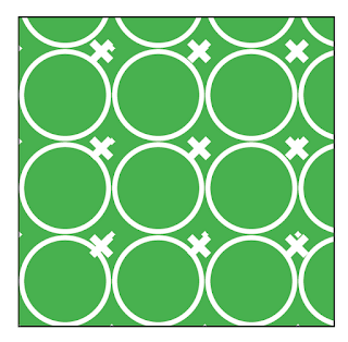
Recently, while watching one of my favorite sitcoms, I noticed an attractive geometric pattern in one of the chairs on the set. I wanted to see how closely I could recreate the pattern using Teacup PatternMaker. Here is a photo of the chair fabric pattern we'll be recreating.


This pattern has two primary shapes: circles and crosses. First let's create the circles. The circles aren't just random circles, they are a grid of circles. And wouldn't you know it, PatternMaker has a pattern type called "Concentric Circles Grid."


So, after creating a new frame with a green fill, I applied that pattern. Here is the result:


Next, I adjust the number of circles. While the pattern is title "Concentric Circles," you can actually reduce the number of circles to 1.


The default grid angle is 70 degrees, so next I change the angle of the grid to 0 degrees.


Now, I need to make my circles larger. After a little experimentation, I determine that I need to adjust the Shape Size to 75 pt and the Inner Radius to 35 pt.

We're almost done with the circle. Now, we just need to thicken the stroke and make the circles white. I change the stroke weight to 4pt and the color to white.


Now that my circles are complete, I'll move onto the crosses. Copy the frame and paste in place. One the top frame, remove the green fill. This will allow you to see the cross pattern in the frame below. Then select the bottom frame and change the pattern to Crosses.


Next I change the pattern angle and shape angle. This looks slightly different than the fabric pattern. See how in the above screenshot, the crosses are on a diagonal grid? By changing the pattern angle and shape angle, the crosses are now aligned in a horizontal and vertical grid.


Next I change the cross size to 21 pt and the and Element Gap to 50 pt. I chose 50 pt. because that was the distance used for the Element Distance in the Concentric Circles pattern.


Then, make the frame larger than you need it and reset the pattern. This will allow you to nudge the I nudge the Crosses frame so that the crosses are aligned in the correct spot within the circles.


Now, nudge the Crosses frame so that it is positioned correctly. Then reduce the size of the frame so that it is the same size as the Concentric Circle frame.


Finally, I increase the Crosses stroke weight to 6 pt.


You may notice that the original fabric pattern looked slightly different: the crosses had pointed ends, and didn't have the little white specks near where the circles intersected. But the goal was to get as close to the original pattern as I could, without leaving InDesign. Mission accomplished!

But wait, there's MORE!

Just for fun, let's push the exercise a little farther. Next, export the InDesign page to a PDF, with Acrobat 5 compatibility. 


Then open the resulting PDF in Illustrator. Here is what you get:


And here is the same objects, viewed in outline mode (Cmd/Ctrl + Y). Notice how it is blank. Where are my patterns? I have no idea....

Why is this blank? I don't know.

I've been told that Adobe doesn't officially support opening up random PDFs and editing them in Illustrator. I've always known there can be some weird conversion issues like outlining some of the type, but I've never seen anything as strange as this. 

Now, I don't know what kind of code is going on behind the scenes that would make the pattern freak out, but fortunately, there are still some fun ways to get this patten as an editable file within Illustrator.

First I tried going to Acrobat and selecting the pattern with the Edit Object tool. Then right-clicking and choosing: Edit Obejct. Because the object is vector, it opened in Illustrator. But, unfortunately, I got the same result.

So now, go back to InDesign. Select the two patterns (Crosses and Concentric Circles Grid). Set the transparency to 99.9%.


Now, export a PDF with Acrobat 4 compatibility. You'll get a warning about bookmarks, transparency, yadda, yadda. Click OK. This will flatten the objects and make them more editable within Illustrator.


Here is the resulting file when opened in Illustrator. Now it looks right!


And here it is in when viewed in Outline mode. Aha! Now I have paths to work with.


Now, you may hear heated opinions about how flattened PDFs are evil, inflexible, and the bane of prepress technicians' existence. And when I send PDFs to my printer, I do my best to never send them flattened PDFs. But sometimes, flattening a PDF can be a good thing. Because Acrobat 4 is more archaic technology, I think that flattening a PDF is sort of like dumbing it down.  

By reducing the transparency just a little bit, it's enough to sort of give the resulting PDF a kick in the butt and make it behave correctly. I wish I had a better explanation, but I not a coder. Sorry.

So now that you have access to the paths within Illustrator, you can (with a little digging in the layers panel) extract the white circles and crosses as one giant compound path.

Then, you can change up the colors a bit. Teacup PatternMaker is great, but it doesn't allow you to apply gradients to patterns. But by extracting the pattern in Illustrator, you can color it however you want. Here are a couple of colorways that I came up with.

Yellow concentric circles grid on red 

Purple concentric circles grid on blue

Let's push it one step further, and do some Live Painting. Interestingly, when Live Painting with a gradient, the gradient is applied across the width of the entire live paint group, rather than the individual area you're painting.

Concentric circles and cross - painted using the Live Paint Bucket Tool

I hope you have enjoyed today's lesson. Have fun patterning!

Thursday, February 16, 2012

"Change Bars"...Not Just for an Editing Workflow Anymore!

BarredText is reminiscent of FrameMaker's "Change Bars," which, when turned on, placed a thin line in the margin of the text flow whenever text has been changed. They have a very basic, but extremely useful functionality. They allow a proofreader to ignore all the text that hasn't changed since the last time they looked at the document. While InDesign and its third party developers have other solutions like Track ChangesParagraph Borders, and Ctrl Changes, none of these offered quite same simple, stripped-down version of FrameMaker's change bars, which simply puts printable bars next to any line of text that has changed.


While InDesign does have change bars, they are only available in the story editor, and there is no option to print them.


While these change bars are definitely handy, there are certain situations where I need to have change bars on the printed page, or on the PDF proof. For example, when the workflow involves sending a PDF proof to a client for review, InDesign's change bars in the Story Editor do me no good. But by having change bars appear on the PDF proof, the client can see exactly what has changed since the last time he saw the document. 

First, let's have a look at what BarredText looks like in its default form. The text bars are anchored objects based on a Object Style. The default is a thin, black-filled frame. Rorohiko did a really great write-up about how it works and how to use it, so I won't duplicate their efforts here. InDesign Secrets also did a nice write-up about BarredText.


This is the serious, functional side of BarredText. But BarredText can also make change bars visually interesting. Normally, a nice, simple little change bar is just what you want. But did you know that BarredText can also be used for creative design? If we change the way we think about using BarredText, its "change bars" and suddenly become dynamic, vertically-expanding design elements.

While we could create our own vertical design elements and anchor them in the text, but with BarredText, the design elements expand dynamically. We're going to explore how to change visual appearance of the BarredText TextBars, while still leaving them anchored within the text frame. This is important, because if the Text Bars are cut from the text flow, they lose their magical dynamic behavior.

If you're using InDesign CS4 and below, you can use drag-and-drop editing to reposition either one of the anchored objects that make up a BarredText textbar. Dragging and dropping a zero-width anchor maker is pretty much impossible in Layout View. If you use drag-and-drop for this purpose, be sure to switch over to the Story Editor.


Anchor selected in the Story Editor

Drag and Drop Text Editing preferences

If you've upgraded to CS5, you can use the handy Anchor Object Control (View > Extras > Anchored Object Control), also commonly referred to as the "little black square near the top right corner of the frame."

So why using BarredText be useful? Perhaps you need a repeating design element that sits in the margins of your page, and you need to to automatically expand whenever new content is added. I'll use a timeline as my example, and add some text bars to each series of events.


However, when I make the text frame 2-columns, the Text bars for both columns are stuck on the left hand side of the frame.


By editing the TextBar Object Style definition, we can get the Text Bars to sit relative to the column, rather than relative to the text frame. (Click on images to enlarge.)


So now that the Text Bar is set up for multiple columns, we can start tweaking the object style. But see how to there is a little square beneath the Text Bar? That's what Rorohiko calls the BarTender.


Initially, both the TextBar and the BarTender are set to the "TextBar" object Style. But if we change the appearance of the "TextBar" object style, and then redefine the style, the Bar Tender also gets changed. 


But we want to BarTender to stay transparent. So by creating a separate object style, just for the BarTender object, we can safely redefine the TextBar object style without having an extra object show up at the bottom of the TextBar. Change the fill and stroke to "None," and base the object style on None. Then apply the BarTender style to your little Bartender squares at the base of each TextBar.

Object Style FILL Options

Object Style STROKE Options
Object Style GENERAL Options

Now that are BarTenders are independent of the TextBar object style, we can get to work on changing the TextBar object style to something more visually interesting. Here are some fun ways to make your change bars work overtime. While some of these ideas involve things that can't be defined in an object style (such as changing the object rotation or filling the object with a graphic), for all the other object attributes, you can define them in an object style, or simply stylize your TextBar and then redefine the object style. 

To get a better idea of some ways to transform the TextBar into the design element of your choice, we'll explore a few ways of changing the shape and orientation of the TextBar.
  1. Object > Convert Shape: Line (makes a line with the first point at the top loft of the TextBar, and the second point at the bottom right of the textbar).


Now that the TextBar object is a Line, you style it in ways that you can't do with a rectangle (such as displaying a stroke start and end). For this example, I chose a wavy stroke, 4pt thickness, a square end, and a pink-to-yellow gradient.


2. Here is a second way to manipulate the TextBar. Object > Convert Shape > Triangle (Makes a upward-pointing triangle)


3. And here is a variation on that: Flip Vertical > Object > Convert Shape > Triangle (makes a downward pointing triangle)


Here is one of the triangles after I used the wavy pink and yellow line to redefine the TextBar style.


I decided to experiment with stroke alignment on my triangle. Here are three examples. Once you find a design that suits your fancy, be sure to redefine the TextBar object style.


But what if the visual effect you're after requires more than just a stroke and fill? Well, because the TextBars start out as thin rectangular frames, you can place an image inside the TextBar.
By changing the default frame fitting options of the TextBar, the TextBar will automatically expose more of less of a particular image.
  • If you set the frame fitting options to "Autofit," the image inside the frame will dynamically resize according to the size of the frame
  • If you set uncheck "Autofit," you can have the frame automatically reveal more of the graphic, as the text expands.
  • This combines InDesign built-in graphic resizing with BarredText's graphic frame resizing. So as the text grows, so does the accompanying graphic. 


Out of curiosity, I tried to see how much I could manipulate the shape of the text frame in order to get unusual shapes. After placing an image into my TextBar frame, I applied a Photoshop clipping path, and then converted the clipping path to a frame. But it was no longer magically dynamic after I did that. Apparently, the dynamic behavior applies to the original BarredText frame, and not the content of the frame. But you can still apply a Photoshop clipping path is you're so inclined. Just don't convert the clipping path to a frame.

I also tried converting to orthogonal line, just for fun, but that also ruined the dynamic behavior.

Edit: 12-11-18
Kerntiff Publishing has come out with true change bars that are available in Layout mode and will print to Pdf! Woohoo! http://www.kerntiff.co.uk/products-4-indesign/editmarks-change-side-bars

Tuesday, February 14, 2012

Make a Valentine's Day Flower with InDesign and Illustrator

Awhile back, David Blatner posted a great article on using something called NINA Script to make spirographs. I thought this would be a great way to showcase how vector objects can be copied and pasted from InDesign into Illustrator, and vice-versa.

So first, follow the instructions in David's NINA article to make a spirograph. I played around with the settings a bit until I got something that resembled a flower.


Then I copied and pasted my NINA Script flower into Illustrator. I wanted to color the flower in shades of pink and red, in honor of Valentine's Day, so I loaded up Illustrator's built-in Flower color swatches: Peony, Pink Rose, and Red Rose.


Using the Live Paint Bucket tool, I gave my flower some colors. If you've never used the Live Paint Bucket tool, you should give it a try. Here is a great article on the Live Paint Bucket tool.

In case you're not familiar with the Live Paint Bucket tool,  and you've ever gotten an Illustrator file from another designer and seen these unusual corner handles, these are corner handles for a Live Paint Group.


Here is my flower as I had completed my coloring of it.


To give it a more organic, less mathematical feel, I twirled it a bit. Want to learn more about the twirl tool? Read this article.


Happy Valentine's Day!