Read the entire article at Creative Pro: http://www.creativepro.com/article/seeing-patterns
Friday, August 30, 2013
Seeing Patterns: The Chevron Pattern
As a graphic designer, I’ve been on a quest to understand the fascination with the chevron pattern and why it recently seems so novel in printed design.
Read the entire article at Creative Pro: http://www.creativepro.com/article/seeing-patterns

Read the entire article at Creative Pro: http://www.creativepro.com/article/seeing-patterns
Thursday, August 22, 2013
Have You Hugged your Developer Today?
Four years ago, as a newly self employed designer, I started attending PepCon. As the decision maker at my own little company, I felt it was worthwhile to spend my personal money to go to my very first professional conference. And let me tell you, it was a real stretch financially. But it so worthwhile that I keep going back.
These days, I spend a bit less time in the sessions, and more time with the developers: those nice guys at the vendor tables, quietly sitting and waiting to demo their amazing tools to anyone willing to stop by and take a look at what they've created.
But what's really great about the developers is that they're not just there to sell existing tools. They are also there to listen to the end users and find out what their needs are. Kris from Rorohiko told me once, "I'm not an InDesign user. I just write scripts for InDesign." Think at about that one for a moment.
So every year I spend a little less time at the sessions and a little more time chatting with the developers. And not just with independent developers. I've also met members of the InDesign engineering team. I've personally given them my list of feature requests (complete with links to blog articles with additional information), and I've personally show them reproducible bugs.
At my last PepCon, I got to meet a former InDesign team member, Ashley Mitchell, who graciously gave his permission for me to get a T-shirt printed with some of his LBOP artwork on it. (This T-shirt is a joke about using GREP styles.)
Also at my most recent PepCon, I managed to corner one of the InDesign engineers right after the Meet the InDesign Team session. I think he handles the code for a part of InDesign that I wanted to see improved. I was chatting with this developer recently and he said "Oh, you did that thing on patterns at the InDesign smackdown." He was talking about my Ignite session! He remembered me from the conference!
Slowly but surely, some of my ideas for InDesign tools are becoming reality. Today I discovered that an obscure bug I had personally shown to an InDesign engineer at PepCon two years ago has been fixed in InDesign CC. It took my breath away to see that they had fixed it. Here's what they fixed:
So if you want feature improvements to InDesign, start coming to PepCon and hang out with the developers. Develop friendships with them, encourage them, write articles about the awesome tools they make. While I think that petitions and survey sites can be useful tools for making your needs known, I've personally gotten a lot more accomplished by simply having relationships with the people who can build the tools I need. In doing so, I am more than just a signature on a petition or three votes on a survey site. I am a friend. And friends help each other out with projects that may not be huge money makers.
I don't know what developers make on the plugins that I conceive and beta-test. And I will never ask. But I have tools now that a few years ago, I could only dream of.
So if you have plugins that you want, go befriend some developers. And I think it doesn't hurt to bring some chocolate or other goodies just to make what you have to say more memorable.
These days, I spend a bit less time in the sessions, and more time with the developers: those nice guys at the vendor tables, quietly sitting and waiting to demo their amazing tools to anyone willing to stop by and take a look at what they've created.
But what's really great about the developers is that they're not just there to sell existing tools. They are also there to listen to the end users and find out what their needs are. Kris from Rorohiko told me once, "I'm not an InDesign user. I just write scripts for InDesign." Think at about that one for a moment.
 |
| Kris and me: InDesign plugin developer and InDesign user |
So every year I spend a little less time at the sessions and a little more time chatting with the developers. And not just with independent developers. I've also met members of the InDesign engineering team. I've personally given them my list of feature requests (complete with links to blog articles with additional information), and I've personally show them reproducible bugs.
At my last PepCon, I got to meet a former InDesign team member, Ashley Mitchell, who graciously gave his permission for me to get a T-shirt printed with some of his LBOP artwork on it. (This T-shirt is a joke about using GREP styles.)
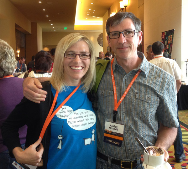 |
| Me and Ashley Mitchell, former senior tester for the InDesign team |
Slowly but surely, some of my ideas for InDesign tools are becoming reality. Today I discovered that an obscure bug I had personally shown to an InDesign engineer at PepCon two years ago has been fixed in InDesign CC. It took my breath away to see that they had fixed it. Here's what they fixed:
"In the Find/Change dialog box, under Conditions, the scroll bar doesn't scroll with the mouse scroll wheel. It just jumps all the way from the top to the bottom. It should scroll properly."I think only about 5% of InDesign users ever use conditional text. And probably a very small fraction of those will ever have enough conditions in a single document to warrant a scroll bar in the Find/Change dialog box. So the amount of people who would ever experience this bug is very small. But perhaps the fix was a quick and simple one. I don't know, as I am not a developer. But I know people who are!
So if you want feature improvements to InDesign, start coming to PepCon and hang out with the developers. Develop friendships with them, encourage them, write articles about the awesome tools they make. While I think that petitions and survey sites can be useful tools for making your needs known, I've personally gotten a lot more accomplished by simply having relationships with the people who can build the tools I need. In doing so, I am more than just a signature on a petition or three votes on a survey site. I am a friend. And friends help each other out with projects that may not be huge money makers.
I don't know what developers make on the plugins that I conceive and beta-test. And I will never ask. But I have tools now that a few years ago, I could only dream of.
So if you have plugins that you want, go befriend some developers. And I think it doesn't hurt to bring some chocolate or other goodies just to make what you have to say more memorable.
Wednesday, August 21, 2013
Adventures in Flexible File Prep: New Twist on PDF Form Fields
Background
I am the graphic designer for my church. As a designer, I want my designs to look as good as possible, keeping in mind the final output device as well as the skills and tools of the people who need to use my files. I've written a couple of other articles about my adventures in designing these situations.- Designing for Small Non-Profits: Preparing Flexible Files to Be Used with Consumer-Grade Software
- Bulletproof, flexible files for Adobe Reader Users
The Why
I've started using using a new trick recently. We needed to create some lanyards for use in our children's ministry.In coming up with this workflow, there were a few must-haves on my list of requirements.
- The final PDF must be multi-up on a page and able to be printed on a standard letter-sized paper
- The person printing the PDF needs to be able to easily add text to the PDF (without having to watch a tutorial video or read an article in order to figure out how to do so).
- The editable part of the document needs to use a fun font. Nothing boring like Helvetica.
 |
| The folks in the office need to be able to edit the name, using ONLY Adobe Reader |
The How
So I started with a simple 1-up design in InDesign, located on an 8.5 x 11 page. Somewhere in the design, you'll need some type that uses the font you'll want to use in your form fields. In my case, the live type is in the word "Staff." The reason for this is because we want that fun font embedded into the PDF.
Because this piece is only 1-sided, you don't have to be very precise in where you put the 1-up design. I made my 1-up with crop marks. There is a built-in crop marks script in InDesign. I wrote an article about it awhile back. (Scroll down to step 6, and skip everything else.)
Because this piece is only 1-sided, you don't have to be very precise in where you put the 1-up design. I made my 1-up with crop marks. There is a built-in crop marks script in InDesign. I wrote an article about it awhile back. (Scroll down to step 6, and skip everything else.)
Next, we're going to add a form field. Go to Window > Interactive > Buttons and Forms to bring up the Buttons and Forms panel. Then draw a rectangle roughly the size that you want for the space where the office staff will type the name in Adobe Reader.

With the rectangle selected, click Convert to Button.

With the rectangle selected, click Convert to Button.

Next, in the drop down list in the panel, change the type from Button to Text Field.

Make sure to check the box that indicates that your form field will be printable (it is checked by default). And make sure the size is set to Auto.

Now, group all your objects and out them multiple on a page. In my case, six of them fit on the page. Be sure and hold shift when option+dragging them, so that they stay aligned.

Now, export an Interactive PDF. This is important because as of the date of this article, print PDFs cannot contain form field objects. In the Forms and Media section of the dialog box, click Include All.

Now, I need to give a disclaimer here because normally, I would never use an InDesign Interactive PDF for a professional print job. "Why," you ask? Because interactive PDFs export as RGB. That means that plain blacks are converted to RGB rich blacks. Normally, that would be a very, very big deal for me. But this is going to be printed 1 sheet at a time, on an multi-function office printer, and there is no small type. So RGB blacks don't matter to me here.
Next, open the PDF in Acrobat. See how all the form fields are highlighted in purple? (Notice also how my nice blue background changed to greenish. I'm not sure why. I suspect it has to do with the weird blending mode I used for my background.) Normally, that would bother me, but for this project, it doesn't matter.
Next, open the PDF in Acrobat. See how all the form fields are highlighted in purple? (Notice also how my nice blue background changed to greenish. I'm not sure why. I suspect it has to do with the weird blending mode I used for my background.) Normally, that would bother me, but for this project, it doesn't matter.

Now, since there is no way to specify a font for your form field in InDesign. We have to do that in Acrobat. So in Acrobat, open the form editing pane.

Select all the form fields (cy clicking and then shift+clicking). Then press Cmd/Ctrl + I.
(I like to think that I stands for Info. So when you click on any object in your PDF, if you press Cmd/Crl+ I, you'll get all sorts of interesting options that you change. Try it sometime for fun. You'd be surprised what you can change in a PDF!)
(I like to think that I stands for Info. So when you click on any object in your PDF, if you press Cmd/Crl+ I, you'll get all sorts of interesting options that you change. Try it sometime for fun. You'd be surprised what you can change in a PDF!)
In the Appearance tab, change the font from Helvetica to something more interesting. The trick here is that you need to use a font that you have already used in your design. That'll mean that the beautiful, fun font that you want for your forms field is already embedded in the PDF. So it will work properly whenever this PDF is opened by someone who doesn't have the same font set as you. The fun font that I used is called GROBOLD.

Next, go to the Options tab in that same dialog box. Change the Alignment to Center.

Now, close that dialog box. Go to File > Document Properties (Ctrl/Cmd + D) and change page scaling to None. That way, the paper will print the size you designed it at, without you having to give any extra instructions to the office staff.

Now you are done! See how the type size automatically adjusts to fit the length of the name? Nifty!

Be sure to tell the office staff to open the PDF in Adobe Reader (not a web browser).
David Blatner wrote a great article awhile back about some limitations of Interactive PDFs. Adobe has fixed the spreads-vs-pages issue he mentions in the article, but everything else is still valid. It's a good read, if you want to know more about which PDF type is best suited for your jobs.
Thursday, August 15, 2013
Beware Stacked Transparency in PDF Files Across Long Documents
I recently encountered a PDF export problem that plagued me for months. I was trying to export a book containing roughly 50 InDesign documents. The last 25 or so documents contained scanned engineering drawings placed as graphics into the InDesign documents. When I tried to export a PDF from the InDesign book file, the PDF would seemingly be exporting just fine… until InDesign reached pages with some of those scanned images. Then it seemed to randomly hang. Fortunately, I finally found the source of the problem, as well as a fix.

Read the entire article at InDesign Secrets:
http://indesignsecrets.com/beware-stacked-transparency-matter-source.php

Read the entire article at InDesign Secrets:
http://indesignsecrets.com/beware-stacked-transparency-matter-source.php
Wednesday, August 7, 2013
Too much text? Try TypeFitter Pro
I'd like to share a little bit about one of my favorite plugins. TypeFitter Pro was developed by Teacup Software and eventually purchased by Typefi Systems. According to the Typefitter manual:
Here is my document before I started adjusting it with TypeFitter Pro. There are just a couple of lines on the right-facing page, but I need those lines to be on the left-facing page (and I don't want to horizontally scale the text or adjust all the kerning). I needed to make a few adjustments to the second paragraph and the the fourth paragraph.


What's so cool about Typefitter Pro is that you can save these tightened paragraph settings right into your paragraph style. You could have a few different styles, each with slightly different justification settings. You could name them something like:
TypeFitter also allows you to manually tighten and loosen text by “nudging” your justification and tracking settings up or down. TypeFitter will “nudge” a whole group of settings all at once, which is a big time saver. Because TypeFitter emphasizes changing justification settings like word spacing, letter spacing and glyph scaling, you can tighten or loosen your type without compromising high quality typography.At it's simplest use, with just the click of a button, Typefitter will make slight adjustments to text, effectively fitting more text into a smaller amount of space. It's great for use on those text-heavy documents, where just one or two lines of text overflow onto the next page. What's so magical about this is that TypeFitter does this without adjusting horizontally scaling the type! Out of curiosity, I went digging around in the paragraph panel to see how it did this. It makes micro adjustments to the Hyphenation and Justification settings.
Here is my document before I started adjusting it with TypeFitter Pro. There are just a couple of lines on the right-facing page, but I need those lines to be on the left-facing page (and I don't want to horizontally scale the text or adjust all the kerning). I needed to make a few adjustments to the second paragraph and the the fourth paragraph.
 | |
|
 |
| My default justification settings |
First I started by clicking the "Tighten Text" button.
 |
| Tighten Text button |
That gave me little visible results, but it did adjust the Justification settings like so:

So then I clicked on the Tighten Text More button...
 |
| Tighten Text More button |
... and I got these settings.

I still needed a little more tightening, so I clicked "Tighten Text More" a couple more times.

That was enough to get the extra text on the right page to fit onto the left page.

What's so cool about Typefitter Pro is that you can save these tightened paragraph settings right into your paragraph style. You could have a few different styles, each with slightly different justification settings. You could name them something like:
- Body
- Body, Tighter
- Body Tighter x2
- Body, Tighter x3
The plugin has the ability to enforce all kinds of typefit rules. I use it at its most simple function. But if you need more control than just pressing the "Tighten Text" button a couple of times, check out the TypeFitter documentation (which is very good by the way). It's beautiful to look at and has great information.
TypeFitter Pro is one of my mainstay plugins, and if ever I'm in a versions of InDesign where I doesn't have it installed, I miss it so much. It makes my life easier and helps in my type-fitting tasks while at the same time, lets me keep the nice-looking type that I work so hard on creating.
Subscribe to:
Comments
(
Atom
)