Monday, April 13, 2020

Stockinette Stitch Knitting Fonts

In my career, my time is spent at the intersection of two industries, of multiple programs, and generally wherever two typically unrelated topics converge. Those areas are often of the greatest interest to me, because they remain largely unexplored. Come with me friends, as I take you on a tour of a bit of that dual existence in my life: at the intersection of multiples worlds, where knitting, font design, and graphic design software merge.

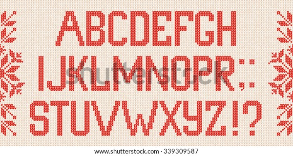
It's important to understand the reasoning behind the necessity of creating this knitting font. Upon searching for Knitting fonts online, you'll come upon a mish mash collection of cross stitch letters, letters made to look like string, and stitches that don't line up... the list of inaccurate knitted alphabets goes on and on. As a knitter, I think it's important that if you're going to design a "knitting font" that you get the details right. Most of the knitted fonts that exist don't get the details correct, and obviously made by non-knitters.

Here are some of the issues I've encountered:

1. The alphabet is actually not a font, but a vector stock art alphabet.
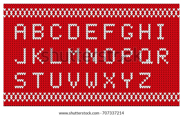

2. The stitches aren't curved like actual knitted stitches are. They're made of straight lines.
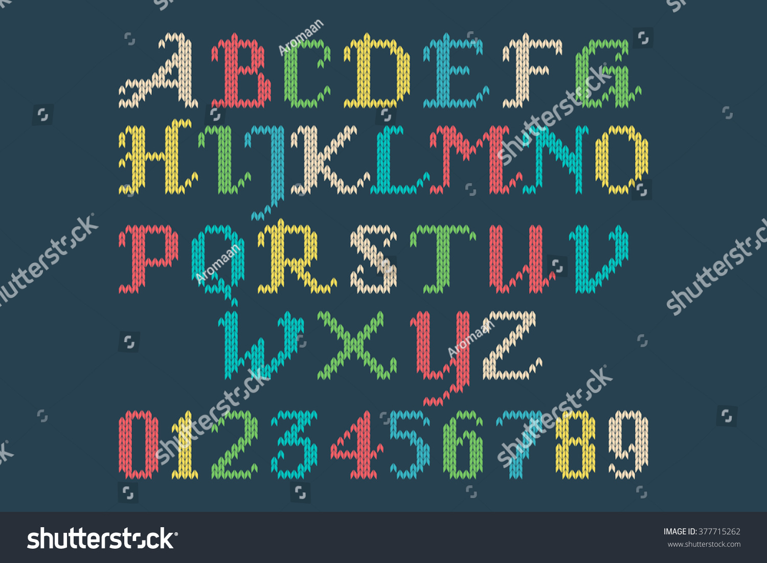
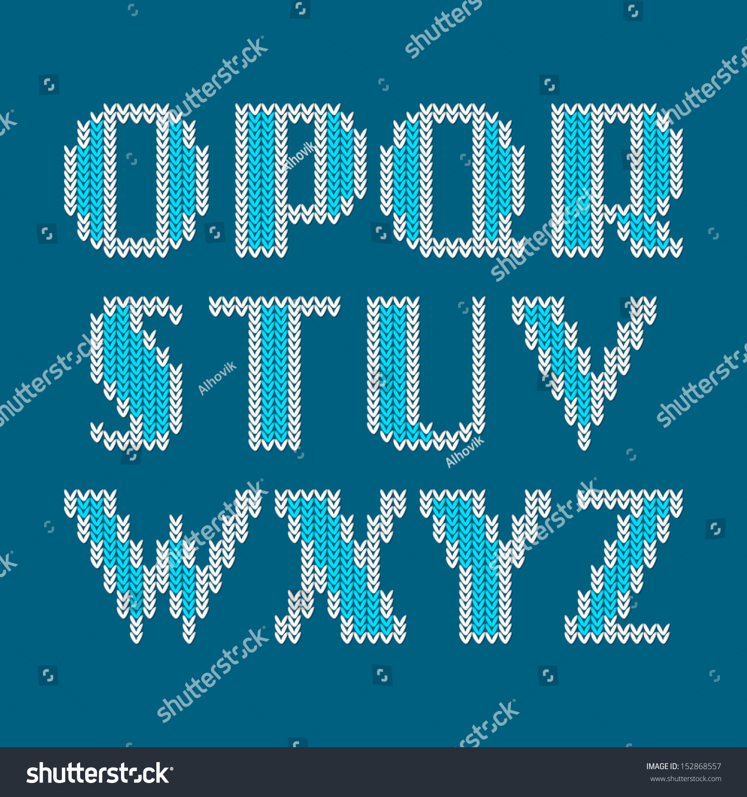

3. The letters are regular letter shapes, used as a clipping path for a raster image.

4. The stitches don't line up. The left and right hand side of the stitches should be on the same vertical plane. While the technique below adds visual interest, it is not representative of the true shape of knitted stitches. Plus, the stitches look like little grains of rice. This example, however, does an excellent job of incorporating both sides of the stitch into the design of the letterforms (and not chopping off one half where it is deemed unsightly).
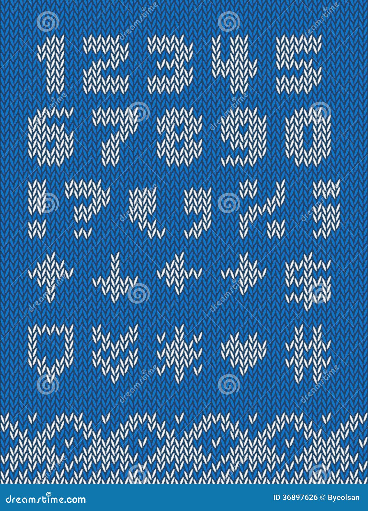

5. The right and left side of each stitch are joined. Knitted stitches are not little hearts. Knitted stitches are actually horseshoe shaped, and mirror each other on around a vertical axis, with a little bit of space in between each half of the stitch.
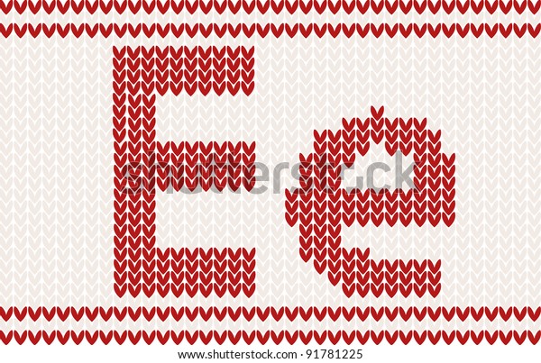


5. No background stitches. When knitting letters in a design in a physical piece of knitting, they are integrated into the fabric itself, they don't float magically in the air. Hence, the need for background stitches. The background stitches are just as much part of the design as the letters themselves. While it's true that the letterforms can be used without the background stitches (as in the example below), for maximum usability, as well as accuracy in representation to a physically knitted fabric, there should be background stitches available, either as alternate characters, or as a second member of the font family.


6. Spaces not handled properly. When uses spaces in a knitted design, there are background stitches in the fabric. This font gets a some of the other technical details correct, but it makes no account for the spaces between the words. 
Knitfont

Once spaces are added, things break down. The background stitches are gone. We can work around this using some special characters and GREP Styles in InDesign, but in this particular font, the character sets don't match, and the necessary glyphs weren't made to allow the background stitches to be used. 

7. Stitches chopped off. Here in another font that makes a fair attempt at knitted stitches. Like the font above, it has no background stitches. 
Xmas Sweater Stitch

If you look closely, it's clear that the details are wrong. In the corners, the side half of the some of the stitches are chopped off. While that does make the diagonals look a little smoother, it's not technically accurate. This was obviously not designed by a knitter.


8. Incomplete character set. This is the closest one that I found to an actual knitting font. The shapes of the stitches are correct, the stitches line up, the style of the letterforms is accurate for what knitters use; it's pretty great. It's even in a style common to what a knitter would actually use when knitting names into a garment. The issues that I encountered are that it doesn't have a full character set, and there are no background stitches built into the font itself. So when using this for graphic design it must be used in conjunction with the vector background that is packaged with the font. 
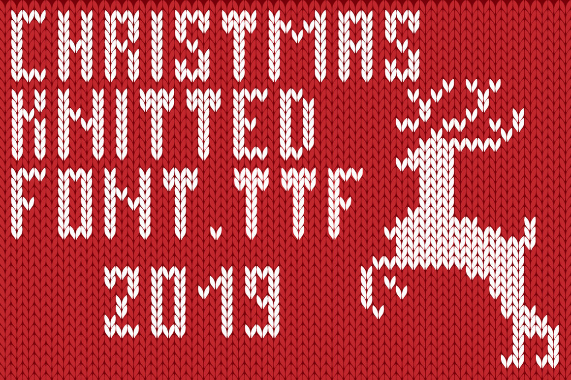
Christmas Font

So why make a my own custom knitting fonts?

While I can manually create these fair isle letters in Illustrator each time I need them, it's a tedious process to do just every once in awhile. I wanted an alphabet that I can quickly use whenever I need to plan some knitted lettering. For example, I've been making family Christmas stockings for over a decade. I've lost track of how many I've made. It would be really great to just type up my name chart quickly each time I go to start a stocking, rather than get out graph paper and draw it.

By incorporating advanced typographic features like ligatures, I can have more flexibility when working with a set number of stitches. Take these stocking for example. Each name needs to fit within 28 stitches. That's why in the BAILEY and the ASHLYN stockings, the Ys are different. Bailey's name is 6 letters long. Ashlyn's name is 7 letters long and required the stitches to have tighter tracking. The Y is very closely aligned to the L in front of it. Having ligatures and alternate characters in the font allows this to happen either automatically or manually.
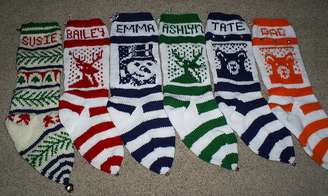
Kelly's Christmas Stockings
Plus, if I have these alphabets as actual fonts, I can quickly and easily typeset knitting letter charts for other knitters on my Etsy shop. I can also use these fonts to personalize my KnitSwag products.

I wanted my knitting fonts to meet the following criteria:
  • Accurate curves (to reflect the way the yarn forms each stitch)
  • Stitches aligned to a grid (not offset in any way)
  • Proper gauge (not too horizontally or vertically compressed). They should be about a .67 height to width ratio.
  • Incorporate the use of ligatures so that character placement can be adjusted to fit a set number of stitches
  • Available in different number of stitches high, in order to be used for different types of projects
  • Available in both Regular and Bold versions
  • Uses a second font with each font family, for background stitches
  • Has a complete character set, including punctuation, numbers, and most special characters

How I made the fonts

I used Adobe InDesign and IndyFont Pro to create my custom knitting fonts. IndyFont Pro is a dream come true! It lets me use the software that I know and love to create fonts. The free version lets you create a single character (for bullets), but the Pro version lets you create full character sets. It's well documented, and the user manual is one of the best I've ever seen!

So far I've created two versions of stockinette stitch fair isle knitting fonts: an 8 stitch high and an 11 stitch high version. They are the only knitting fonts of their kind! I'll be designing more in the coming weeks. Would you like to have a custom name chart in these fonts? Head on over to my Etsy shop and I'll set you set up! I made these fair isle alphabets with specifically with knitters in mind.


Monday, March 9, 2020

A More Accurate Knitting Graph Paper

I am a lifelong knitter. I am also an avid user of Adobe Illustrator. Occasionally, my two loves collide and the result is something useful and unusual. This tool is one of those results.


In my knitting life, I sometimes do a type of knitting called Fair Isle. In popular culture, this is associated with Ugly Christmas sweaters. But in the knitting world, this has been a sophisticated and much loved technique that has existed for centuries before. Do a quick search for stranded color work knitting or fair isle knitting and you'll find hundred of beautiful designs.

The essence of Fair Isle is that it follows a color chart to indicate which color of yarn to use on which stitches. Usually, two strands of yarn are used on each row, and the unused strand of yarn is held at the back of the work. Usually, the color charts for this type of knitting are created in a spreadsheet program.

As a knitter, the issue that I've run into is that knitting stitches are not square. It's simple enough to make the spreadsheet cells roughly proportional to the dimensions of a knitted stitch (roughly 1 wide by .75 high). But once those designs are knitted, the result can be disappointing, because not only are knitted stitches not square, they're not rectangular either. They are horseshoe shaped. Many times, illustrators will draw them as Vs because that's the part of the stitch that is visible from the front of the work. This is especially apparent when using fair isle to design letterforms. Shapes that would normally have lovely curves and smooth diagonals, can have jagged edges.

You may notice that the Vs in the knitted piece below are actually upside-down; this is because this stocking was knit from the top-down, so the knitting is actually upside down while being knitted.


Traditional graph-paper style charts cannot account for this end result. So help knitters better visualize how their final designs will look when knitted, I designed an accurate fair isle chart, made not of rectangles, but of actual knitted stitches. 

This is a BLANK fair isle knitting chart (available in both landscape and portrait).  This chart comes with two versions: one has gridlines and the other does not. On the gridded version, every fifth row and column is a darker shaded outline.

It works for both top-down as well as bottom-up knitting. If you are a knitter and want a better type of knitting graph paper, then this is for you! 


If you are a knitter, please visit my KnitSwag Etsy shop and see all the other lovely knitterly items I have for sale. I have designed them with you in mind!


Thursday, September 26, 2019

Making Sense of the Color Panels in Adobe Acrobat

Since the introduction of Acrobat DC, users have been lamenting the fact that there is seemingly no way to have a shape with "No Fill." I wrote about that extensively here: How to Make a PDF Drawing markup with "No Fill"

The issue stems from Acrobat DC's redesign of the way that users choose colors. This redesign didn't make it's way into the other two places where users can choose colors but was an introduction of the Color Picker tool with a paint bucket icon. At some point is was changed to a large colored dot renamed "Change Color"). No matter what the icon, and what it was named, this tool seemed to oblivious the other two methods of choosing colors.

Color Picker tool: paint bucket icon

 In responding to a post on the Acrobat forums, I did a little digging to the color pane that Acrobat uses to choose colors. By clicking on the sprocket Options icon of the Choose Colors tool, the Properties dialog box opens. In 2018, it looked like this. By click on one of the swatches (either Color or Fill Color), a second dialog box would open. This used to be an Acrobat-specific swatch panel, but at some point was changed to use the OS-specific color picker. This is what it looks like on a Mac.


Sometime between 2018 and September 2019, the Color picker changed. Now it has a "Transparent" checkbox.


I took a look at the Colors panel in a couple of other Apple programs, and that checkbox is not there.


I don't know if Apple gives developers the ability to customize the built-in color panel of the Apple OS. So I don't know who is responsible for adding it. Regardless, this checkbox solves a problem that has been plaguing its users since Acrobat DC was introduced.

It actually allows users to make a drawing markup with no fill. One might think that "No Fill" would be a better term to use here. Or even better, the swatch with a red line through it, as Acrobat used to have, and as still exists in the deprecated Properties panel.


The issue with the word "Transparent"

The issue with the word "Transparent" is that has varying degrees implied to it. Like a slider. The transparent object can be partially transparent, or fully transparent, and anywhere in between. Plus, one can see through transparent objects, but the word implies that a viewer can also see the object itself, in addition to seeing the object behind the transparent object; Like what happens when you look through a window or a water glass.

Not so with the "Transparent" checkbox shown above. It's an all or nothing. This confusion is compounded but the fact that Acrobat annotations also have an opacity setting, which is a slider (as it should be). This opacity slider has nothing to do with the "Transparent" checkbox in the Colors pane. But the average Acrobat user isn't going to know that.


Plus, the nature of transparency is that in order to see if something is transparent, you'd have to also have another object behind it. Again, that's not how it works with the checkbox in Acrobat. 

In the graphic design industry, transparency also implies that there are multiple layers or objects, all stacked on top of each other. And in printing workflows, how one handles transparency can determine the success or failure of a print job. So among designers, transparency is something to be handled delicately.

In order to have a No Fill using the Properties dialog box, Acrobat users are expected to know that:
  • Transparent means see-through, even if there is nothing behind the object. 
  • Transparency has nothing to do with Opacity.
  • They need to stop looking for the industry standard term of "No Fill".
  • They cannot click on the red diagonal line in the swatch panel.  Because unless they click the "Transparent" checkbox, that swatch UI doesn't exist.


To make matters even more confusing, Adobe decided in DC to redesign the way users can choose colors. But they only did it in one place, by introducing the Choose Picker which resides in the toolbar. For most users, this is the only place they are aware of. And guess what? There is no "Transparent" checkbox.


The new Color Picker offers additional ambiguity with it's UI in that it actually does show when an object has no fill. "How?" you ask? It's the absence of the checkmark from any of the swatches.

No Fill

If all of this wasn't confusing enough, keep in mind that the old UI of the Properties toolbar was simple and worked without confusion. But most users don't know to look there.


Wednesday, July 24, 2019

A Workaround For Numbering Table Columns

If you’ve ever tried to use numbering in a table, you’re likely familiar with the behavior of how InDesign determines where to place the numbers. As demonstrated in this article, you’ll see that InDesign will scan the table from left to right and then from top to bottom and apply the numbering this way.

But what if you want the numbers to be assigned from top-to-bottom and the left to right? It’s possible, but not inside of a table. With Western languages, text flows from top to bottom, and right to left. So what we need to do is construct our numbered list in a way that matches that flow. And then add the borders.

Read the entire article at InDesign Secrets.


Tuesday, July 9, 2019

EASY Mac Screen Sharing

Mac users: Did you now that screen sharing is built into the desktop Messages app? It is SO EASY to use! I stumbled across this by accident and I wish I known about it a lot earlier. I pay for an annual subscription to a screen sharing app, and it's kind of a pain to use. But this one is built in to the OS, and is so easy that my parents could use it. The function even has a built-in microphone, so the person on the other end can hear you.

You first just need to start a message thread with someone. Then go to Buddies > Ask to Share Screen.


This is the You can choose to either view or control. If you want to control someone's screen, you have to be the one to initiate the process. Then the person on the other end will get this dialog box.


I had my husband ask to share my screen, and he happened to be connected to our Apple TV via AirPlay. And I heard my own voice come through the speakers on the TV!


Here is a more full-fledged article o the topic: https://appletoolbox.com/screen-sharing-osx-yosemite/

Tuesday, July 2, 2019

Cotton Shimmer Shawl (Knitting Pattern)

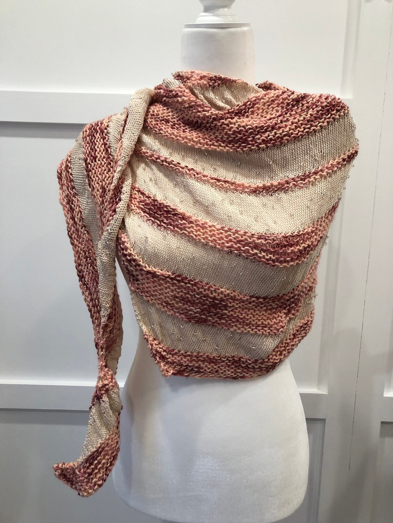
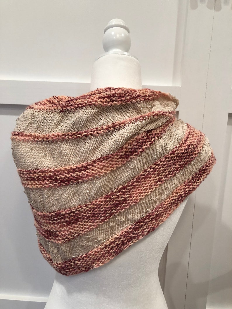
Using affordable and widely available yarns, this shawl uses three simple design elements to create a stunning shawl. You’ll be using: two different types of yarn, two different needle sizes, and beaded knitting. The mercized cotton thread, worked in beaded stockinette stitch, offers a visually interesting contrast to the chunky garter bands. Since both yarns are cotton, this wrap makes the perfect accessory to take the chill off on a crisp spring day.

Materials

  • Lion Brand Comfy Cotton, Approx 125 g.
  • Red Heart Classic Crochet Thread: “Natural” (approx 175 yards)
  • Package of #10 glass E beads (40 g/1.41 oz)
  • Size 10 US (6 mm), 24” circular needles
  • Size 4 US (3.5 mm) 24” circular needles


Monday, June 3, 2019

How to Install a Script to Acrobat's Menu

This post goes along with an Acrobat script: An Easier Way to Mark Comments as Checked in Acrobat DC.

If you would like to purchase this script, visit the Try67 website.
Scripts I've added to the Acrobat Menu Bar


  1. Check the following settings in Acrobat - Edit menu (or under the Acrobat menu on a Mac computer)- Preferences, JavaScript:
  • Enable Acrobat JavaScript - should be checked
  • Enable menu items JavaScript execution privileges - should be checked
  • Enable interactive console - should be checked
  • Show console on errors and messages - should be checked

How to install the script:
  1. Close Acrobat.
  2. Copy your javascript to the following folder:
  • Windows (32 bit): C:\Program Files\Adobe\Acrobat <VERSION NUMBER>\Acrobat\JavaScripts
  • Windows (64 bit):  C:\Program Files (x86)\Adobe\Acrobat <VERSION NUMBER>\Acrobat\JavaScripts
  • Mac:  /Users/<USERNAME>/Library/Application Support/Adobe/Acrobat/<VERSION>/JavaScripts
  • or /Applications/Adobe Acrobat <VERSION>/Adobe Acrobat Pro.app/Contents/Resources/JavaScripts
(To find it go to Applications > Adobe > Adobe Acrobat <VERSION> Pro > then right-click the Adobe Acrobat application itself and select "show package contents", then go to Contents > Resources > JavaScripts
If you find the Resources folder but there's no JavaScripts folder within it, then create it yourself and the place the script there.)

  1. Open Acrobat.
  2. Open a PDF.
There should be new item/s under the "Tools" menu (under "Add-on Tools"). They will be the names of your scripts. If you have Acrobat DC you might need to search for it in the Tools panel.

Why Won't InDesign Sample Scripts work in InDesign 2019?

I encountered a strange issue recently. I was creating a business card imposition in InDesign. I opened the Scripts panel, and then ran CropMarks.applescript. Nothing happened.


My compute seemingly locked up for a moment, but no crop marks appeared. After a  minute or so of investigation, I realized that InDesign 2018 had launched. But I was using InDesign 2019...

I went back to InDesign 2018, and it displayed the following dialog box:


It turns out that when InDesign 2019 was shipped, no one at Adobe had changed the hard-coded application version in the sample Applescripts. 


The workaround is that you simply need to change them to be "2019" instead of "2018." Alternatively, you can use the corresponding sample javascripts in the Samples folder for the job.

Monday, April 29, 2019

Dropbox Commenting is No longer in a Silo!

Previously, I had written a couple of lengthy and frustrated posts about Dropbox commenting, and how it should be avoided at all costs. Because (at the time, it existed in a silo, and once you removed your documents from Dropbox, all your comments would be gone.

Beware of Dropbox Commenting
More Reasons to Hate Dropbox Commenting

Well no more, my friends! We are one step closer to a solution to group collaboration. A client of mine made comments in the dropbox web app, and I was notified. When I took a look at the comments, I was shocked to see that they also appear now in Acrobat!


Dropbox Comment Notification
Acrobat Comments Pane
File Names are automatically appended with "See Comments"


  • I tried adding a comment in Acrobat to see if the comment would then show up in the web interface of Dropbox. Sadly, it doesn't. 


  • I also don't view a web interface as an acceptable solution for commenting on long documents, since there is so much scrolling involved. And the tools are limited to boxes and sticky notes (no text annotation).
But at least now I don't have to warn my clients to NEVER use dropbox commenting. 

Monday, March 25, 2019

After More Than a Decade, a New Comment Icon in Acrobat!

Many Acrobat users don't know that there is more than one type of sticky note icon in Acrobat. I wrote about those here: The Case for Still Using the Deprecated Features in Acrobat, Part 1: The Properties Toolbar
Acrobat list of Icon types

It seems to be that the icons are at least somewhat standardized across PDF viewers. Bluebeam Revu has the same icons (minus "Insert Text").

Bluebeam Revu list of Icon types

I noticed that Acrobat recently added a new icon! The reason for it has to do with the latest (and hugely unpopular) changes to the Acrobat commenting tools. But at least now one of the issues is sort of addresses. It's been very difficult to see which comments are selected in the desktop version of the program, as I demonstrated in this feature request: Comments and Annotations need marching ants

Adobe has heard our requests, and although they didn't implement the solution as I would have, they at least made it easier to see the various comments now. When you mouse over one of them, it gets enlarged. Sadly, it only works with the speech bubble type comment. So if you use any of the other 16 icons, this feature doesn't work. At least it works, with different colors so we're not limited to yellow.

This new icon is called "Selected Comment." It should really be named "Hovered Over", since it works when a comment is hover over, not when it's selected.

Hover over the speech bubble icon and it will enlarge
New Acrobat list of Icon Types

Icon Confusion

Adobe seems to really be steering its user towards the "speech bubble" icon and away from all other comment icons. They failed to incorporate the different icons into the tools panel at all. One has to know about the deprecated "Properties Toolbar" to utilize the different icons. But the new releases of Acrobat ignore the various icons.

Here are the commenting tool options in Acrobat DC web.

Only a Few commenting tools were included in the web version of Acrobat DC

To make things more confusing, while the "comment" icon at the top is a rectangular speech bubble, all the comments within the body of the document are displayed as round speech bubbles.

All the icons are displayed as speech bubbles
Unless of course, you view it in Acrobat desktop version. Then the icon types get changed to the Reviewer's Adobe avatar (which is ridiculously hard to change, by the way). And I have no idea why the comment icon is red.

Look, my Document Geek logo has replaced the icon type! WTH?
Also, when I click on the comment, there are no no properties associated with it. At. All. ???

Look ma! No properties!

If a reviewer hasn't given themselves an Adobe avatar, they get a generic one. So that means that instead of useful icons, all of my documents will now have the same generic gray avatar in every single comment.

Generic Head Avatar

Commenting Tool Differences


The list of commenting tools available is robust in the desktop version. The way it should be!

Acrobat DC Desktop Version commenting tools
The toolset is very limited in the web version. And the icons are different

Acrobat DC for web commenting tools
If you open a document review from the web, into Acrobat, the toolset is now limited to those tools available in the web version of Acrobat. But the icons are slightly different.

Acrobat DC tools: desktop version, but Document opened from a shared review

Stick with one type of Review

In my opinion, it's best to stick with one type of review method. If you use the desktop version and some sort of cloud sharing method (like dropbox), stick with it. You'll have the full range of tools available to you. But if all you want to do is add a few sticky notes (as was done in the Adobe demo files for the Acrobat DC for web videos), then by all means, use the Shared Review and comment in your documents in your web browser of choice.