This post is about a rounded corner workaround I found that will work in both InDesign CS3, CS4, and CS5.
This all started because I had a project which required me to create call-out boxes. I had been analyzing the callout boxes in my favorite study bible, and I wanted to duplicate the effect in InDesign. The top edge of the box had two lines (different tints and different thicknesses). The bottom edge of the box had rounded corners. I knew I could accomplish this effect with a couple of frames, grouped together (one for the rounded corners, and one for the text frame), but I wanted the flexibility to resize my text frame as needed, without having to ungroup, regroup, and risk distorted text and corners...
So my first task was to create the top rules, using two paragraph rules in the top line, one Rule Above, and one Rule Below.
My next task was to add the rounded corners at the bottom. At first, I tried the popular method of running the Corner Effect script. This script doesn't actually use live corner effects (like CS5 does), but actually edits the corner anchor points.
The script is less than intuitive. You have to know which points (first, second, third, and fourth) correspond to which point on the rectangle. After a little experimentation, I figured that I to get bottom rounded corners on my rectangle, I would need to choose the last two points. I was so perplexed at the logic behind the order of the rectangle points that I wrote an entire article about it: A Designer's Guide to Understanding Polygon Point Order when Using InDesign's Corner Effects Script.
So, the Corner Effects Script seemed to work pretty well, until I took a look at the paragraph rules in the top line of my text. For some mysterious reason, adding rounded corners messes with the paragraph rules in the top paragraph. They now no longer extended to the edge of my text frame, despite the fact that I had set paragraph rules to span the entire column width. My guess is that somehow the rounded corners alter the object geometry which determines how wide the paragraph rules extend. But I'm just guessing. I really don't know.
I was working in CS3, so I figured that this was probably fixed in CS4...but it did exactly the same thing. Here is the same text box with the colors nice and bright to highlight the problem.
So I next tried rounded corners using in CS5. I rounded just the two bottom corners...but again, the same thing happened to the paragraph rules in the top line. It seemed to work at first, until I resized the text frame. As a workaround, I adjusted the paragraph rule Right and Left Indents to account for the short paragraph rules. But not all of my text boxes needed to be the same size, and when I made the text box wider or narrower to fit my design, the paragraph rules were almost always the incorrect width (the correct width being equal to exactly the column width).
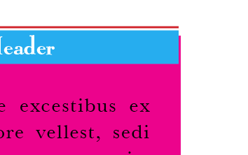
I also tried the CS5 new Rounded Corner Effect, but again, the paragraph rules did not function as expected. See the little magenta peeking out behind the right side of the header?
So I decided to try a solution that had nothing at all to do with real Rounded Corners, and everything to do with Faking Rounded Corners. I would achieve rounded corners at the bottom of the text frame using a big, fat, paragraph rule. Here are the settings I used:
By making the paragraph rule the same color as the text frame, the rule has the same effect as rounded corners, but without messing up the object geometry in the paragraph rules in the top line. And I can also now resize the text frame at will, without inadvertently changing the corner size. And the best part is that this workaround isn't just for the latest version of InDesign, but works exactly the same in earlier versions as well. Here is the text frame with a gray paragraph rule and frame fill, so you can see how it all worked together.


Brilliant! But how did you get the paragraph rule to end off rounded? I did it with the dotted stroke style and the gap the same color. (learned that on InDesign Secrets)
ReplyDeleteoops. I spoke too soon. I see it's included in the comments over there.
ReplyDelete