This post is a continuation of my other posts about diagonal lines within tables. Now for those of you who are British, please don't get upset that I didn't get the diagonals quite right. But my goal was to: using a single InDesign table, replicate the British flag as closely as possible.
Technically, the diagonals should line up exactly from one corner of the table to the opposite corner of the table, but InDesign: diagonals run from one corner of the cell to the opposite corner of the same cell. In this case, our table is 2 cells wide by 2 cells high, so the diagonals aren't perfect. But you get the idea.
My mental starting point for this table was a graphic containing geometric specifications for the British flag. You can find it here.
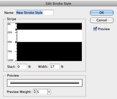
Because the specifications graphic listed proportions for the stripe width, I was able to create custom stripe stroke styles based on those proportions.
First, I made a table; then I filled the table with Blue and then started working on my strokes. I made a three custom stroke styles: one for the horizontal and vertical lines, and two for the diagonals. Then I applied a thick white stroke, set the gap color to Red, and applied my new custom stroke styles.
So, download my sample files, make 2 row by 2 column table, with the cells each 15 points high x 30 points wide. Then apply these cells styles to it. Voila! An almost British flag.
 |
| The stroke style for the horizontal and vertical table strokes (10 pt white stroke with gap color set to Red ) |
 |
| Stroke style for the right-slanting strokes (6 pt white stroke with gap color set to Red) |
 | |
|

No comments :
Post a Comment