Showing posts sorted by relevance for query tables. Sort by date Show all posts

Sunday, March 10, 2013

The Top Eight Reasons You Should Attend the Print and ePublishing Conference

If you're active in the InDesign community, than you've probably heard of the Print and ePublishing Conference (PePcon). It's coming up soon and you don't want to miss it!

Being a self-employed designer, I can attest to how expensive conferences are to attend. There's airfare, hotel, meals, entertainment... all in addition to the conference registration. Attending conferences is not something I do lightly, as I have to foot the bill for 100% of the cost of attending. There are so many great conferences to attend, but I'd like to share with you my perspective as to why PePcon is so awesome. Please know that I'm not a professional trainer, and I'm not a conference presenter. They didn't pay me to write this. I've simply found this conference to be so valuable for my professional development that I am compelled to share why.

Reason 1: Easy Small Talk (for Once)

I'm in the publishing business. I spend all day at home, on my computer. My officemates are my dogs. I truly enjoy my job and my peaceful, quiet office environment. But I sometimes find small talk outside of work difficult. Why? Because my favorite topics are technical manuals, tables of contents, metadata, and conditional text. If I share these concepts with non-publishing people, I'm usually presented with a blank stare. But to you, my fellow publishers, these are great topics of conversation. Amongst you, My People, I can have effortless small talk. Not only is that amazing, it's not something I encounter very often in my day-to-day life.

Reason 2: Lots of Awkward People

Don't misunderstand. I mean this in the most affectionate way, as I count myself among the awkward crowd. I spend nearly every day alone behind a computer screen, and my social skills aren't the greatest to begin with. But plenty of other people at the conference have the same social skillset as me! It turns out that when you put a bunch of awkward people together, it becomes less awkward for all of them. Who knew?

As PePcon has progressed over the last few years, David and Anne-Marie keep coming up with new and better ways to help get us introverted, somewhat-socially-awkward people talking to one another. Some of their tools are:
  • Business card bingo: a game in which you have to interact with and introduce yourself to approximately 25 different people (one at a time, of course). The bingo winner gets an awesome prize. We may be shy, but we still love prizes!
  • Meet the Speaker table (so you can ask a question privately, in a quiet space, rather than in front of a crowd of people)
  • Table signs: these signs are a helpful suggestion of where to sit during mealtime and breaks. There are tables for Government, Consultant, Business Publishing, Design Firm, software Developer, Education, etc. Those simple table signs help to guide us to the group of people with whom we have the most in common. I was amazed at the increase in interaction from one year to the next, just by the simple addition of signs onto the tables.

Reason 3: The world's experts at your fingertips

It's not uncommon to come to a conference like this, looking for a solution to a problem. Our industry is small enough that we are a pretty tight community. So if you explain your InDesign problem to one of the experts at the conference, they'll likely know the exact person who has already developed a tool to solve your problem. And chances are excellent that the developer you need is just a few tables away, waiting to talk to you.

Reason 4: Awesome Swag

This conference has the obligatory conference goodie bag, but it's filled with much more than a notepad and a few flyers. They give away coffee mugs, plugins, books, posters, thumb drives, and more. And by stopping by the sponsor booths and speaking to the various software developers, you'll get even more coupon codes and freebies. Since many of the book authors are at the conference, it's easy to get them to autograph your books! Many of the individual sessions also offer prizes at the end, for correctly answering questions pertaining to the lesson.

For the last couple of years, a complimentary set of MOO business cards had been included in the conference registration. They also have impressive door prizes at the end of the conference, including a couple of big ticket items such as FontFolio 10 pack, or the entire boxed edition of the Master Collection. With the way things are headed, I wouldn't be surprised if they gave away a Creative Cloud subscription or two this year.

Reason 5: Great Food

They put on quite a spread for us every year. It strikes a great balance between healthful and decadent. The meals have great variety, and let you east as balanced (or as unbalanced) as you like. They also offer all kinds of snacks and goodies in between the amazing meals. Cookies at 10:30? Creme Brûlée at 3:00? Why yes, please! They also make accommodations for folks with special dietary requirements, such as gluten free, or kosher. And if you go to the Ignite Session (which is sort of like an open mic night), there is usually an amazing cupcake selection. Besides being really tasty, I find the food is a great buffer for when we're sitting at a table full of strangers, practicing our small talk.

Reason 6: Conquer Your Fear of Public Speaking

Growing up, I was one of those students who hated doing speeches in school. So much so, that I sometimes would opt to take a F on an assignment, rather than do a required speech. What can get me talk in front of people? Only my favorite topic: InDesign (and its Creative Suite siblings). What better way to get over your fear of public speaking than to commit to speak in front of hundreds of your colleagues and the superstars of the publishing world? If you've figured out a totally amazing trick that the rest of the InDesign world should hear, then come to Ignite and share it with us. We don't bite. We want to hear about your amazing trick.

I've found that nothing boosts confidence quite like having publishing superhero stop by the table and say "Great speech! How did do you that awesome thing in InDesign?" For those brave souls who choose to do an Ignite session, you'll get a very special gift. Last year, they gave out PePcon umbrellas. And I am among the dozen people in the world that has one!

Reason 7: Make New Friends

At my first PePcon, I knew no one there. I went alone, and I was scared to death. To my surprise, I came home having made new friends. For an introverted person, this is a very big deal. It is important to have personal connections with other InDesign users around the world who can offer feedback and assistance with my InDesign problems. Alternatively, if I'm having a rough day, we can commiserate together on twitter, and that is just as wonderful.

Reason 8: Meet the InDesign Team

You may have heard that there is an entire session dedicated to hearing from engineers that create InDesign. But here's something that's not in the conference schedule: those engineers are also walking around mingling in between sessions, just like the rest of us. At last year's conference, I got the opportunity to personally share my InDesign wish list with an InDesign Engineer. And he took notes! Sure, Adobe is a giant global company, but getting to chat with a software engineer face to face made me feel like a very valuable member of the InDesign community.

So please, join me at PePcon. It's going to be tons of fun. And maybe we'll go have BBQ together.

Saturday, October 8, 2011

Diamonds, Dots, and Waves: Stroke Style Options for InDesign Tables

For today's episode of Fun With InDesign Tables, I started out by to experimenting with the White Diamonds stroke style.

I made a table 4 columns by 2 rows and gave it a 35 point White Diamond stroke. Just a note: "White Diamond is the name of the stroke, but you can color the diamonds however you want. I suspect that the name "White Diamond" has to do with the fact that the center of the diamonds appear as white (paper-colored)...that is, unless you give the stroke a gap color.

Then I colored the outside border red, and the inside column strokes to yellow.


Next I took the same table and widened it a bit, and then added a black gap color to the table strokes. I thought it was interesting that the gap color stayed confined to the border of the diamond shapes, and made inverse white knockouts in the corners of the table.


Next, I took the same table and gave it a stroke style of Japanese dots. Notice how the black gap color now extends to fill out the rounded corners. This one sort of reminds me of the beaded counting toys that I remember from my childhood


Here are a few more tables, with different stroke styles.

Straight Hash Stroke Style

Think-Thin-Thick Stroke Style

Wavy 
Dashed
Note that the only thing I changed in these 6 tables is the stroke style. The stroke width, stroke colors, and gap color remained the same.


Monday, June 28, 2010

Data-less Tables: InDesign meets Knitting

One of my recent projects took me to the Outer Banks of North Carolina, where after work one day, I played in the Atlantic for the very first time. I grew up on the west coast, near San Diego, and found the Atlantic to be quite different than the Pacific. On this particular beach, missing were the throngs of people, giant parking lots, and McDonalds. Other than one or two other families, my husband and I were the only ones on the beach. It was a wonderful day, plenty hot to enjoy a nice time in the water. Since most of my days are spent in my small home office, behind a giant computer screen, I was struck by the beauty and rhythm of the waves. I decided to design an afghan based on the colors and pattern I saw there.


I am a knitter, and I love geometric patterns. Years ago, I read a book entitled “Number Knitting” which is based entirely on knitting geometric shapes in garter stitch. In case you aren’t a knitter, garter stitch is the simplest type of knitting, named because it was the pattern used on the garter of hand-knit stockings. It is wonderfully elastic, and lies perfectly flat. It goes like this:

Row 1: Knit.
Rows 2-end. Repeat row 1.


It doesn’t get any simpler. Another one of the beauties of garter stitch is that is has a magical 2:1 ratio of (rows:stitches). This perfect 2:1 ratio allows you to create geometric shapes with precision: Triangles, squares, rectangles, trapezoids... Using these shapes, you can create beautiful designs. There are a few really great books that discuss in detail about using these shapes to create designs: Woolly Thoughts (written by two mathematicians), and the aforementioned Number Knitting (which is actually a patented knitting method!). One of knitting’s most beloved authors, Elizabeth Zimmerman, was also a proponent of garter stitch, and used it’s magical proportions to create fascinating garments, often made entirely in one piece. Though Elizabeth passed some years ago, her daughter, Meg Swansen, continues the family legacy with her business, and web site: Schoolhouse Press.

So how does this relate to InDesign?
In my first feeble attempts to work through design concept I had envisioned, I tried Illustrator. But it wasn’t working for what I wanted to do. It is very difficult to get the align and distribution correct on diagonal lines. I could have gotten out a pencil and paper, a protractor, and an angle, and tried to design it freehand on paper, but I can’t draw very well and I would have to know what I wanted to draw before I attempted to draw it. I am not a draftsman or a sketch artist. What I really needed was just a simple way to make horizontal, vertical, and diagonal lines. Wait! Diagonal lines are a feature in InDesign tables! I’ve never had a need for them before, but being stuck in an airport on my way home from the east coast, (with no internet connection) this seemed like the perfect opportunity to get some creative work done. Here are the features I used to create my afghan design.
  • Tables
  • Diagonal Lines
  • Swatches
  • Cell Styles

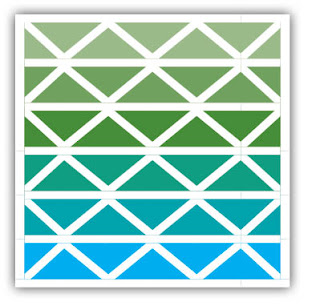
  1. First, make a table, equal in width and height. 6 rows by 6 columns
  2. Fill it with cyan.
  3. Add a 10 point white stroke to the exterior border of the table.
  4. Add 10 point white stroke to the top and bottom border of each row.
  5. Select a single cell, and add a 10 point right slanting diagonal stroke.
  6. Make a cell style based on each the right and left slanting cells. Apply those cell styles to each cell in the table, in a checkerboard pattern.
  7. Now choose your colors. I chose solid colors for each row, to simulate a gradient from cyan to light green. Yarn don’t come in gradients (at least not like this), so I needed to simulate one with my color choices.
I will likely buy this yarn from a website, and I will likely choose Cascade 220, as they have a HUGE selection of colors, and I am familiar with that yarn and am a big fan. Alternately, I could commission a spinner to spin me some yarn and hand-dye it. That would be the coolest thing to do, and there are a lot of handspinners in my area of the country, so I won't have a problem finding someone to make the custom yarn for me.


So my afghan design is complete, but I started experimenting with diagonals and found that you can acheive some pretty cool effects. After applying some different stroke types to the diagonals, I learned a few things:
  1. I wasn’t getting the diagonals to line up perfectly, so after a bit of thinking, I realized that the proportion of the triangles wasn’t quite right. It appeared that the 10 point white row strokes were encroaching on the colored squares, so after a little bit of experimenting, I figured out that to make a perfect triangle, you need to account for the difference in width between the 10 point row stroke and the 0 point column stroke. This is because the row stroke pushes up the contents of the cell (and therefore the cell’s diagonal). I tried decreasing the width of each column by 10 points. And it worked. Now I had perfect squares and triangles.
  2. For fun, I tried adding changing the stroke type from Solid to Thin-Thick, but it doesn’t apply the way you would think. The thick side is always on makes the base of the left-most side of the stroke, and the thin side is makes the base of the right-most side of the stroke. So it fixed that asymmetry by changing the diagonal stroke type every other row.
  3. Another interesting thing I noticed is that because the first and last column have 10 point column strokes, you’ll need to add 5 points to the width of the first and column to account for the edge strokes encroaching on the column.
Following are a few examples of different type of diagonal strokes. For these examples, I reduced the number of colors from 6 to 3, so you can easily see the different patterns.


Here is the final afghan:


Would you like to purchase the pattern for this afghan?

And here is a video about how I made it, and then translated it back into my graphic design software. Scroll to 6:07.


Author Note: Did you like this article? Check out another article on diagonal lines in tables here.

Monday, August 15, 2011

Using InDesign Tables to Duplicate the Window Structure Outside the Lincoln Memorial

Last May, I was able to attend the 2nd annual InDesign Secrets Print and ePublishing conference in Arlington, VA. I spent each day at the conference surrounded by fellow InDesign aficionados, talking about prepress, interactive graphics, searchable PDFs, and best practices for publishing workflows. Those conferences are more fun for me than any theme park. I was on InDesign overload, and loving every minute of it.

On the last evening of the conference, my husband and I took some time to tour the National Mall. Since I was recovering from the aforementioned (self-induced) InDesign overload, all I could think of was patterns. (If you've read my blog for awhile, you may have read some of my other posts about patterns.)

While I was touring the several-hundred-year-old buildings and streets, I snapped a few photos of some of the more interesting patterns in the architecture, with plans to recreate the geometry using InDesign tables.

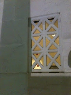
This photo is of the concrete window-type architectural details on the Lincoln Memorial. If you're inside the memorial, and about to head back down the stairs, stop and turn to your right. Walk two columns past the main entrance and look at the face of the wall. That's where you'll see these window cutouts. These tiny little windows are so small when compared to the rest of the memorial, that they're nearly impossible to see on most of the Lincoln memorial photos I found on the web. But fortunately, I found a photo that displayed the little windows on both sides of the Lincoln Memorial. See the little windows? (By the blue arrows.)

Copyright Rocco Caveng. Photo used with permission.
Here are the windows up-close.


Since my plan was to recreate the geometry of the windows in InDesign, let's get started. There are a couple of different ways to create these windows. Both methods use Diagonal Lines.


Table Cells with Crossing Diagonal Lines
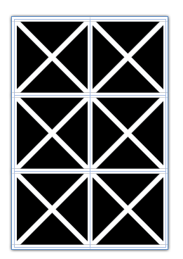
Make a table with two columns and three rows, with crossing diagonal lines, as shown below. Using the Crossing Diagonal Lines method, each cell has an X through it, and so if you choose to fill your cells with colors, they will be limited in that the entire cell has to have the same fill color. This is definitely the easier of the two methods, as each of the cells have the same stroke and diagonal lines settings.

2 Columns, 3 Rows, Crossing Diagonal Lines
2 Columns, 3 Rows, Crossing Diagonal Lines (Colored Cells)
Table Cells with Single Diagonal Lines
Another way to create this window pattern is by making a table with 4 rows, and 6 columns, and manually formatting each of the cells with a single diagonal line. I explored this idea in another blog post: Data-less Tables: InDesign Meets Knitting.

Using this method, you have more flexibility in your color choices because there are so many more cells.


Something interesting that I discovered while working with diagonal lines with that they can have different stroke properties than the other cell strokes. By increasing the vertical and horizontal stroke weight (and leaving the diagonal lines at a smaller stroke weight), you can create some interesting effects. For this example, I created a separate orange-filled frame behind the table. I also added a drop shadow to the table frame.


By adding some color to the strokes, and then shearing the table, you can create some very unique geometric designs.

Sunday, May 13, 2012

Making a Chevron Pattern Within InDesign

This is a pattern I saw recently while in the stationary aisle at Target. I like this pattern because it reminds me of the brightly colored crocheted chevron afghans that my grandmother made when I was a child. We had a number of these afghans around our house growing up, and after learning how to crochet at age eight, some of my first projects were efforts to duplicate her handiwork. My early efforts were not as well crafted, but they were good practice for me as I learned to be diligent in improving my craft.


So, how to create a chevron pattern in InDesign? At first, it's not clear. Usually, when creating a pattern in InDesign, I use TeaCup PatternMaker. Other times, I'll use tables and apply interesting stroke styles to them. But to create a chevron pattern, neither one of those methods will work. But I eventually found a suitable method.

But first, let's explore why my standard go-to pattern creating methods won't work.

TeaCup PatternMaker has a pattern type called "Waves," but it is exactly that: wavy. It's a really nice pattern, and I even wrote an entire blog post about it. But in this case, I need my "waves" to have sharp points, not curved points.


The "Waves" pattern is neat because you can change the amplitude stroke weight, and angle. But...you can't specify sharp corners.


Another limitation of the Waves pattern (or any Teacup pattern) is that it must fill a graphic frame: you cannot apply Patterns to strokes. Nonetheless, the Waves pattern is pretty neat, and one of of favorite TeaCup patterns.

My second go-to pattern creating method involves tables and stroke styles. In a couple of instances, I've used the "Wavy" strokes style on a table. While the Wavy stroke style is great because you can (obviously) apply it to a stroke, you have virtually no control over how it is applied. You can't change the amplitude, wave length, number of waves... nothing. All you can do change the stroke weight.  There seems to be a fairly strict limitation on the shape of the wave, and the number of waves will change in order to keep the built-in wave shape relatively constant. Thinner strokes get more waves. Thicker strokes get fewer waves.


Now that we know why my first two ideas didn't work to give us the pattern we're after, let's talk about the method that will give us the pattern we're after.

But first, let's take a step back and look more closely at the image.


Do the blue wavy lines it remind you of anything in InDesign? No? Well, how about if the lines were red? Now do you see how it looks similar to the squiggly underline beneath a mispelled word?


So, we know that InDesign has the capability to create a chevron pattern, as demonstrated by the squiggly red underline of dynamic spelling. But we need to find a way to translate this chevron pattern into a printable, editable object. Now, I don't know of a way to print the dynamic spelling underlines (why would anyone want to? See note below...), But I do know of another feature in InDesign that also has a wavy underline. This feature is "Conditional Text."

In case you've never used Conditional Text before, it is a great feature. It's got to be among my top ten favorite InDesign features. Basically, conditional text let's you show and hide different bits of text. For example, if you are doing a textbook with both a teacher and a student version, you can use conditional text to hide the teacher's portion of the document (such as the answer key). You can also use conditional text to hide bits of text that perhaps you don't need right now, but might want to save for use later. But in this case, what's so cool about conditional text is that you can show AND print text indicators!


So, now we have a way to create a chevron pattern, and to also print it. So how to get a whole frame of these wavy conditional text indicators, but not have any text to get in the way and obstruct the pattern?


First, let's attempt removing the letters, while still having the conditional text indicator. The solution is a right-indent tab (Shift + Tab). Right indent tabs are neat because they are dynamic. However wide your text frame is, a right-indent tab will extend all the way to the right-most edge of the text frame.


Now, we need to get a whole bunch of these little conditional text indicators stacked on top of each other. You may think that we would simply add a bunch of paragraphs, and the tighten up the leading to zero. That will work, but it would be very difficult to edit. Plus, it limits you to one color of chevron. Instead, we simply need to make more Conditions. InDesign will by default, want to make them all different colors, so you'll have to change the colors one by one.


Because I want to replicate the chevron pattern I saw at the store, I'll make all my conditions Light Blue.


Now, select your text (which is just a right-indent tab), and apply all five conditions. You have a chevron pattern!


You can add as many new conditions as you want, apply them, and the little chevrons will just be added to the top of the stack.


If you want to change your chevron colors, simply double click on the Condition, and change the color.   Here, I changed all the odd conditions to Blue (as opposed to Light Blue). Note that the conditions at the top of the panel are actually displayed at the bottom in the text frame. The conditions are sorted alphanumerically (top to bottom) in the Conditional text panel and in the reverse order (bottom to top) in the text frame.


So now that we have a chevron pattern that will show and print, and it's the colors that we want, it's fully dynamic and will extend as high and as wide as we want it to... what if we want to edit it further? What if I wanted real live strokes instead of just conditional text indicators?

A few weeks ago, I heard about a new plug-in from Markzware that converts a PDF into an InDesign layout. There is another piece of software (PDF2ID) that's does something similar, but I haven't tried it. During the course of my experiments with chevrons, Markzware was calling for beta testers for their new plugin, so I leaped at the opportunity. I think the original intent of the plugin was to translate recognizable patterns in text formatting of PDF documents, and recreate that text formatting as InDesign character and paragraph styles. But the cool thing about the Markzware plugin is that it will allow you to OPEN a PDF and have live, editable vector objects right in InDesign. Wow!


So, I exported my chevron pattern as a PDF, and then converted it using the PDF2DTP plugin. Once it's converted, when you select all the blue lines, you'll see that they are now fully editable strokes (click on image to enlarge).


If I wanted to, I could further stylize these strokes. And you can see that I can now easily change the stroke width, the amplitude, the stroke height, the colors, and pretty much whatever I want to change about them. I now have a fully editable chevron pattern, created right within InDesign.


Author edit on 6-10-12: If you don't have a copy of PDF2DTP, you can still use this method to create a chevron pattern. Simply open your PDF in Illustrator. If you like, you can simply copy and paste the strokes from Illustrator back into InDesign. The PDF2DTP plugin is very neat, because it allows you to "open" PDFs and edit them without ever having to leave InDesign.

Author edit on 8-24-12 regarding dynamic spelling underlines: I found a plugin that will include dynamic spelling indicators when exporting to PDF.

Did you like this article? Then check out my article about Chevrons at Creative Pro. That article discusses how we see chevrons and the simplest way to create a chevron in Illustrator.

Tuesday, July 24, 2018

Caution, Warning, and Danger Styles

In my work as a technical publisher, my documents use quite a few "Cautions." I see requests on the Adobe forums about this from time to time, so I thought I would share my method for formatting these styles.

There are a number of ways to set these up, including tables, but I have found that tables can prove a bit cumbersome. I've decided to incorporate the use of InDesign Paragraph Shading and Paragraph border settings. Disclaimer: These features were introduced in InDesign CC 2018. If you open this file in an earlier version of InDesign, it will not behave as expected.

Because I like my manuals to have plenty of white space, with nice wide margins, these styles are set up to have a large left indent. Here are some of the features of these styles:

  • Both Warning and Danger styles are set up based on Caution, so if you need to make any adjustments for the spacing or font, you just have to do it in one place.
  • The CAUTION, WARNING, and DANGER text auto-populates (they utilize the bullet feature to accomplish this).
  • The little triangle dings are vector anchored objects, so they are easily editable. 
  • The dings each have their own object style, so they sit in the correct spot based on which paragraph style uses them. "WARNING" is  longer than "DANGER", so the triangle ding sits a little farther to the left.
  • The CAUTION TEXT is set up as a "Next style".
  • Caution Text displays borders even when over over threaded frames.
  • All styles auto fit the width of the frame.

Download the IDML file here.


Caution Styles

Caution: Paragraph Shading

Caution: Paragraph Borders

Caution Text: Paragraph Borders
Caution Text works over threaded frames and auto resizes to frame width

Tuesday, June 26, 2012

Make a Mondrian using InDesign Tables

Want a Mondrian, but can't afford the real thing? You're not alone. Don't worry, you can make a similar design using InDesign tables. Take it one step further and have it printed large format on canvas, and hang it in your office.


Congratulations! You just saved yourself $27 million.

Friday, September 30, 2011

The British Flag as an InDesign Table

This post is a continuation of my other posts about diagonal lines within tables. Now for those of you who are British, please don't get upset that I didn't get the diagonals quite right. But my goal was to: using a single InDesign table, replicate the British flag as closely as possible.

Technically, the diagonals should line up exactly from one corner of the table to the opposite corner of the table, but InDesign: diagonals run from one corner of the cell to the opposite corner of the same cell. In this case, our table is 2 cells wide by 2 cells high, so the diagonals aren't perfect. But you get the idea.

My mental starting point for this table was a graphic containing geometric specifications for the British flag. You can find it here.

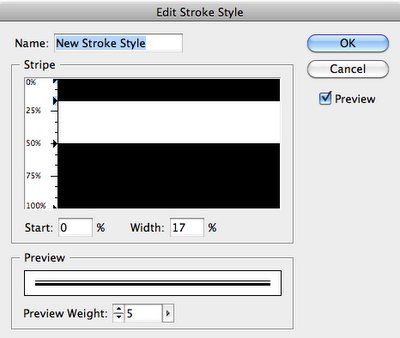
Because the specifications graphic listed proportions for the stripe width, I was able to create custom stripe stroke styles based on those proportions.

First, I made a table; then I filled the table with Blue and then started working on my strokes. I made a three custom stroke styles: one for the horizontal and vertical lines, and two for the diagonals. Then I applied a thick white stroke, set the gap color to Red, and applied my new custom stroke styles.

So, download my sample files, make 2 row by 2 column table, with the cells each 15 points high x 30 points wide. Then apply these cells styles to it. Voila! An almost British flag. 


The stroke style for the horizontal and vertical table strokes (10 pt white stroke with gap color set to Red )


Stroke style for the right-slanting strokes (6 pt white stroke with gap color set to Red)

Stroke style for the left-slanting strokes (6 pt white stroke with gap color set to Red)
If you're puzzled by the logic that InDesign uses to apply stripe stroke style to diagonal lines, well, you're not alone. Check out one of other articles where I have a bit of a writeup about it, as well as some samples of a larger variety of stripe stroke styles applied as diagonal lines. Data-less Tables: InDesign meets Knitting