Showing posts sorted by relevance for query PatternMaker. Sort by date Show all posts

Sunday, February 22, 2015

Using PatternMaker Lines to Recreate Striped Knitted Fabric

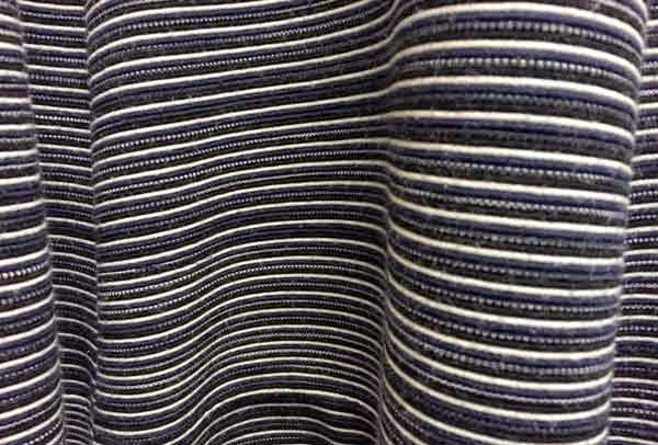
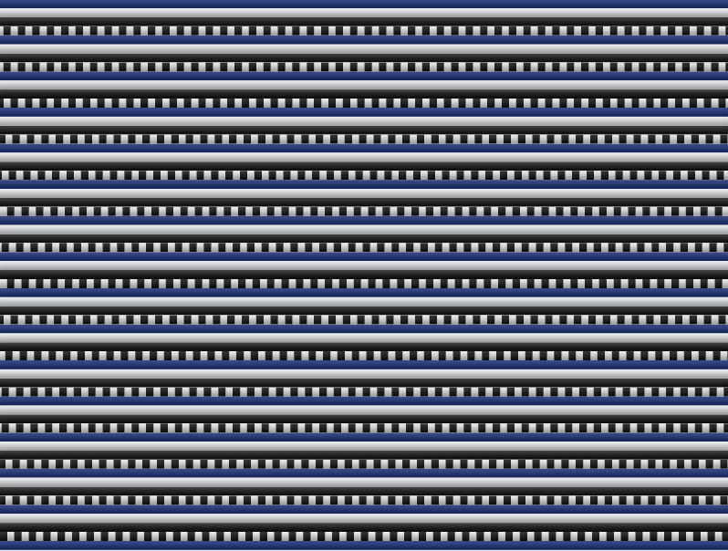
I have a beautiful striped blue dress that I love to wear in the spring and summer. It's knitted fabric, which makes it stretchy and comfortable. But it's also a rather thick fabric (due to the knitting technique used). It doesn't wrinkle and it's very flattering. I recently took a closer look at the fabric to see if I could determine how it was made and if I could recreate the look of the fabric in InDesign using Teacup PatternMaker.
Blue Dress Fabric
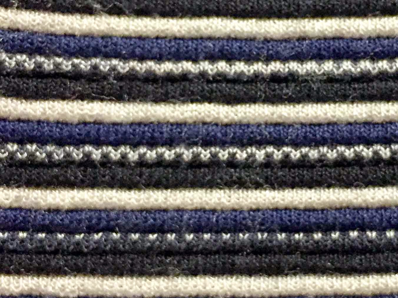
Blue Dress Fabric: Close Up
The first thing I noticed about the fabric was that was knitted in stripes:
1. White
2. Black
3. Two-tone: Black and White
4. Blue

The second thing I noticed about the fabric was that it was jacquard knitting.  Jacquard knitting is a complex type of multi-color knitting whereby the floats created by the color switches will be confined to the inside of the finished project. What that means to the person wearing the fabric is that the interior of the fabric doesn't snag when you wear or wash it. You'll see this technique used in those fancy knitted ski sweaters that cost a couple hundred dollars each. The cheap sweaters don't employ this technique because it's more complicated to produce. That's not going to affect how I recreate the pattern using PatternMaker; I just thought it was something interesting to note.

The third thing I noticed about the fabric was that it was pin tucked, resting in subtle horizontal ridges along the width of the fabric. It makes each stripe puff up a little bit, so that even if the fabric was all in a single color, subtle horizontal ridges would still exist.

Believe it or not, we can create this pattern using only 5 objects! So let's recreate this pattern using PatternMaker!

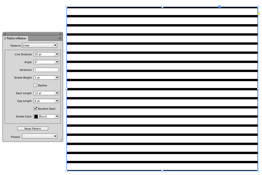
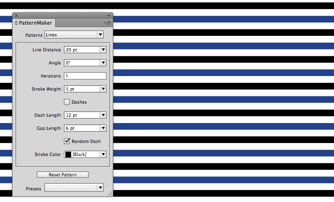
1. Make a large rectangle and fill it with black lines using the following settings.
Black PatternMaker Lines
2. Set your ruler increments to Points. Now, keep in mind that the units used in PatternMaker are the same as whatever unit of measurement you have for the current document you're working in. I find PatternMaker much easier to use if I am working in points. To quickly change your unit of measurement, Ctrl+Click in the top left corner of you ruler guides. Then choose Points.


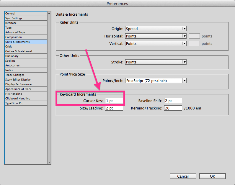
3. Change your Cursor Key preference to 1 pt. Since we'll be reusing (and nudging) the black lines for the rest of the design, it's important to set the cursor key preference so that when we nudge, we'll get the exact alignment of the lines.
Change Cursor Key Preference
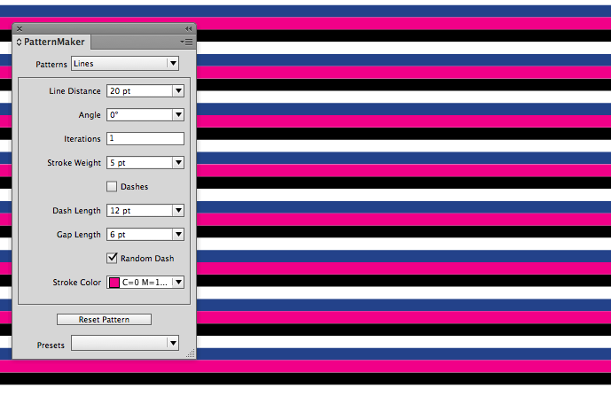
4. Add the Blue Lines: Select the Black Lines, then copy and paste in place. In PatternMaker, change the Pattern Stroke color to blue and then Shift+Up Arrow once. This will move the blue lines up 10 points. Because the line distance is exactly 20 points, that will put the blue lines exactly halfway in between the black lines.
Black and Blue Lines
5. Add the White Line Placeholder: Since you already have the black lines pattern on your clipboard, simply Paste in Place again. Change the Pattern stroke color to magenta so you can see the pattern while you're aligning it. Press the up arrow five times.
Use Magenta to Align the Lines
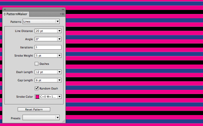
6. Duplicate the Magenta lines. Copy the magenta lines and and Paste in Place. Then Shift + Up Arrow once. These lines will be the placeholder for the white background two-tone lines we'll be creating next.
Duplicate the Magenta Lines
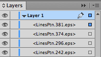
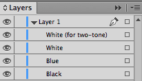
7. Rename your layers. If you look in the Layers panel, you'll see something similar to this. Those names come from how PatternMaker works. For every pattern you make, PatternMaker creates and embeds an EPS file into your InDesign document. Those embedded EPS filenames are what then get displayed in the Layers panel. But when all your patterns are created using the same type of shape (Lines, Triangles, Crosses, Dots, Waves, etc.), the names in the Layers panel aren't very helpful.
Auto-Generated Confusing Layer Names
So to make it easier to use the Layers panel to select the different frames, change the names in the Layers panel according to your colors, like so:
Understandable Layer Names
To change the names of your layers, click on the layer name, pause, then click again (a slow double click). The name will then highlight in blue and become and editable text field.

8. Change the magenta to white: In the Layers panel, Shift + Click on the little squares next to the two White layers. Then change the pattern stroke color to white.
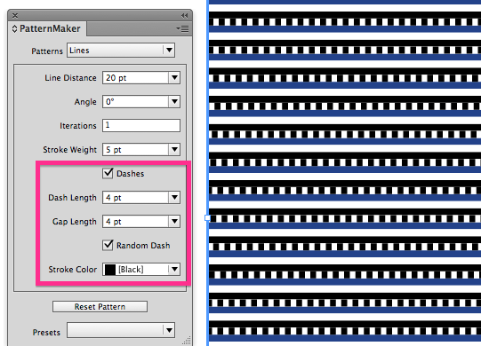
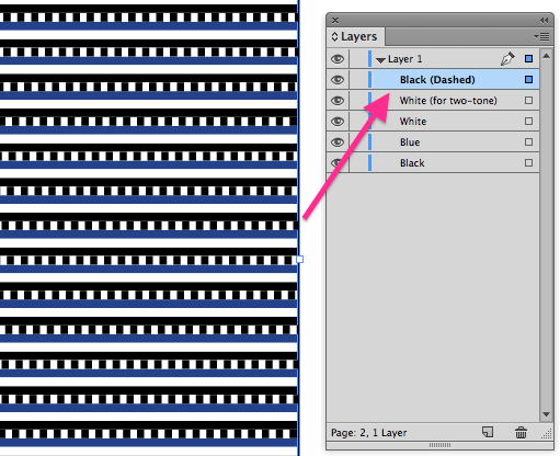
9. Make the dashed line for the two tone. Select the top white lines pattern, then copy and paste in place. Change the line color to black and choose Dashes, Random Dashes, 4 pt Dash length and 4 pt Gap Length. The Random Dash is important because without it, the pattern will look like it has vertical stripes in it. Be sure to change the name of the layer in the Layers panel.
Dashed Line for two-tone stripe
Be Sure to Change to Layer Name
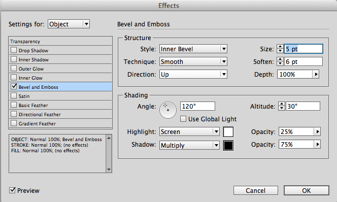
10. Add bevel and emboss to simulate the pintuck. Use the the settings below.
Bevel and Emboss Settings for Pintuck
Completed Blue Dress Fabric Pattern

Blue Dress Fabric
While this recreation is not an exact replicate of the original blue dress fabric, it is an interesting study in what can be done with PatternMaker and just a few objects. PatternMaker is a free download and come with 3 free patterns: Crosses, Lines, and Scallops. An additional pattern pack can be purchased as a subscription for $49/year.

Thursday, April 18, 2013

How to Make an Argyle Pattern in InDesign

This article will teach you how to make an argyle pattern using InDesign and Teacup PatternMaker plugin. Wikipedia has a great article on the history of the argyle pattern. This pattern is surprisingly simple to make, using only five objects. The magic is the a single blending mode.

First, choose a few colors you like and add them to the swatches panel. You'll probably change them later, as you experiment with blending modes. But for now, start with a few swatches in the swatches panel. They have to be in the swatches panel in order to show up in the dropdown menu of PatternMaker color choices.

I like pink and purple, because those colors are predominant in the splash screen of InDesign (which, if you don't already know, is my favorite software). Plus, I'm a woman, and we tend to like pink.


Next, draw a big frame and apply the PatternMaker "Lines" pattern.


Now, you may be thinking, "Why are we drawing dashed lines when what we need is a bunch of diamonds?" First thing we need to do is to turn off the dashes.


Next, make the Stroke Weight really thick, and then change both the angle and the line distance. I made my Line Distance 26 pt, Angle 60 degrees, and Stroke Weight 13 pt. The key is that the line distance needs to be double the stroke weight. That is what will give us nice perfectly symmetrical diamonds.

Now for the next color: Copy, paste in place, and change the angle to a negative number. Oh wait! You can't? Me neither.


So instead of using a negative line angle within PatternMaker, simply flip the object horizontally. Like so:


Next, add a blending mode to the top frame. I chose Darken. But you might prefer a different color mode.


Next, copy, and paste in place. Put the blending mode back to Normal. In the PatternMaker panel, change the Stroke Weight to 1 pt and the color to Paper.


Again, copy and paste in place, then flip horizontal.


Now we have a basic argyle pattern, but I think it needs a bit of color in the background. Make another rectangle and color it brown. Send it to the back.


Now, you might like the way this looks, but I think it's kind of ugly. I don't want the purple interacting with the brown background. So we need to isolate the pink and the purple lines so that those are the only two objects affected by the blend mode of the purple lines.

When you have a bunch of objects stacked on top of each other, all with the same bounding box dimensions, it's rather troublesome to select just the ones you want without moving all the others out of the way. Enter: the Layers panel.


With Layer 1 twirled open, I can see all five objects. I know that the rectangle at the bottom is the brown frame. And I want just the two objects above that. So click on one of the little squares next to the object name, then shift+click on the little square directly above it. That will select both the purple lines and the pink lines.

Next, group them and in the Effects panel, click "Isolate Blending."


That's the basic idea. You can change up your patterns by making the thin lines dashed, changing the line angle, colors and blending modes.


Happy Patterning!

Wednesday, January 4, 2012

PatternMaker Weave: Chinese Carpet Pattern

Last night, my husband took me to a dinner at a nice Chinese restaurant. On the back wall of the restaurant was a large mural of traditionally-dressed people sitting on a red mat, presumably drinking tea. The mat was red and had a basketweave pattern. I knew I could recreate the pattern using PatternMaker. So let's get started.

I made a frame, filled it with red, and then chose the "Weave" pattern. I then set the angle to 90 degrees.

I wanted the pattern to have a perspective skew, as did the original, so I used the Shear tool to shear the frame. Interestingly, the pattern skewed along with the frame. Cool!


I wanted the mat longer, so I made the frame a bit taller. When you do this, you'll need to reset the pattern so that it fills the frame with a new graphic using the same settings.


So I Reset the Pattern (see the little red arrow in the screenshot below). I fully expected to have the pattern reset to a non-skewed version, but instead, the pattern retained the skew settings. I never really thought about it before, but apparently, you can modify the skew settings of both the graphic and the graphic fill independently. When you Reset the Pattern, the new pattern-graphic (which is an embedded EPS) will automatically reset to not just the settings specified in PatternMaker, but also to the skew settings of the graphic frame.


If you like basketweave pattens, check out one of my other blog posts about this same topic. In that post, instead of PatternMaker, I created the pattern two different ways: one using tables, and one using knitting.  Here's the post: Using InDesign Tables to Design a Geometric Color Block Pattern

Friday, February 24, 2012

Green Circle and Crosses Fabric Pattern (PatternMaker)

Recently, while watching one of my favorite sitcoms, I noticed an attractive geometric pattern in one of the chairs on the set. I wanted to see how closely I could recreate the pattern using Teacup PatternMaker. Here is a photo of the chair fabric pattern we'll be recreating.


This pattern has two primary shapes: circles and crosses. First let's create the circles. The circles aren't just random circles, they are a grid of circles. And wouldn't you know it, PatternMaker has a pattern type called "Concentric Circles Grid."


So, after creating a new frame with a green fill, I applied that pattern. Here is the result:


Next, I adjust the number of circles. While the pattern is title "Concentric Circles," you can actually reduce the number of circles to 1.


The default grid angle is 70 degrees, so next I change the angle of the grid to 0 degrees.


Now, I need to make my circles larger. After a little experimentation, I determine that I need to adjust the Shape Size to 75 pt and the Inner Radius to 35 pt.

We're almost done with the circle. Now, we just need to thicken the stroke and make the circles white. I change the stroke weight to 4pt and the color to white.


Now that my circles are complete, I'll move onto the crosses. Copy the frame and paste in place. One the top frame, remove the green fill. This will allow you to see the cross pattern in the frame below. Then select the bottom frame and change the pattern to Crosses.


Next I change the pattern angle and shape angle. This looks slightly different than the fabric pattern. See how in the above screenshot, the crosses are on a diagonal grid? By changing the pattern angle and shape angle, the crosses are now aligned in a horizontal and vertical grid.


Next I change the cross size to 21 pt and the and Element Gap to 50 pt. I chose 50 pt. because that was the distance used for the Element Distance in the Concentric Circles pattern.


Then, make the frame larger than you need it and reset the pattern. This will allow you to nudge the I nudge the Crosses frame so that the crosses are aligned in the correct spot within the circles.


Now, nudge the Crosses frame so that it is positioned correctly. Then reduce the size of the frame so that it is the same size as the Concentric Circle frame.


Finally, I increase the Crosses stroke weight to 6 pt.


You may notice that the original fabric pattern looked slightly different: the crosses had pointed ends, and didn't have the little white specks near where the circles intersected. But the goal was to get as close to the original pattern as I could, without leaving InDesign. Mission accomplished!

But wait, there's MORE!

Just for fun, let's push the exercise a little farther. Next, export the InDesign page to a PDF, with Acrobat 5 compatibility. 


Then open the resulting PDF in Illustrator. Here is what you get:


And here is the same objects, viewed in outline mode (Cmd/Ctrl + Y). Notice how it is blank. Where are my patterns? I have no idea....

Why is this blank? I don't know.

I've been told that Adobe doesn't officially support opening up random PDFs and editing them in Illustrator. I've always known there can be some weird conversion issues like outlining some of the type, but I've never seen anything as strange as this. 

Now, I don't know what kind of code is going on behind the scenes that would make the pattern freak out, but fortunately, there are still some fun ways to get this patten as an editable file within Illustrator.

First I tried going to Acrobat and selecting the pattern with the Edit Object tool. Then right-clicking and choosing: Edit Obejct. Because the object is vector, it opened in Illustrator. But, unfortunately, I got the same result.

So now, go back to InDesign. Select the two patterns (Crosses and Concentric Circles Grid). Set the transparency to 99.9%.


Now, export a PDF with Acrobat 4 compatibility. You'll get a warning about bookmarks, transparency, yadda, yadda. Click OK. This will flatten the objects and make them more editable within Illustrator.


Here is the resulting file when opened in Illustrator. Now it looks right!


And here it is in when viewed in Outline mode. Aha! Now I have paths to work with.


Now, you may hear heated opinions about how flattened PDFs are evil, inflexible, and the bane of prepress technicians' existence. And when I send PDFs to my printer, I do my best to never send them flattened PDFs. But sometimes, flattening a PDF can be a good thing. Because Acrobat 4 is more archaic technology, I think that flattening a PDF is sort of like dumbing it down.  

By reducing the transparency just a little bit, it's enough to sort of give the resulting PDF a kick in the butt and make it behave correctly. I wish I had a better explanation, but I not a coder. Sorry.

So now that you have access to the paths within Illustrator, you can (with a little digging in the layers panel) extract the white circles and crosses as one giant compound path.

Then, you can change up the colors a bit. Teacup PatternMaker is great, but it doesn't allow you to apply gradients to patterns. But by extracting the pattern in Illustrator, you can color it however you want. Here are a couple of colorways that I came up with.

Yellow concentric circles grid on red 

Purple concentric circles grid on blue

Let's push it one step further, and do some Live Painting. Interestingly, when Live Painting with a gradient, the gradient is applied across the width of the entire live paint group, rather than the individual area you're painting.

Concentric circles and cross - painted using the Live Paint Bucket Tool

I hope you have enjoyed today's lesson. Have fun patterning!